

A widely cited study by Brinson, Hood, and Beebower (in 1986, and then updated in 1991) found that asset allocation accounts for approximately 90% of the variation in portfolio returns over time, while investment selection and market timing play a much smaller role.
It is why diversification is crucial if you want to build a portfolio that can outperform in a wide range of market conditions. By spreading your investments across various asset classes, sectors and geographic regions, you reduce the impact of any single investment's poor performance. In essence, "don't put all your eggs in one basket".
This risk management strategy helps to mitigate volatility and potentially stabilise returns, meaning that if one investment declines, others may offset those losses. While it doesn't guarantee profits or eliminate all risk, diversification significantly enhances the likelihood of achieving long-term investment goals by smoothing out the inevitable ups and downs of the market.
The key is to build a portfolio where the underlying investments behave differently. This is where calculating the correlation coefficient comes in.
Correlation coefficient explained
Correlation coefficient measures the relationship between the price movements of two different assets. While it is complicated to work out, it is very easy to use. This correlation coefficient can range between -1 and 1. A figure of 1 would suggest that the two assets follow each other while a score of -1 suggests that as one rises in value the other falls and vice versa. A score of 0 means that the two assets are not correlated at all. Or in other words, they do their own thing.
If you calculate the correlation coefficients for a range of assets you can use this information to help build a well diversified portfolio that has a greater chance of producing more stable returns.
Correlation heatmaps
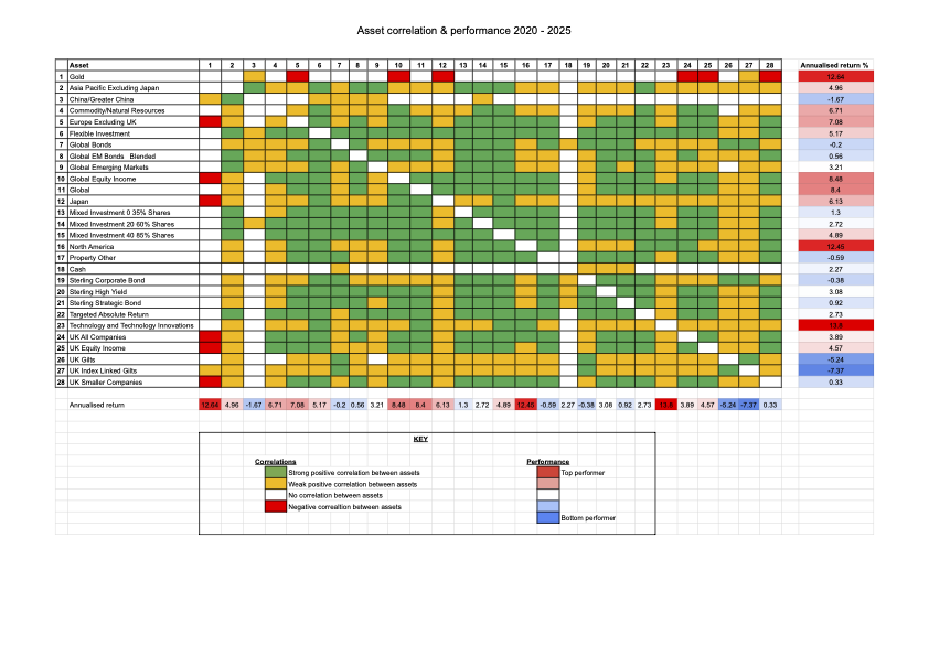
Below I have produced three heatmaps. The first heatmap shows 27 domestic and international Investment Association sectors (covering assets including bonds, equities and cash) plus gold, along with their respective correlations and annualised performance over the last five years (2020 to 2025).
Don't forget that this period included the pandemic stock market crash (and the fastest bear market in history) as well as the worst ever calendar year performance for a typical 60% equity / 40% bond portfolio, which occurred during 2022. During 2022 the correlation between bonds and equities became increasingly positive, as they both fell in tandem. It served as a timely reminder of the importance of diversification (beyond just equities and bonds) as well as understanding asset correlations when constructing a portfolio.
The first two charts below are colour-coded for ease of use (click on each image to enlarge them). A green square shows that there was a high positive correlation (over 0.7) between the two sectors/assets in question. A yellow square shows that there was a weak positive correlation between the two sectors (i.e. a correlation coefficient between 0.2 and 0.7). A white square indicates that there was no discernible correlation between the asset classes (i.e. they are uncorrelated and have a correlation coefficient of between -0.2 and 0.2). A red square indicates a negative correlation between two sectors (i.e. a correlation coefficient of -0.2 or lower). You will notice that the first column contains numbers which help you identify the asset type that each subsequent column refers to. Also, the geographical sectors listed refer to equity sectors unless stated otherwise.
In the first chart you will notice that the only assets to show a negative correlation or little correlation to most other assets over the last five years are gold, cash and Chinese equities. Holding these assets would have helped diversify your portfolio, however as shown by the annualised performance figures, Chinese equities were one of the worst performing assets over the last five years, emphasising that diversification isn't the only consideration.
Other noteworthy observations are that Targeted Absolute Return funds have been positively correlated to equity markets, which is somewhat surprising given how they are marketed for their diversification potential. Also many bond sectors have positive correlations (although often weak) with equity markets, again quashing the assumption that bonds always move inversely to stocks.
2020-2025 Asset correlation heatmap
Changing correlations
However, correlations between assets can and do change over time. The chart above shows the correlation for the five year period from 2020 to 2025, but during that period the correlations won't have remained constant. It is one of the reasons why conventional wisdom about diversification can become invalid.
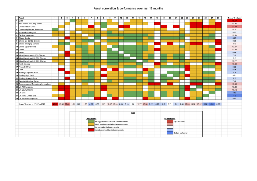
The chart below titled '2025 Asset correlation heatmap' shows the correlations between the same sectors/assets over the last 12 months, along with the annual performance of each asset class.
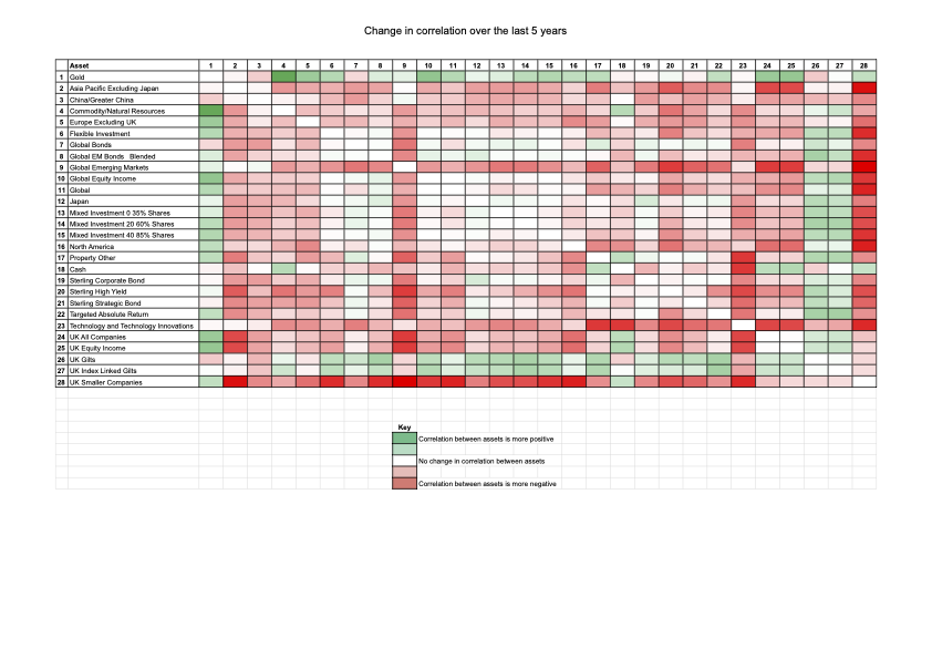
The subsequent chart titled 'Change in correlations since 2025' shows the change in correlation between 2020 and 2025 as well as the strength of that change. You can use the chart to see the areas where correlations are changing. So far example, while gold is still uncorrelated to most asset classes it is currently not quite as good a diversifier as it has typically been over the last five years.
Meanwhile global emerging market equities and Chinese equities have become less correlated to other major equity markets.
2025 Asset correlation heatmap
Correlations over the last 12 months
Change in correlations since 2020
Summary
Understanding how assets are correlated can significantly enhance the likelihood of achieving long-term investment goals when building a portfolio. The above research will help you in that endeavour. However, bear in mind that the research analysed the behaviour of the average fund within each sector/asset class. As such, the correlations quoted are not indicative of every fund within each sector. It is possible to find funds within the same sector that behave differently. But overall...
- Global bonds and equities are more positively correlated than conventional wisdom would suggest, although this is starting to ease.
- Cash remains the most uncorrelated asset, while gold has also proved a good portfolio diversifier as well as a strong performer.
- The Targeted Absolute Return sector has been a weak performer as well as poor portfolio diversifier despite the marketing promises. Of course, individual funds from the sector may provide diversification benefits (as has been seen within my own £50k portfolio and the inclusion of Thesis TM Tellworth UK Select)
- Global emerging market equities (as well as Chinese equities) have been good portfolio diversifiers (and are increasingly so) although performance has been volatile.
Correlations will no doubt change in the future but the research shows it pays to think beyond traditional asset allocations that focus just on bonds and equities, and that usually have a significant UK bias.

£200 Pension Cashback Offer
Make a qualifying deposit or transfer a pension to our partner Interactive Investor.
- Deposit or transfer a pension of at least £20k and you could earn £200 cashback
- Terms and Fees apply, Capital at risk
- New & Existing customers opening a SIPP
- Offer ends 31st July 2026
Before starting your transfer, check you won't lose any valuable benefits (such as guaranteed annuity rates or a lower protected pension age) and find out what exit fees you might have to pay
