

If you have been reading my weekly and monthly investment notes you will be all too aware of the competing narratives that are influencing markets. Whether it be hopes of more monetary or fiscal stimulus, geopolitics, valuation fears, speculation or the coronavirus investors have been quick to react, often chasing their own tails. However, in the last week, the UK Government has confirmed that a second wave of the coronavirus is now on its way, along with stricter measures to curb its spread throughout the population. The UK is not alone, evidence of a second wave already exists in Europe, alongside increased lockdown measures in a number of countries, while the coronavirus death toll in the US has now surpassed 200,000. This has all helped to sharpen investors' focus on the threat that a second wave of the coronavirus pandemic might pose to investment markets. The question now is how could you position your portfolio to mitigate the potential downside from a second wave of the coronavirus?
Earlier in the year, I produced a research piece titled Funds for the pandemic. In that article I revealed:
- the funds that had made a profit during the worst of the COVID induced sell-off in February/March
- those funds that fared better than their peers during the sell-off
That research piece will likely prove valuable. However, in the case of the second bullet point, some of the funds that fared better than their peers still fell significantly.
Understandably some investors might not want to position their portfolio explicitly for a second wave by buying individual funds but would prefer to diversify their portfolio more strategically to mitigate some of the risks associated with a potential second wave. They might prefer to take a more tactical view and manage their portfolio so as to retain or include certain asset classes that could help mitigate the risks.
Diversifying your portfolio by holding a range of assets is sensible as not all assets move in the same direction all of the time. By investing in a range of assets you can protect your portfolio against the worst of a stock market collapse. There is a statistical measure that exists to show whether two things (in this case sector/asset classes) follow each other or not, which is known as correlation.
You can work out whether two things are correlated by working out what is known as the correlation coefficient. It is complicated to work out but it is very easy to use. The correlation figure can range between -1 and 1. A figure of 1 would suggest that the two objects follow each other while a score of -1 suggests that as one rises the other falls and vice versa. A score of 0 means that the two assets are not correlated. However, correlations in investment markets do not remain constant, particularly around an aggressive market crash and subsequent rebound which we've experienced in 2020.
Interestingly we are exactly 6 months on from the 23rd March low at the height of the pandemic-induced sell-off. This provides a nice symmetry of how asset correlations behaved in the 6 months ahead of the crash, which included the last months of the equity bull market, and how they behaved in the 6 months after the bear market in equities when markets rallied.
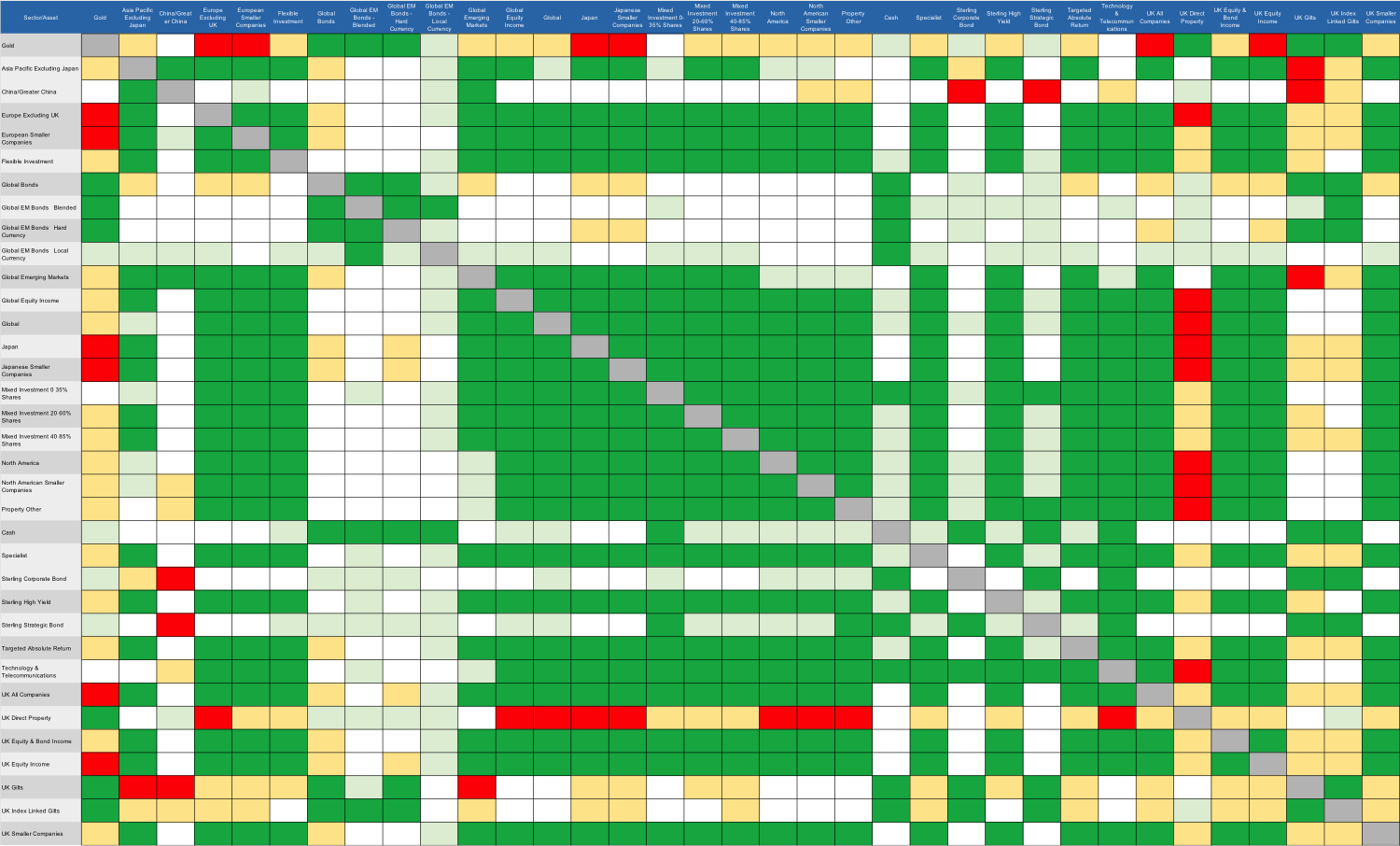
How to use the pandemic heatmaps
To enable you to see how asset/sector correlations have behaved going into this year's bond/equity market crash and afterwards, I have produced two heatmaps. The first heatmap shows 36 domestic and international Investment Association sectors (covering assets including bonds, equities and cash) plus gold, along with their respective correlations in the 6 months since the March low. The second, and more useful chart, shows the correlations between the same sectors/assets during the six months that ended at the market low of the 23rd March 2020.
Each chart is colour coded. A green square shows that there is/was a high positive correlation (over 0.6) between the two sectors in question. A light green square shows that there is/was a weak positive correlation between the two sectors (i.e a correlation coefficient between 0.3 and 0.6). A white square indicates that there is/was no discernible correlation between the asset classes (i.e they are uncorrelated and have a correlation coefficient of between -0.3 and 0.3). A yellow square indicates a weak negative correlation between two sectors (i.e a correlation coefficient of between -0.3 and -0.6). A red square indicates a strong negative correlation coefficient (i.e a correlation coefficient of -0.6 or lower).
So let's say that you have a significant US equity holding in your portfolio. The first chart shows that right now most asset classes have a strong positive correlation with that sector, namely North America. (Note: the geographical sectors are all equity sectors unless stated otherwise). The risks are currently high that if we have an aggressive sell-off in US equities that most asset classes will move in the same direction. The only assets to show no correlation (or at least not a significant one) to US equities are UK gilts, gold and cash. Holding these assets will help diversify your portfolio in the event of a sell-off.
Interestingly, that's exactly what we've seen happen within my own £50k portfolio where UK gilts and gold make up a significant portion of my portfolio, offsetting my equity component's volatility which is mostly invested in US equities. Perhaps more importantly during the sell-off in February/March (see the second chart) the assets remained uncorrelated to US equities, and in fact gold became negatively correlated to the sector. If we see an aggressive second wave of the pandemic, history suggests that a combination of these asset classes could help diversify a portfolio.
Correlations during the 6 months after the March low and up to 23rd September 2020


Correlations during the 6 months heading into the market low of 23rd March 2020

The key takeaways
- Basing your diversification on the performance of assets since the market rebound could leave you exposed to a repeat of the market turmoil we saw in the first wave of the pandemic. Over the summer months, assets have become increasingly correlated (positively so) as central banks support the market via monetary policy (i.e. via quantitative easing). That means risks are rising within portfolios if we experience a severe coronavirus second wave and an ensuing sell-off.
- Instead, focus on how different assets classes within your portfolio performed in relation to each other ahead and during the sell-off (the second chart).
- When equity markets crash and volatility spikes, at the point of investor blind panic, cross-asset correlation actually starts to rise temporarily (not shown above) as people rush to cash. We saw this in February when even bond markets started to fall at the same time as equity markets. But as the second chart above shows, despite this temporary move, across the lifetime of February's crash different assets did behave differently, especially after the initial 'blind panic' phase had passed.
- Cash is king during a crash as it preserves capital. In that regard, it is a good diversifier but it yields very little the rest of the time and those in cash have missed the market rebound.
- Assets that were uncorrelated to equities during the crash and so might diversify your portfolio during a second wave would be:
-
-
-
-
-
- UK gilts
- UK index-linked gilts
- Global bonds
-
-
-
-
-
- Unsurprisingly UK gilts, although not exciting, form a core part of the Perfect ISA portfolio which has a strong record of preserving capital and producing strong long term returns.
- Emerging market bonds, especially those denominated in local currencies don't offer the diversification benefits of other global bond sectors (which benefited from a strengthening dollar which often happens in a crisis).
- Strategic bond funds (often quasi-high yield funds) and high yield bond sectors tend to follow equities downwards aggressively. So avoid if you want to diversify.
- Gold can help diversify your portfolio as it was negatively correlated to almost every asset class during the first wave of the coronavirus (again benefiting from fear and a stronger dollar).
- Direct Property would be a good diversifier if it wasn't for the risks of having your money locked within an illiquid fund - AVOID
- On the whole Targeted Absolute Return funds are highly correlated with equities and didn't perform well as a group during the first wave of the pandemic.
- Chinese equities were about the only equity market to show a negative correlation to other equity markets, most notably US equities - this may come as a surprise to many but we've already started to see this play out again in recent weeks.

£200 Pension Cashback Offer
Make a qualifying deposit or transfer a pension to our partner Interactive Investor.
- Deposit or transfer a pension of at least £20k and you could earn £200 cashback
- Terms and Fees apply, Capital at risk
- New & Existing customers opening a SIPP
- Offer ends 31st July 2026
Before starting your transfer, check you won't lose any valuable benefits (such as guaranteed annuity rates or a lower protected pension age) and find out what exit fees you might have to pay
