

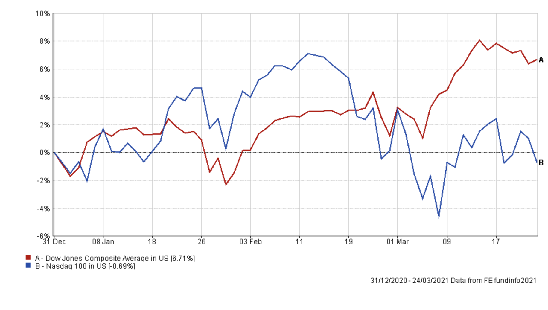
In my weekly and monthly newsletters I've written extensively on the reflation trade that has captivated markets since mid-February. Bond yields have spiked causing bond prices to tumble. Equity markets initially ignored the turmoil in bond markets but ultimately were forced to pay attention. While there have been areas of the market (large growth stocks such as technology companies) that have been hit hard by the reflation trade, other areas have fared much better. Energy stocks and financials have performed well alongside value plays (which were among last year's laggards). The chart below shows the performance of the Dow Jones so far this year versus that of the tech-heavy Nasdaq 100. It beautifully illustrates the divergence in fortunes within equity markets with the former hitting new all-time highs
Yet one of the most popular questions I've been asked of late is how can you quickly tell which funds will benefit from an ongoing reflation trade. Which funds have a greater bias to value stocks? How can you tell which funds invest in cyclical sectors? It is not easy unless you go through every fund factsheet one by one but even then many won't disclose much beyond their top 10 holdings. So I set about trying to identify those funds that may benefit from an ongoing reflation trade and those to potentially avoid.
Finding funds for the reflation trade
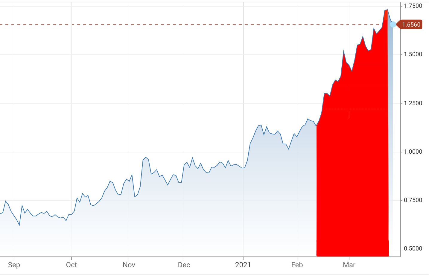
For ease, in this article I use the term reflation trade to describe the environment of rapidly rising bond yields, when economic growth expectations are positive. In order to find those funds that have benefited from the reflation trade and the spike in bond yields I focused on the time period coloured red in the chart below. The chart shows the movement in the yield of the 10 year US treasury since September 2020. As you can see, while there was a spike in the 10 year US treasury yield at the start of 2021, the most significant move actually occurred between 10th February and 19th March. During this period rising bond yields and rising inflation & economic growth expectations were the biggest drivers in investment markets.
Reflation sector heatmap
First, it is useful to produce a heatmap, such as the one below, of the performance of key unit trust sectors over the highlighted period. The strongest performing sectors are shown in green while the weakest performing sectors are in red. In each instance, I've used the sector average return. The sector heatmap is useful because if you wanted to take advantage of the reflation trade it provides a helicopter view of the ponds to go fishing in. The same heatmap pattern would inevitably be seen in investment trusts and ETFs.
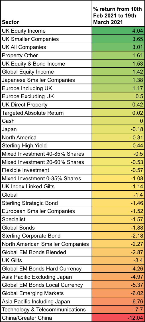
You can clearly see the sector winners and losers, with Chinese and Asian equities being the biggest laggards along with government bonds such as gilts. Those sectors that have done well are those that typically have exposure to value stocks or areas of the market benefiting from an acceleration in economic growth such as smaller companies, REITs, financial stocks and energy stocks while avoiding growth stocks and more speculative assets. Interestingly very few sectors have outperformed cash since the bond sell-off escalated. This emphasises the point that I made in a previous newsletter on how a typical bond/equity portfolio has struggled in an environment when bond and equities have often fallen in tandem.
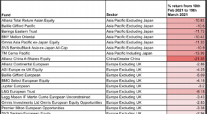
The funds for the reflation trade
However, sectors are not a homogenous group of funds. Typically, within each sector, there is a wide range of funds with different remits and mandates. It means that in aggressive and occasionally nuanced market repricing, such as the one we've experienced in recent weeks, there are winners and losers within each sector. Whether a fund ends up being a winner or loser depends on the companies and assets it invests in. So I analysed over 2,000 funds across the stated time period and identified those that have been the best and worst performers on a relative basis within each sector. Within equity sectors the best performers will have a more cyclical/value bias while the worst performers favour growth stocks. Within bond sectors the best performers are those funds that typically have a shorter duration.
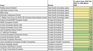
The result of my analysis is that I have produced the two heatmaps below. If you click on each image they will load a pdf (which you can enlarge) that contains around 200 funds in each table across 35 unit trust sectors. The tables are grouped by sector in order to make cross-referencing with the above sector heatmap easier. Then within each sector, funds are listed alphabetically. Each heatmap is colour coded. In the case of the best funds for the reflation trade heatmap the performance figures are coloured yellow to dark green, with dark green being the best performing fund across the entire heatmap. Similarly, the 'funds that struggle' heatmap is coloured from white to dark red, with dark red representing the worst performing fund.
Funds for the reflation trade

The funds that struggle


£200 Pension Cashback Offer
Make a qualifying deposit or transfer a pension to our partner Interactive Investor.
- Deposit or transfer a pension of at least £20k and you could earn £200 cashback
- Terms and Fees apply, Capital at risk
- New & Existing customers opening a SIPP
- Offer ends 31st July 2026
Before starting your transfer, check you won't lose any valuable benefits (such as guaranteed annuity rates or a lower protected pension age) and find out what exit fees you might have to pay
