

Let's start with a simple question. Which of the following investors is having the most success?
- Investor A who invested £50,000 2 years ago and is up £4,218.
- Investor B who invested £50,000 5 years ago but is down £415
Based on the information above most people say Investor A has been more successful. But what I didn't tell you was that 5 years ago the market fell by 20% and stayed there until 2 years ago when it rallied 10% to date. So if you'd invested £50,000 2 years ago and your performance reflected the wider market you'd now have £55,000. Similarly if you'd invested £50,000 5 years ago your portfolio would be worth £44,000 if it had matched the performance of the market.
Suddenly it would appear Investor B has hugely outperformed the market while investor A has underperformed. This perfectly illustrates the importance of giving context to a portfolio's performance by referencing a benchmark.
But there's something else I didn't tell you. Neither investors' portfolio looks anything like 'the market'. Rather than be invested 100% in equities Investor A only invested 60% of his portfolio in equities with the rest in a cash account that makes 3% a year. Similarly Investor B invested 60% of his portfolio in equities and put the rest in cash making 3% a year.
The reality is that neither investor has outperformed the other in relative terms. Furthermore both have simply matched 'the market' when you take into account their exposure to it. This perfectly illustrates the importance of having a relevant benchmark.
That is why it isn't much use referencing a diversified portfolio against the FTSE 100. I only include it in my charts when looking at my portfolio or the 80-20 Investor selection as an indicator of market sentiment.
So how do you go about making a relevant benchmark?
In the fund management world managers choose their benchmark. Most of the time funds within the same sector will have similar benchmarks. That's because if you are managing a UK equity fund you will almost exclusively invest in shares that are constituents of the FTSE All Share Index. As such it makes sense to use something like the FTSE All Share as your benchmark. But for DIY investors it's not that simple as they invest in a range of asset types.
In my time building portfolios for wealthy clients I found there are 3 types of benchmarking which work best. I'll call these
- Goal benchmarking
- Average benchmarking
- Asset/risk benchmarking
Goal benchmarking
When we are investing we should always have a goal in mind. It could be to beat the return on cash. The goal might be to build a big enough pension pot to produce a desired level of income in retirement.
Whenever I'd sit down with clients I would crystallise what that goal was. This goal has an impact on the level of investment risk you will need to take to achieve the goal. That's because your goal will dictate how much you need to invest and the rate of return you need to achieve. The problem is that the 'how much you need to invest' part of the equation is limited by a client's budget. This inevitably increases the investment return required to hit their goal.
The tricky part is working out what that required rate of return is. As strange as it may sound I've only managed to ever find one online calculator that can do the job. Previously I've had to make the calculations myself. So try this investment calculator.
The figures are stated in dollars but that doesn't matter, you simply need to imagine it's a £ sign. To use the calculator:
- enter the amount of money you currently have in the 'your target' section
- enter your investment term
- put your current portfolio value (if you have one) in the 'starting principal' section
- put any regular amounts you invest into the 'contribute amount' section and then select the frequency
- click calculate
This gives you your own personal annual rate of return which you need aim for in order to achieve your goal. Remember this is the average amount you need to make each year. So lets say your target rate of return is 5% but you make 15% in year 1. That is fantastic. But if you then lost 4% in year 2 you may be tempted to feel like it's been a disaster. Yet you would still be ahead of your 5% annual target. That's good news.
A target rate of return is important as it gives a sense of perspective of where you need to be over time. Plus it ensures you focus on the long term and don't panic when markets fall. Equally it stops you developing unrealistic expectations when your portfolio has a strong year. If your required rate of return is high (over 7%) then you will need to consider increasing your contributions or lowering your final target figure. Either way re-run the calculator until you end up with a realistic rate of return. Just to give you an idea, equities historically produce an average annual return of around 5%.
Average benchmarking
Of course while your goal benchmark is the most important you still might want to see how you are doing versus everyone else. In the above example, when in year 2 you lost 4% you didn't know if you were doing anything wrong. Obviously you are losing money but if the market is down 10% then you are doing relatively well. Of course if the market is up 10% then you are doing very badly by comparison and may want to review your strategy.
Yet finding a relevant average benchmark is easier than it sounds. Below is an example portfolio which I will use to illustrate the point:
- 20% Jupiter European
- 25% CF Miton UK Value Opportunities
- 15% Fidelity Multi Asset Defensive
- 20% Old Mutual UK Mid Cap
- 20% Fundsmith Equity
A simple average benchmark would be to assume the sector average return for each component of your portfolio. So your benchmark would look as follows:
- 20% Europe Excluding UK sector average
- 25% UK All Companies sector average
- 15% Mixed Investment 0%-35% Shares sector average
- 20% UK All Companies sector average
- 20% Global sector average
You can use this free tool to quickly chart the performance of any fund versus its sector average. Simply select the funds in your portfolio. Then change the timeframe to match the dates for which you've been invested in the fund. Then simply hover over the line charts to see the performance of the fund and its benchmark over the chosen timeframe.
Note down the sector average numbers and then apply a simply bit of mathematics to get the overall performance of your 'Average benchmark'
So in my example it would be 0.2 x (return of 20% Europe Excluding UK sector average) + 0.25 x (return of UK All Companies sector average) + 0.15 x (return of Mixed Investment 0%-35% Shares sector average) + 0.2 x (return of UK All Companies sector average) + 0.2 x (return of Global sector average).
If the return is less than that achieved by your portfolio in reality then you are outperforming the average professional fund manager!
Asset/risk benchmarking
Now the above type of benchmarking is usually sufficient for most people's needs. However the IMA sector definitions can be quite broad. That means that funds within the same sector can vary hugely in the actual assets they invest in. A fairly obvious example is the Mixed Investment 40%-85% Shares sector. You can see straight away that there will be funds with only a 40% exposure to equities alongside funds with an 85% exposure. That is incredibly broad and means that some funds within the same sector are not comparable at all.
So the alternative benchmarking method involves drilling down to the actual assets that your portfolio invests in. You can do this by using the 80-20 Investor asset allocation tool. Now take the earlier example. If I analyse every holding that every fund contains and work out my true asset allocation it looks like this:
- UK Equities 50.40%
- European Equities 22.04%
- North American Equities 11.89%
- Cash 7.06%
- UK Fixed Interest 6.32%
- Global Fixed Interest 0.77%
- Property 0.59%
- Commodity & Energy 0.46%
- Japanese Equities 0.36%
I bet you are surprised that the fourth biggest holding in the portfolio is cash! Just out of interest, if I perform the same analysis on the sector average based benchmark we worked out in the last section then that asset allocation is
- UK Equities 45.50%
- European Equities 21.30%
- North American Equities 8.27%
- Global Fixed Interest 6.11%
- Other Equities 4.25%
- Other International Equities 3.37%
- Money Market 3.10%
- Japanese Equities 1.43%
- Asia Pacific Equities 1.04%
- Others 5.6%
If you compare the two you can see that there's a fair amount of difference between them. If you want an accurate benchmark then you first need to perform the asset allocation drill down exercise on your portfolio. Then you need to construct your benchmark using market indices for each asset rather than sector averages. For my example portfolio I created an asset based benchmark using the following mix of indices
- FTSE All Share 51%
FTSE Eurofirst 300 Index 23%
S&P 500 12%
Cash 7%
FTSE Actuaries UK Conventional Gilts All Stocks 7%
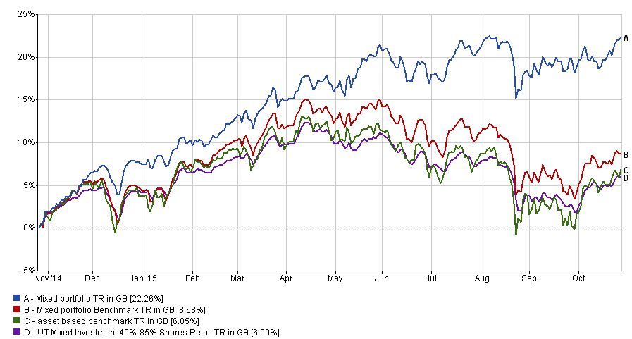
The other holdings were so small I rounded the above figures up. So using the same charting tool as previously I can benchmark my portfolio, as can you. To show you the difference between the different benchmarking methods I took the liberty of charting the performance over the last year of my example portfolio (blue line) versus the 'average benchmark' (red line) and the 'asset benchmark' (the green line). You can see that the 'average benchmark' actually overstates how well the portfolio should have done.
While the 'asset' portfolio is more accurate it is laborious to work out. However, here is a tip. After X-raying your own portfolio calculate your equity exposure. in my example it is 84%. Then choose whichever of the following sector averages closely matches the underlying equity exposure of your portfolio (remember to use the 80-20 Investor asset allocation tool work out your true equity exposure):
- Mixed Investment 0%-35% Shares
- Mixed Investment 20%-60% Shares
- Mixed Investment 40%-85% Shares
Therefore I chose the Mixed Investment 40%-85% Shares sector average as it represents a mixed portfolio with an equity exposure similar to mine. You will notice that I have plotted its performance on the same chart below (purple line) - click to enlarge. Look how closely it resembles the 'asset benchmark'!
So a quick and accurate way to benchmark your portfolio is pick one of the above sectors as a benchmark and then use the aforementioned charting tool to work out its performance. Then compare that to what your portfolio has achieved in reality. Alternatively rather than use the broad sector averages you can pick a fund such as one of the following as your benchmark based on your equity exposure:
- Vanguard - LifeStrategy 20% Equity
- Vanguard - LifeStrategy 40% Equity
- Vanguard - LifeStrategy 60% Equity
- Vanguard - LifeStrategy 80% Equity
- Vanguard - LifeStrategy 100% Equity
However there are limitations to picking just one fund (even if it is a globally diversified fund) as a benchmark. Even a fund house like Vanguard is just one company out there producing active and passive funds. Their asset mixes tend to be fairly rigid so when you change the asset mix on your portfolio you could end up comparing apples and pears. A slightly broader benchmark such as the sector average are not only readily available but also flexible should you tinker with your asset mix.

£200 Pension Cashback Offer
Make a qualifying deposit or transfer a pension to our partner Interactive Investor.
- Deposit or transfer a pension of at least £20k and you could earn £200 cashback
- Terms and Fees apply, Capital at risk
- New & Existing customers opening a SIPP
- Offer ends 31st July 2026
Before starting your transfer, check you won't lose any valuable benefits (such as guaranteed annuity rates or a lower protected pension age) and find out what exit fees you might have to pay
