

I was asked an interesting question recently regarding how to implement the all-weather portfolio, made famous by Ray Dailo and by the book 'Money - Master the Game' written by Tony Robbins.
The portfolio is supposed to perform well in any kind of market environment be it a bull or bear market. That doesn't mean it always makes a positive return. Just for reference, the portfolio is constructed as follows:
- 30% invested in domestic stocks
- 40% invested in long-term government bonds
- 15% invested in intermediate-term bonds
- 7.5% invested in commodities
- 7.5% invested in gold
Of course, it is an American concept so it was focused on buying US stocks and US Treasuries. The problem for UK investors is the additional currency risk they are exposed to when buying those assets denominated in US dollars. As I've written about extensively in my newsletters and research pieces, the pound/dollar exchange rate has been incredibly volatile over the last two years, but particularly in the last few months, having a huge impact on investor returns.
Four years ago, and with no knowledge of Ray Dailo's all-weather portfolio, I produced a research piece titled the Perfect ISA portfolio, which is worth reading. In the research I laid down some rules that a perfect ISA portfolio asset allocation had to meet:
- There had to be no constraint over which assets could be included or in what proportions they are held
- The portfolio must have made money in every tax year since the last market peak back in 2000 and not lost money
- It had to at least beat a FTSE 100 Index tracker over the entire period and
- The asset allocation had to remain constant throughout that time
Ambitious. To do this I analysed a mind-blowing number of possible asset allocations assuming you chose funds from one of the 27 unit trust sectors listed below
- Asia Pacific Excluding Japan
- China/Greater China
- Europe Excluding UK
- European Smaller Companies
- Flexible Investment
- Global Bonds
- Global Emerging Market Bond
- Global Emerging Markets
- Global Equity Income
- Global
- Japan
- Mixed Investment 0%-35% Shares
- Mixed Investment 20%-60% Shares
- Mixed Investment 40%-85% Shares
- Cash
- North America
- North American Smaller Companies
- Property
- Sterling Corporate Bond
- Sterling High Yield
- Sterling Strategic Bond
- Technology & Telecoms
- UK All Companies
- UK Equity Income
- UK Gilts
- UK Index - Linked Gilts
- UK Smaller Companies
Interestingly, despite the global possibilities the perfect allocation turned out to be
- 9% cash
- 71% UK Gilts
- 20% UK Equity Income
You can see that this has an uncanny resemblance to Ray Dailo's portfolio. He has 30% in domestic stocks and 55% in domestic government bonds with the rest in gold and commodities. Rather than gold and commodities my perfect portfolio invests in cash and has a slightly lower equity content in favour of more gilts. But the domestic focus is uncanny. My original Perfect Portfolio complied with all of the prerequisites including the performance demands and I have revisited it annually to see that it is still working.
At the heart of the Perfect Portfolio lies the idea of diversification and more importantly the correlation between different assets (sectors). It means identifying assets that behave differently which will provide a return when other parts of your portfolio fall in value. To make a portfolio that performs well in all market conditions it is going to have to be defensive and low risk by design. It is also going to be domestically focused. However most DIY investors are happy to take on more investment risk, in the hope of higher returns, but still want to limit the downside potential where possible.
For example, they may decide to have a large exposure to US equities but also want to manage risk and diversify the rest of their holdings. In other words, rather than building an all-weather portfolio they are building one to take advantage of a prevailing wind, without getting blown away. To do this you need to understand what we mean by correlation and how assets are correlated.
Correlation explained
Correlation is a statistical measure that shows whether two things follow each other or not.
You can work out whether two things are correlated by working out what is known as the correlation coefficient. It is complicated to work out but it is very easy to use. The correlation figure can range between -1 and 1. A figure of 1 would suggest that the two objects follow each other while a score of -1 suggests that as one rises the other falls and vice versa. A score of 0 means that the two assets are not correlated.
In theory, if you can work out the correlation coefficient between different asset types then it is easier to build a more diversified portfolio. The first problem is that correlation coefficients aren't published anywhere. The second problem is that correlations can change over time.
Take the October 2018 sell-off for example. When markets were tumbling headlines were proclaiming the end of the bond/equity model of portfolio construction. In fact bonds and equities had been rising and falling in tandem for some time. So initially when the stock market fell so did bonds, which is contra to the historical norm of them moving in opposite directions (i.e being negatively correlated). The problem is that QE and central bank monetary policy has caused assets to become more correlated over time (i.e that most boats all rise at once). It follows that when the market fell in October we saw bonds and equities fall. However as you will see shortly, as the market started to price in the unwinding of QE, envisaging a world where central banks wouldn't still be manipulating stock and bond markets, the old negative correlation between bonds and stocks started to return.
Sharp market moves such as we saw at the end of 2018 provide a great insight into what the market is most worried about but also how the market could unravel if we get another bout of nervousness. By using such periods in recent history we can hopefully build better-diversified portfolios for the current market backdrop.
Designing your diversified portfolio
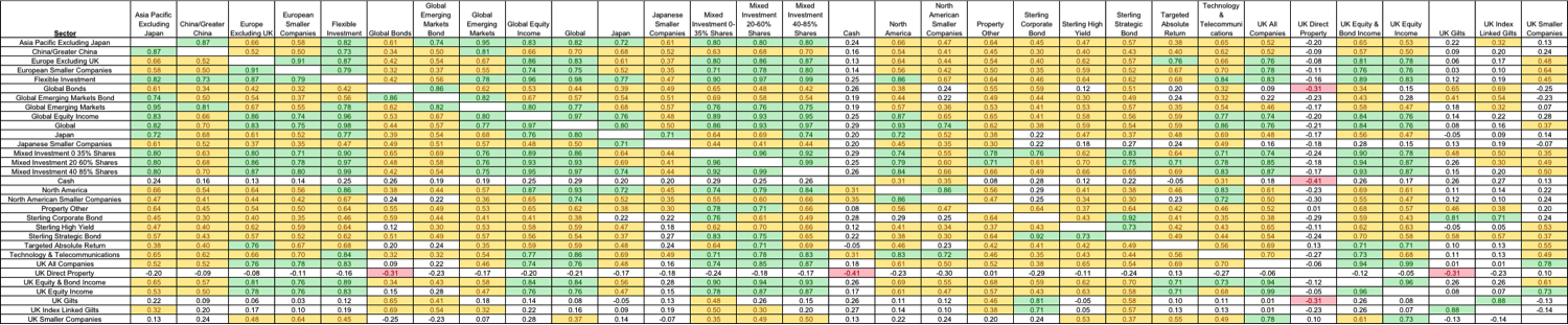
To help to build a more diversified portfolio you need to identify assets that behave differently to the ones you have. I have analysed the correlations between all the key unit trust sectors for two periods of time. Firstly, the 5 years up to the 1st October 2018 (just before stock markets sold off) when everything was going up. Secondly the last 6 months which encompasses the two months just before the stock market peak and the four months since.
I have produced two heatmaps. The heatmaps are colour coded so that where there is a strong positive correlation (over 0.7) between two sectors it is painted green. Where there is a weak positive correlation (between 0.3 and 0.7) it is coloured yellow. Where there is no significant correlation at all it is coloured white. Where there is a negative correlation (-0.3 or lower) it is coloured red.
Correlations during the 5 years prior to the market sell-off
Click the image below to download a pdf version of the table which you can zoom in on.

Correlations over the last 6 months
Click the image below to download a pdf version of the table which you can zoom in on.
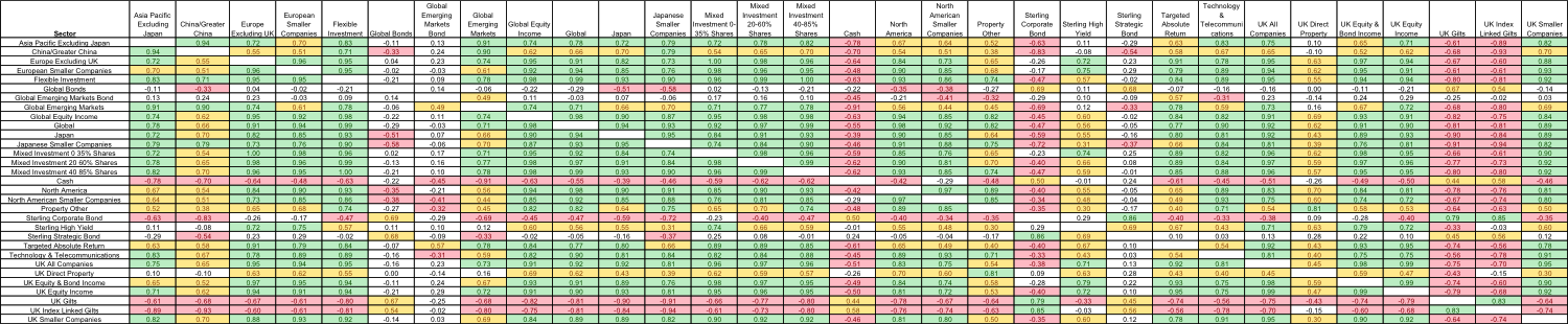

Some key takeaways
- In a market where buy-the-dip works, because global central banks have your back via QE and low interest rates, asset correlations rise. That's why the first chart has barely any red on it at all. In a world full of fear where buy-the-dip doesn't work because investors are panicking over global growth and central banks stepping away from supporting the market (the second chart) then correlations change because investors start focusing on the fundamentals once more. You can see there is a lot more red.
- Cash is uncorrelated to almost anything in a rising market but negatively correlated in a falling market or bear market scenario as it's one of the only assets to make a positive return. Cash becomes King.
- UK bonds, particularly government bonds (gilts) are among the best diversifiers to almost every asset class (which reinforces my findings based on performance data rather than correlation coefficients in my Perfect ISA research)
- In a falling market direct UK property funds have been great diversifiers as they've been uncorrelated to almost everything.
- The heatmaps also show how correlated certain sectors are. For example, global equity funds are often just quasi-US equity funds, which most investors don't realise. So holding both can over-expose you to the fortunes of the US stock market.
Picking funds
The above gives you an excellent idea of the asset mix you may want and which sectors to pick funds from. Of course, you can use the BFBS tables to help you select funds from specific sectors.
But as we know, not all funds within a sector behave the same way. This is particularly true of sectors such as the Targeted Absolute Return sector. So you can't just assume that because two sectors are generally uncorrelated that any two funds that you pick from them will also be. Of course, I can't work out the correlations of every fund out there (as there are over 2,000 of them). So below I explain how to ensure funds that you pick are not correlated along with tips on how to diversify your portfolio.
- Firstly don't pick more than 3-5 funds from any one sector (read my previous research piece 'Diversification dilemma: How many funds should you buy per sector?' for a full explanation).
- When you choose some funds, compare their performance charts during market rallies and sell-offs (much as I have done earlier). The journey is more important than the destination when it comes to identifying if funds move in tandem or otherwise.
- Don't forget that cash is a destination as well as a starting point. Having less money in the game will clearly reduce the volatility of your portfolio and the correlation to other assets can be negligible or negative (as shown above). Of course in a rising market holding too much cash will dampen your returns.
- Buy gold (as per Dailo's portfolio)? There is a conventional wisdom that you should buy gold in times of market turmoil. This is a topic I covered in depth in my 80-20 Investor research piece titled 'Should you ever invest in gold? If so how much?'. The key point to take from the research is that gold is not a fool-proof hedge against market falls. Neither is it a complete hedge against volatility because if you hold more than 25% of your portfolio in gold you actually increase a typical portfolio's volatility.
- Look at beta. The correlation analysis that I do is easy to understand yet very complex to carry out. That is because I have to calculate the statistical correlation between the funds that I am looking at. However there is a statistic, called Beta, which is published by fund managers which tells you how correlated their returns are to the index they have chosen to use as their benchmark (which can be the sector average). All funds within the sector don't have to use the same benchmark. Beta measures a fund’s sensitivity to the general market in which it operates. The market always has a beta of 1 by definition. So if a fund also has a beta of 1 that would mean that if the market rose by 5% then so should the fund. If the fund has a beta of -1 then as the market rises so the fund falls. A well-managed index fund will have a beta of exactly 1. Funds that outperform the market when it does well but do even worse when the market is going down will have a beta above 1. A fund's beta score will give you some insight into how the fund will perform versus its benchmark. Once you know the beta score then look at what the benchmark is that it's being compared to. Look at a number of other funds in the same sector to check that the benchmark your chosen fund is using is consistent with others within the sector. If it is then most funds within a sector will have a beta of between 0.8 to 1 but if your fund's beta is much different than this then you can't assume that it will behave in line with the sector averages used to construct the correlation charts above.
- How much you put in each fund depends on how much you want to diversify your portfolio. Once you have picked a number of funds look at their past returns and how hypothetical portfolios with varying exposure to each fund would have performed. Focus on both the upside and the downside, then decide on your preferred mix.

£200 Pension Cashback Offer
Make a qualifying deposit or transfer a pension to our partner Interactive Investor.
- Deposit or transfer a pension of at least £20k and you could earn £200 cashback
- Terms and Fees apply, Capital at risk
- New & Existing customers opening a SIPP
- Offer ends 31st July 2026
Before starting your transfer, check you won't lose any valuable benefits (such as guaranteed annuity rates or a lower protected pension age) and find out what exit fees you might have to pay
