

In recent weeks, I've written extensively about the stock market and the constructive signs to look out for that might indicate that the rebound is more than a 'dead cat bounce'. A key driver has been 80-20 Investor members' desire to know when 'the market bottom is in' after the fierce equity sell-off. Their plan presumably is to pile in while the market is 'cheap' and benefit from at least part of a rally back to new highs.
Equally, with the benefit of hindsight were there any warning flags investors should have heeded back in February in order to avoid the drop. In the days before the stock market crash began I published a note titled ‘Are we near the top'. It turned out to be very prophetic even if I had no certainty which way the market would go. But clearly, with the benefit of hindsight, the warning signs were there. Some members even cashed out of the market before the crash (sparked by the 80-20 Investor stop loss alerts, their own analysis, intuition or just old fashioned luck) and are now wondering when to get back in.
But is there a more reliable quantitative indicator that can be used to guide people?
It's time in the market that's important
As the saying goes it's time in the market not timing the market that counts. As such I'm loathed to enter discussions about how you can call the market bottoms and tops. However, I do understand from a risk management perspective why some DIY investors might find top/bottom indicators useful tools for gaining insight in a quantitative way. Not necessarily so that they can rely on them blindly to move in and out of the market but rather to help them manage risk or to challenge their own preconceived thoughts and biases.
It could be argued that such indicators might be useful in deterring someone from capitulating just as the market outlook seems at its bleakest. Or indeed make an investor consider whether they are taking too much risk for their own tolerances.
I see a lot of people who tie themselves up in knots trying to come up with systems and indicators that will perfectly time the market. If it were that easy it would have been done already and we'd all be rich following the process. In reality, you would likely fare better capturing a trend after it's developed in a sustainable way rather than trying to catch the market bottom and failing. Equally, if you jump out of the market after every tick down then you will end up worse off than if you just stayed in over the long term, as the churning of your portfolio increases costs and your time out of the market.
With 80-20 Investor the aim is to provide just enough data to help members make their own informed decisions without overwhelming them with too much data. Momentum lends itself well to this endeavour which is why it's at the core of our algorithm. On the plus side when markets rally you can benefit immensely, but of course it's not fool-proof and if markets tumble then you will follow the trend also. Our stop loss alerts are one way to try and limit the downside. If you read my own £50k portfolio updates I don't religiously follow them when running my own portfolio. That, of course, is a personal choice but it would be interesting to consider an indicator that might highlight periods when statistically they may offer a greater chance of protecting your capital rather than hampering your returns.
So in this article, I'm not showing you how to call the top and bottom of the market with any certainty but instead, I'm describing a simple, easy to apply, indicator that may help in showing you when risks of a severe pullback are rising or indeed when they are reducing.
Market top/bottoms
In recent weeks my newsletters have talked a lot about market breadth, the importance of the bond market and the VIX as indicators to keep an eye on when investing in equities during a sell-off. You could add numerous (if not hundreds) of other indicators to the list that are widely used or watched by traders. Some are complex or difficult to track without expensive data subscriptions. On their own they are useful but are much more insightful when viewed collectively. No one indicator is fool-proof and will give false signals from time to time.
While many of these are good for trying to gauge the market bottom they are not as useful for gauging the market tops as well. Is there a useful simple indicator that can be used by investors to gauge when to reduce/increase risk?
Perhaps the most frequently used indicator is the 10-month simple moving average. In simple terms, if on a monthly basis an index closes above its 10-month moving average line then it suggests that you should remain invested in the market. If however, it closes below the 10-month moving average line then it's a sign to reduce risk and or move into cash.
The reason the 10-month moving average is used is to iron out the daily and weekly price swings that are inherent in stock markets. This allows us to focus on the underlying market trend (much like we do with momentum). Often this strategy is charted using monthly candlesticks. I won't go into great detail about candlesticks and how they work from a technical analysis perspective but here is a simple explanation from Investopedia. The article talks about daily candlesticks, but the concept is exactly the same for monthly data as you just consider the price moves over a month rather than a day. The article also suggests that the green candles are always left empty but as the chart below shows they can be coloured in.
So if you look at the chart below you can see that in recent years ahead of the key market slumps the 10-month moving average line (the average price over the previous 10 months) was broken to the downside by a red monthly candlestick. When I say broken, I'm referring to the bottom of the red candle being below the moving average line. I've circled these occasions on the chart below. Had you switched out of the market into cash at that point you would have avoided some of the more severe market corrections, including the most recent sell-off.
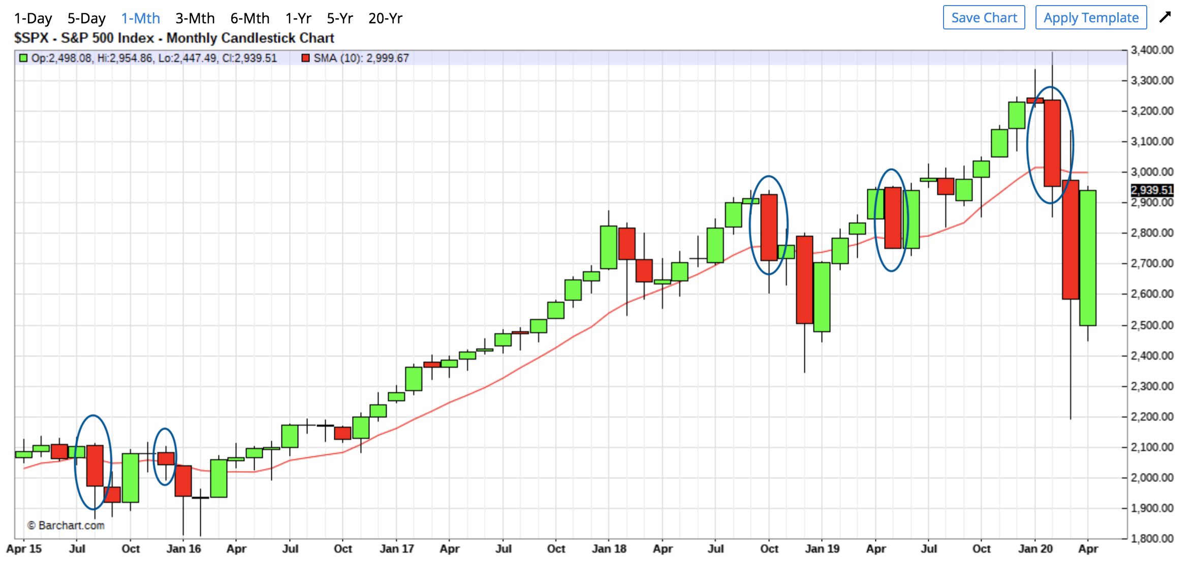
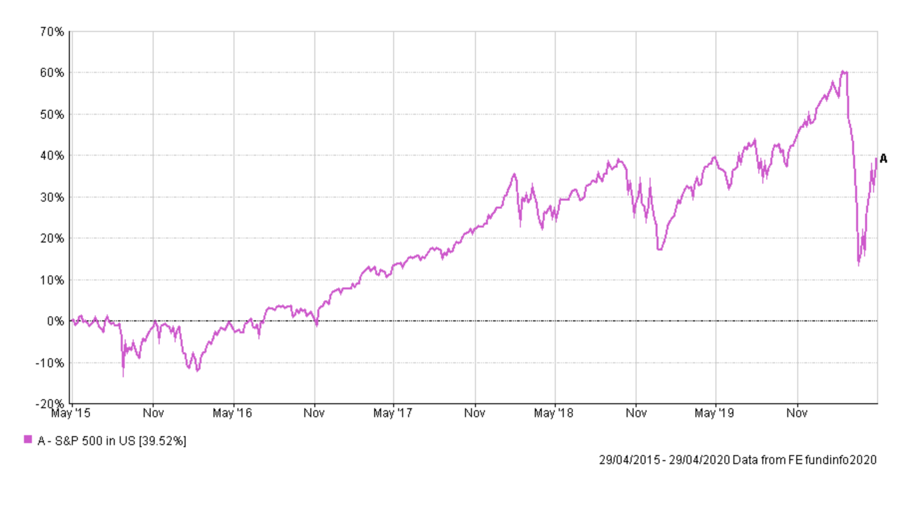
You can compare it to the S&P 500 chart below to see the size of the drawdowns you would have missed.
It follows that the 10-month moving average strategy would mean that you begin investing again once the monthly closing price is back above the 10-month moving average line. So in the chart above, when the top of the green candlestick is back above the moving average line. Research by Advisor Perspective charts all the entry and exit points using such a strategy going back as far as 1995, which is shown below. They just track the closing prices for the index, rather than using candlesticks to illustrate the market moves.
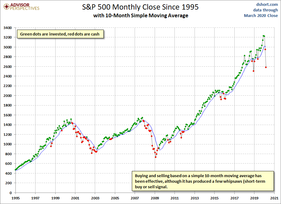
It highlights how effective the strategy can be but it isn't faultless, such as during the sell-off in the autumn of 2018. If you zoom in on the chart you can see that the strategy would have moved you out of equities at the end of October just before the market rallied slightly in November 2018. It then put you back in at the start of December 2018, before the market slumped. It would have then taken you out of the market at the end of December before putting you back in during February. Not ideal. However, looking at the historical performance the indicator is particularly good at helping you to avoid the largest drawdowns that occur in bear markets. It would have helped you avoid the worst of the bursting of the dotcom bubble, the financial crisis crash and the coronavirus sell-off. That alone would mean the strategy would have led to significant outperformance across each individual event and over most timeframes.
Interestingly ETF-replay.com allows you to backtest the strategy on 4 ETFs (one of which is the Dow Jones) over any timeframe you choose, starting as far back as January 2003. The evidence shows that across a severe sell-off the strategy clearly works. It also shows that the longer your timeframe the greater the chance that a simple buy and hold strategy will outperform ('time in the market' trumps 'timing the market'). However, had you used the strategy from January 2003 up until the market low of 23rd March 2020, then the 10 month moving average strategy would have marginally outperformed over the entire period, but with a max monthly drawdown of only -14% versus -41% for a buy and hold strategy.
Such an indicator clearly has its pros and cons, with simplicity being one of its pros. One of the cons being that you have to wait until a month-end in order to apply it. But then again that could be classed as a positive in that it stops knee-jerk reactions and allows you to follow the trends as they develop rather than being distracted by the daily price moves. We are not day traders, remember that. The indicator also syncs nicely with 80-20 investor BOTB which is only updated once a month and could prove a useful tool to use in tandem with the 80-20 Investor stop loss alerts as mentioned earlier. Perhaps investors might pay more attention to the stop loss alerts when the 10 months moving average indicator starts to signal danger. Conversely, perhaps they might pay less attention if the indicator is still not signalling the all-clear. Perhaps they might increase or decrease risk, rather than jump in and out of cash when using such a strategy.
As I say, nothing is perfect and it won't call the exact top or bottom of the market, but it might be able to highlight a shift from a longer-term bear market to a bull market and vice versa, helping investors to navigate.
If you want to check the current position of the 10-month moving average then simply click this link. Interestingly, April's closing price is going to finish below the moving average line, as it did in February and March. Remember, the closing price on red boxes (down months) is at the bottom, while the closing price on green boxes (months when the market rallied) is at the top.

£200 Pension Cashback Offer
Make a qualifying deposit or transfer a pension to our partner Interactive Investor.
- Deposit or transfer a pension of at least £20k and you could earn £200 cashback
- Terms and Fees apply, Capital at risk
- New & Existing customers opening a SIPP
- Offer ends 31st July 2026
Before starting your transfer, check you won't lose any valuable benefits (such as guaranteed annuity rates or a lower protected pension age) and find out what exit fees you might have to pay
