

In last week's newsletter I wrote to ask members if there were any particular areas of interest that they would like me to explore. Among the many responses (please keep them coming in) was the following question:
"I'm an extremely happy customer first off! 80-20 is just fantastic!
I write because I have approx 12K invested in gold and silver. I've had it for years and was lucky enough to invest when gold cost half what it does now. I've waited and waited for the $5000/oz gold that may happen but I'm increasingly disillusioned with gold. Particularly when I see the returns 80-20 is giving me.
I would need something like 80-20 to guide me as sitting on it is boring and I feel if I had traded more I might have done better. Maybe you know someone in the industry whose opinion you value. I hope this makes sense. I just would love your opinion.
Thanks from a very grateful customer."
Where is the price of gold headed
The first thing I’d say is that if you haven’t read my previous research piece ‘Should you ever invest in gold? If so how much?’ then do so. Many of you won’t have read it but it’s a timeless piece and just as relevant now as when it was published. In it I determine
- Why the world is obsessed with gold
- The price of gold throughout history
- Whether gold is a good hedge against volatile markets
- A lesson from recent history
- How much gold should you hold in your portfolio
- A better strategy altogether
Now I can’t obviously tell you whether to sell out of your gold and silver holdings but what I will do is apply some technical analysis to highlight the possible outcomes for the precious metals. At the foot of this article I recap what technical analysis is in case you've not come across it before.
Gold
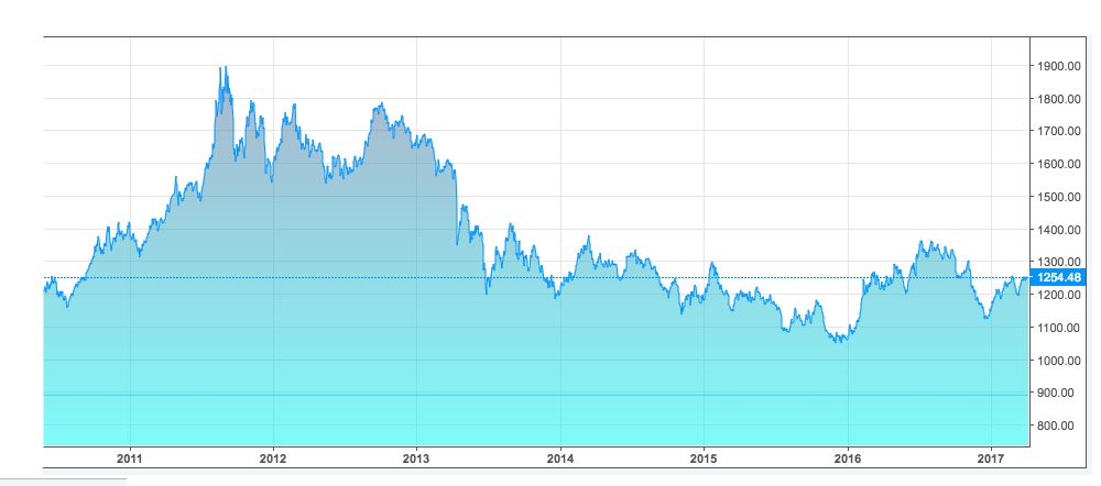
If we look at the long term picture for gold in the first chart below it shows that the peak gold price was $1,900 during the financial crisis when fear over the collapse of the banking sector gripped markets. Today the price of gold trades at $1,253. The point to note is that both are a long way away from $5,000.
The second chart below shows a technical analysis chart (click to enlarge) that I’ve produced highlighting some important lines of support and resistance.
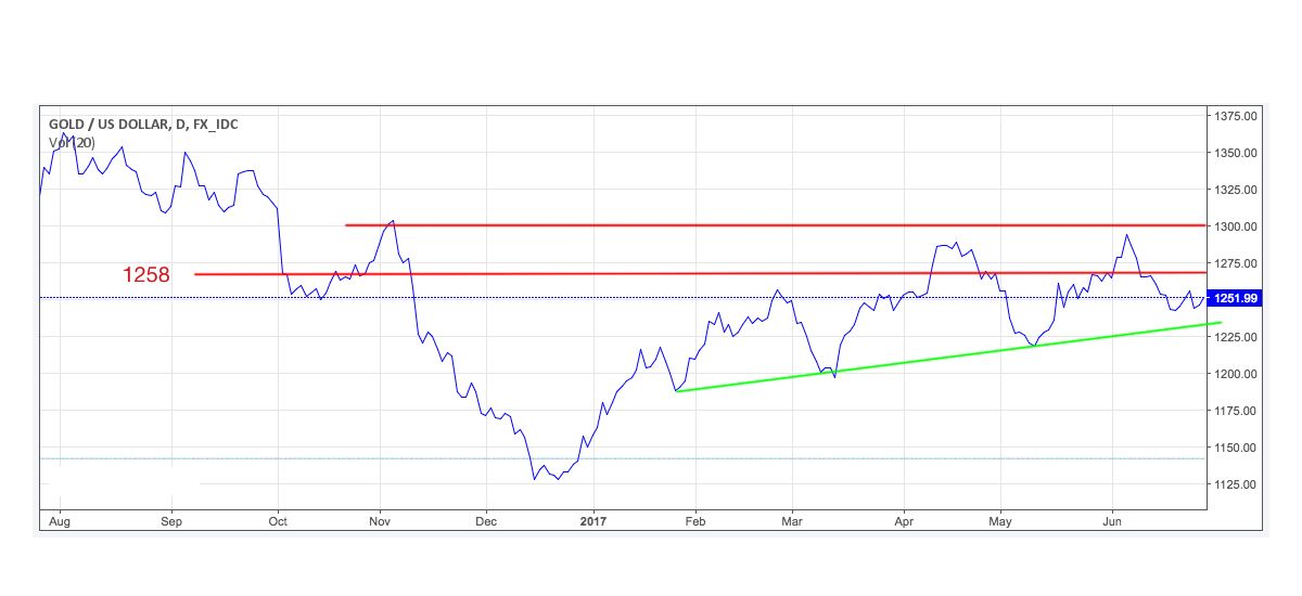
If the price of gold can continue to move higher then $1,300 becomes the target beyond which the gold bugs (that’s the nickname for those who love gold) will get excited as it sets up a potential drive higher to $1,350 and beyond.
Gold tends to move in the opposite direction to the dollar (partly because it’s priced in dollars). Also it doesn’t produce an income and has little physical use in industry. Therefore the catalyst most likely to drive the gold price higher is fear. That could be fear over geopolitical risks or even a banking crisis. In the absence of a fear catalyst then central bank policy will have a greater impact on the gold price. Any sign that interest rates will rise will be good for the dollar and more than likely negative for gold. As I wrote in the aforementioned article, holding gold in a market that is not in the grip of fear is painful.
Silver
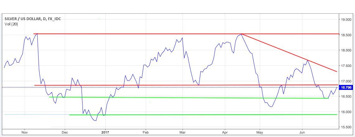
Silver has a number of support lines below its current price of $16.796. If you look to the downside the $16 level is supportive and if we can remain above that and finally break up through $17 then we could see a move to $18.5 and possibly beyond.
However it’s not going to be easy as that is 10% above where we are now. You will notice that I’ve drawn a sloped potential downward resistance line. Normally you need three touching points on a resistance or support line to confirm it, and as there are only two at present I’d just keep an eye for the price of silver hitting that line and falling. If it does that will confirm the downward trend. However if it breaks up through it then it’s more likely that we head to $17.50 and higher.
Gold/silver Index
As a closing thought the gold/silver index is worth looking at. The idea is to divide the current gold price by the price of silver. So currently the gold/silver index is 74.54. Historically a number of 70 suggests that gold is overvalued versus silver and that silver is likely to perform relatively better than gold in the near term.
What is technical analysis? - A recap
For those who don't already know or have forgotten here is an explanation of what technical analysis is:
Trying to predict the future of the stock market is akin to reading tea leaves. Personal predictions are almost always clouded by prejudices which reaffirm what we ‘want’ to happen rather than what is ‘most likely’ to happen.
That is why one objective method is to use technical analysis to try and judge likely outcomes. So what is technical analysis? One line of thinking is that stock markets are driven largely by human behaviour. At the simplest level you could argue that fear and greed drive a lot of investors’ actions. Let’s say that an opportunity presents itself and some investors jump on it and buy the shares in question. The demand then drives up the price. More investors jump on the bandwagon looking to profit. Then at some point the tide turns (fear sets in) as people think the price for the shares is looking expensive and so people start selling. More and more people start selling to take profits and the price falls. At some point the price falls until others think the shares look cheap and start buying, outnumbering the number of sellers. Again demand outstrips supply and the price goes back up.
This see-sawing explains the movement you see in stock market charts such as those below. The prices at which investors start bailing and selling the shares is called a point of resistance while the point at which they pile in is called a point of support.
As such there is a surprising level of predictability to human behaviour. In terms of the stock market that means when the price goes through historic points of resistance or support it can indicate a new unfolding market rally or collapse. Why does it do this? Part of it will be because traders trading in millions of pounds will use these points of resistance and support to trigger trades. Yet for a lot of investors they might not even be aware of these inflexion points. They simply are reacting to how other people in the market behave. Put it this way, when stock markets fall you feel tempted to sell, right? Also once it starts to rally, you are tempted to jump in? That’s why these patterns have a tendency to repeat.
Some investors and traders swear by it and trade solely using technical analysis. I don’t fall into that camp. I view technical analysis like a road map drawn by someone who has already completed a journey to somewhere near where you are planning to drive to. The road map won’t take you exactly to your intended destination, nor will it be entirely accurate. However, it will give you a better sense of what to expect. Then if you decide you like the look of a particular market you can use 80-20 Investor’s ‘Best funds by Sector‘ data to choose an actual fund to invest in.

£200 Pension Cashback Offer
Make a qualifying deposit or transfer a pension to our partner Interactive Investor.
- Deposit or transfer a pension of at least £20k and you could earn £200 cashback
- Terms and Fees apply, Capital at risk
- New & Existing customers opening a SIPP
- Offer ends 31st July 2026
Before starting your transfer, check you won't lose any valuable benefits (such as guaranteed annuity rates or a lower protected pension age) and find out what exit fees you might have to pay
