

As regular 80-20 Investor members know, periodically I like to look at what technical analysis suggests about where key markets might be headed next. Interestingly a number of members have been in touch to ask if I could produce a new technical analysis article as we head into 2022, given that markets have been incredibly volatile in recent days and weeks.
Technical analysis is not a crystal ball but instead gives you a range of possible outcomes and levels to watch. In volatile market conditions, technical analysis tends to prove particularly useful and traders and professional investors start to pay greater attention to it.
As ever, I like to recap what technical analysis is and how it works. I always advise investors not to try and time the market because they will never get it right. However, there's nothing wrong with trying to determine a range of possible future outcomes within investment markets. Think of it like a weather forecast. It’s not 100% accurate but it will give you a better idea of whether a storm is on the horizon. Technical analysis is the nearest thing we have to weather forecasting in the investment world.
What is technical analysis? - A recap
For those who don't already know or have forgotten here is an explanation of what technical analysis is:
Trying to predict the future of the stock market is akin to reading tea leaves. Personal predictions are almost always clouded by prejudices that reaffirm what we ‘want’ to happen rather than what is ‘most likely’ to happen.
That is why one objective method is to use technical analysis to try and judge likely outcomes. So what is technical analysis? One line of thinking is that stock markets are driven largely by human behaviour. At the simplest level you could argue that fear and greed drive a lot of investors’ actions. Let’s say that an opportunity presents itself and some investors jump on it and buy the shares in question. The demand then drives up the price. More investors jump on the bandwagon looking to profit. Then at some point the tide turns (fear sets in) as people think the price for the shares is looking expensive and so people start selling. More and more people start selling to take profits and the price falls. At some point the price falls until others think the shares look cheap and start buying, outnumbering the number of sellers. Again demand outstrips supply and the price goes back up.
This see-sawing explains the movement you see in stock market charts such as those below. The price at which investors start bailing and selling the shares is called a point of resistance while the point at which they pile in is called a point of support.
As such there is a surprising level of predictability to human behaviour. In terms of the stock market that means when the price goes through historic points of resistance or support it can indicate a new unfolding market rally or collapse. Why does it do this? Part of it will be because traders trading in millions of pounds will use these points of resistance and support to trigger trades. Yet for a lot of investors they might not even be aware of these inflexion points. They simply are reacting to how other people in the market behave. Put it this way, when stock markets fall you feel tempted to sell, right? Also once it starts to rally, you are tempted to jump in? That’s why these patterns have a tendency to repeat.
Some investors and traders swear by it and trade solely using technical analysis. I don’t fall into that camp. I view technical analysis like a road map drawn by someone who has already completed a journey to somewhere near where you are planning to drive to. The road map won’t take you exactly to your intended destination, nor will it be entirely accurate. However, it will give you a better sense of what to expect. Then if you decide you like the look of a particular market you can use 80-20 Investor’s ‘Best funds by Sector‘ data to choose an actual fund to invest in.
Latest technical analysis
There are different types of technical analysis, however, I find the most useful guide is to simply highlight the points of resistance and support, as I've done previously. So below I provide technical analysis, looking at areas of support (the green lines in the charts below) and resistance (the red lines), on the key global equity markets and the pound/dollar exchange rate. Occasionally I also look at moving average lines. Click on the charts to enlarge them.
US stock market
The chart below (click to enlarge) shows the movement of the S&P 500 over the last 12 months, on which I've drawn lines of support and resistance. You can see how the S&P 500 has remained in an uptrend, stretching back more than a year, and has now set 67 new all-time highs so far this year. The S&P 500 sits at 4591 at the time of writing.
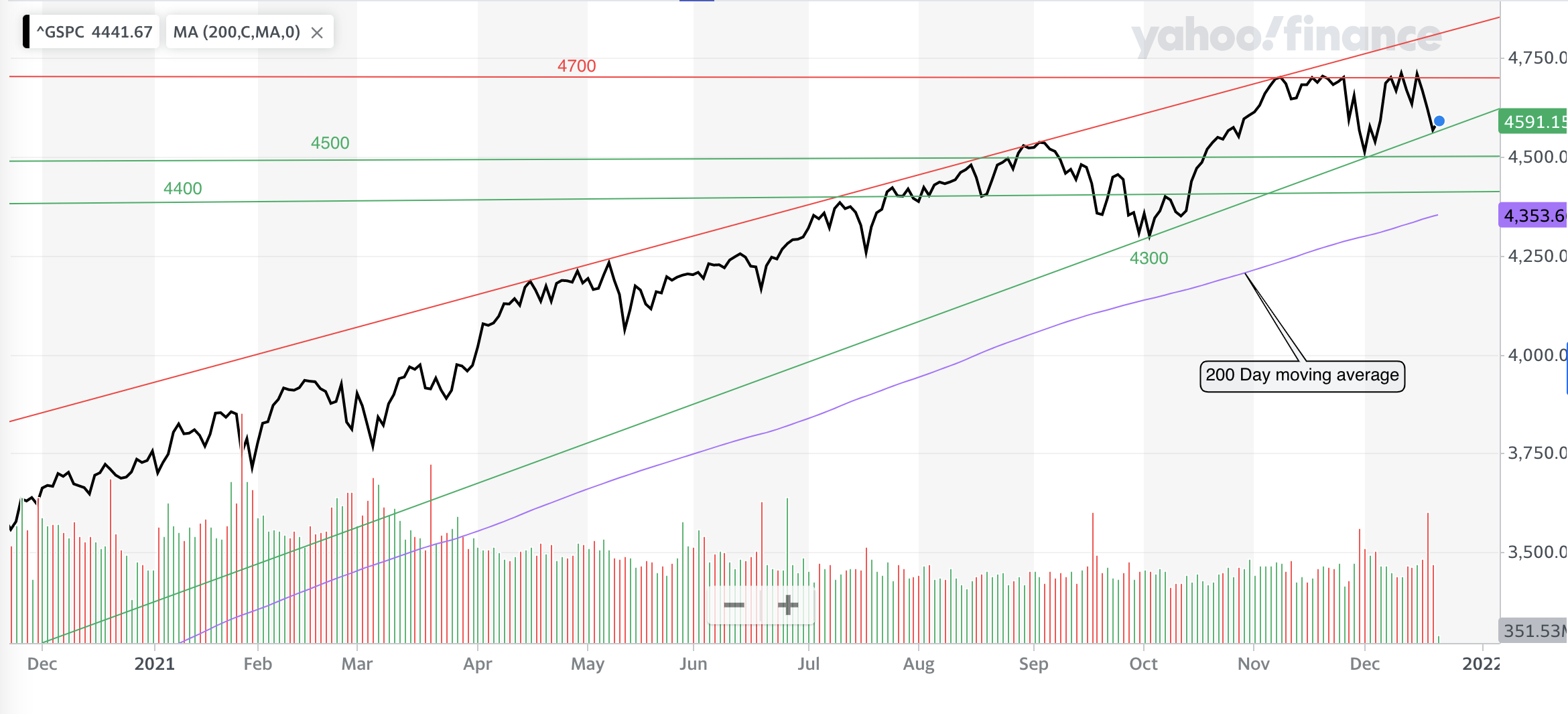
You can clearly see that despite the volatility we've experienced in December, that the S&P 500 rebounded off the line of support that forms the rising floor of the uptrend channel. To the upside, the index is now being sandwiched into a corner between the aforementioned rising support line and the red line of resistance at 4700. Such a squeeze usually results in a strong move higher or lower. We need the S&P 500 to finally break 4700 convincingly, and hold above that level if we are to see the next leg higher in US stocks.
However, if the S&P 500 falls sharply below 4500 things could get a bit ugly, as that marks the lows of November/December but also the highs of the autumn. If we break down through 4500 then an obvious line of support is 4400 which also proved supportive in August. Then 4300 marks the October low when a spike in natural gas prices shook investment markets. This would be almost 10% below the S&P 500's December all-time high and also below the 200 day moving average (which would be a bearish sign).
If the market broke down from there things could really unravel down towards 4000. Below that 3750 has been supportive in the past and would represent a 20% pullback (i.e a bear market).
UK stock market
As I write, the FTSE 100 sits just below 7300 at 7297. The chart below shows the FTSE 100 over the last year. If you read my last technical analysis article from September at that time the FTSE 100 was stuck between the then resistance line of 7150 and the support line at 7000. With the FTSE 100 becoming squeezed into a narrowing uptrend triangle a decisive move higher or lower was on the cards. As the chart below shows, in September we eventually got the latter but crucially the FTSE 100 then rebounded off the 6900 line, forming a higher low above the one we saw in mid- July, which was a positive move.
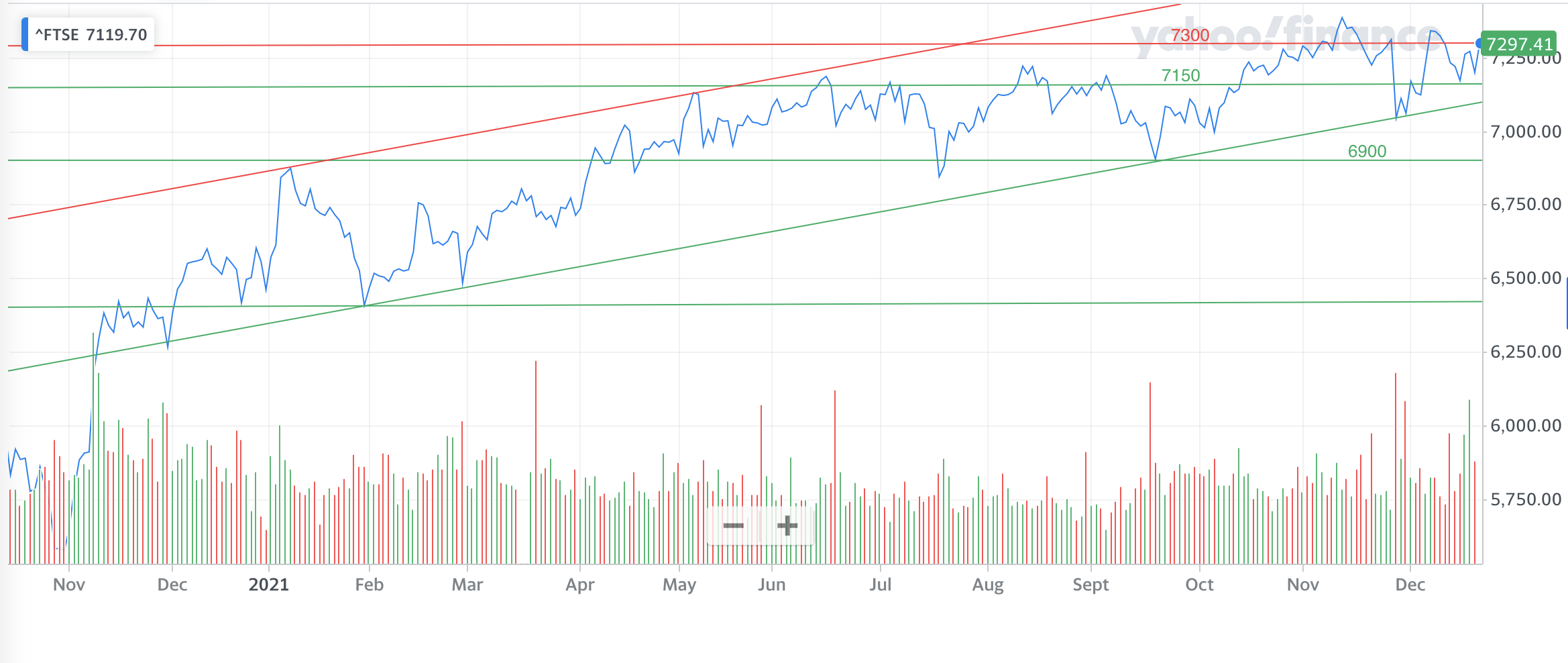
In fact, since September the FTSE 100 price moves have confirmed an uptrend is now in place sandwiched between the rising support line and rising line of resistance shown in the chart above. If we zoom in a little bit more you can see in the chart below that the FTSE 100 in fact bounced off the rising support line twice more in November.
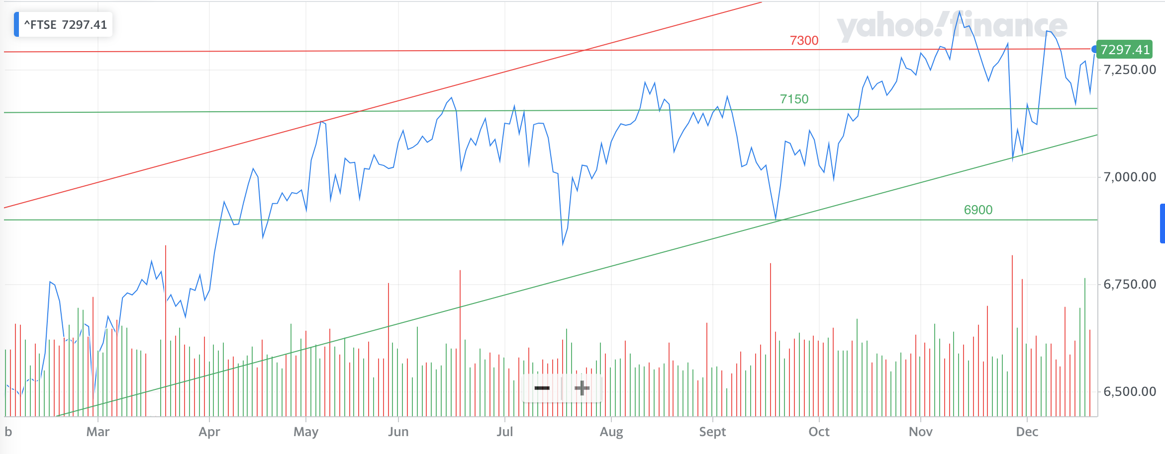
You can also see that the 7150 line remains key, in terms of support, and if we break below there and the bottom of the rising support channel (around 7090) we are likely to revisit 6900 once again. Below 6900 then the long term support lines of 6800 and 6400 seem like obvious candidates for support - see below.
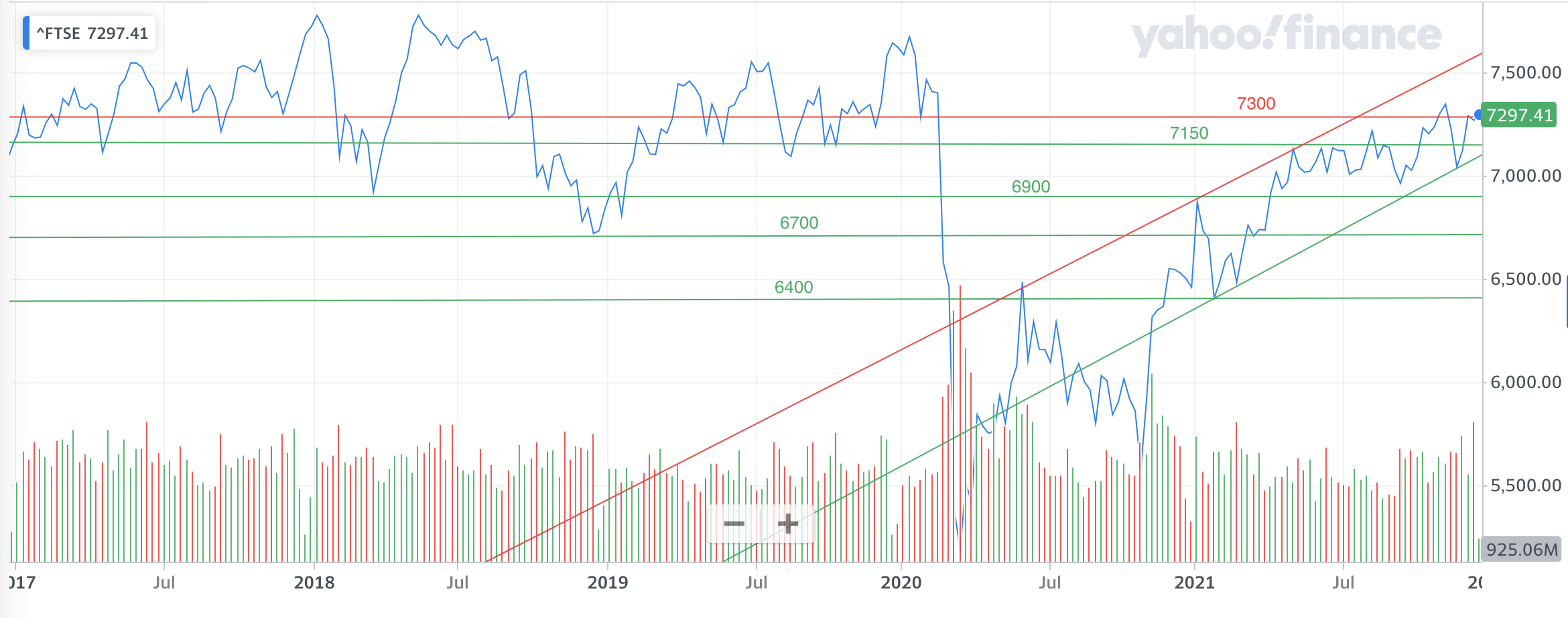
If the FTSE 100 can convincingly close higher than 7300 then that opens up the likelihood of a revisit of the pre-pandemic highs. But we are still a long way away from the all-time high of 7877 which we saw in 2018.
Japanese stock market
Last time I highlighted how the Nikkei 225 had been a slow-motion car crash with the index in an established downtrend that started in January this year. The Nikkei 225 was being squeezed between a downward sloping resistance line and the horizontal support line at 26800. As mentioned earlier, when being squeezed into a corner an index will usually move aggressively higher or lower and we got the former (see the chart below). Now the former downward resistance line is a weak line of support.
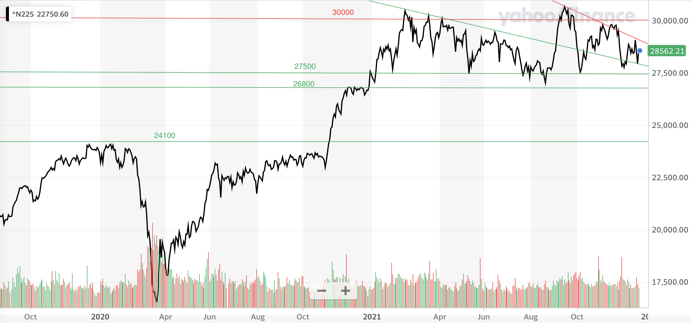
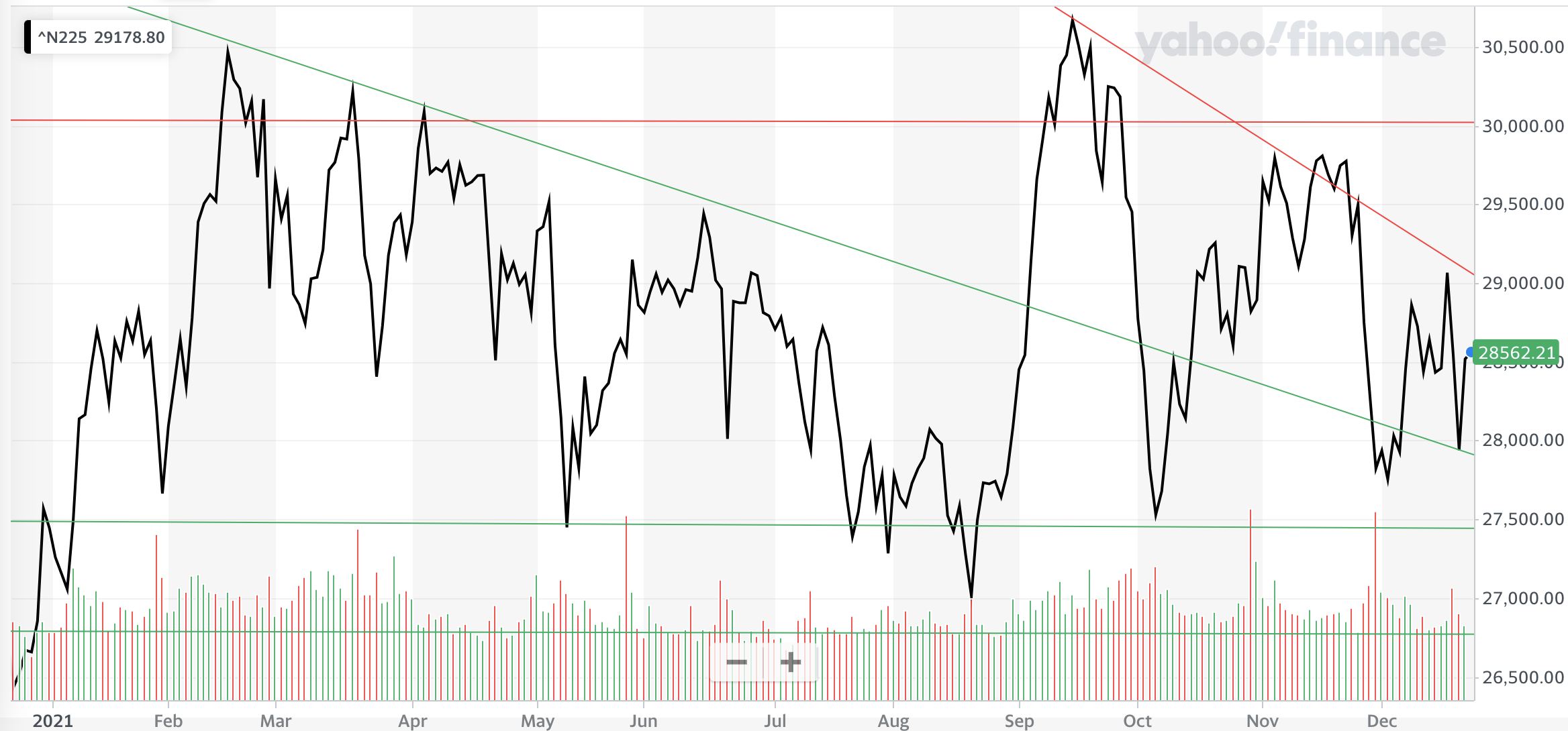
Once the downtrend was halted at 26800 the index rocketed back to its recent highs. Now the index has settled into a sideways trading pattern between 30000 and 26800/27000. This can be seen more clearly in the chart below which focuses on the last year alone. These upper and lower bounds are the trend lines to watch as we head into 2022.
If we break below 26800 then 24100 looks like a potential support line (see the first chart) and below there then it is 23000. The latter would represent an almost 20% fall from current levels, which would equate to a bear market.
Pound vs Dollar
The short term downtrend in the value of the pound versus the US dollar, highlighted in September, ultimately strengthened as shown in the chart below.
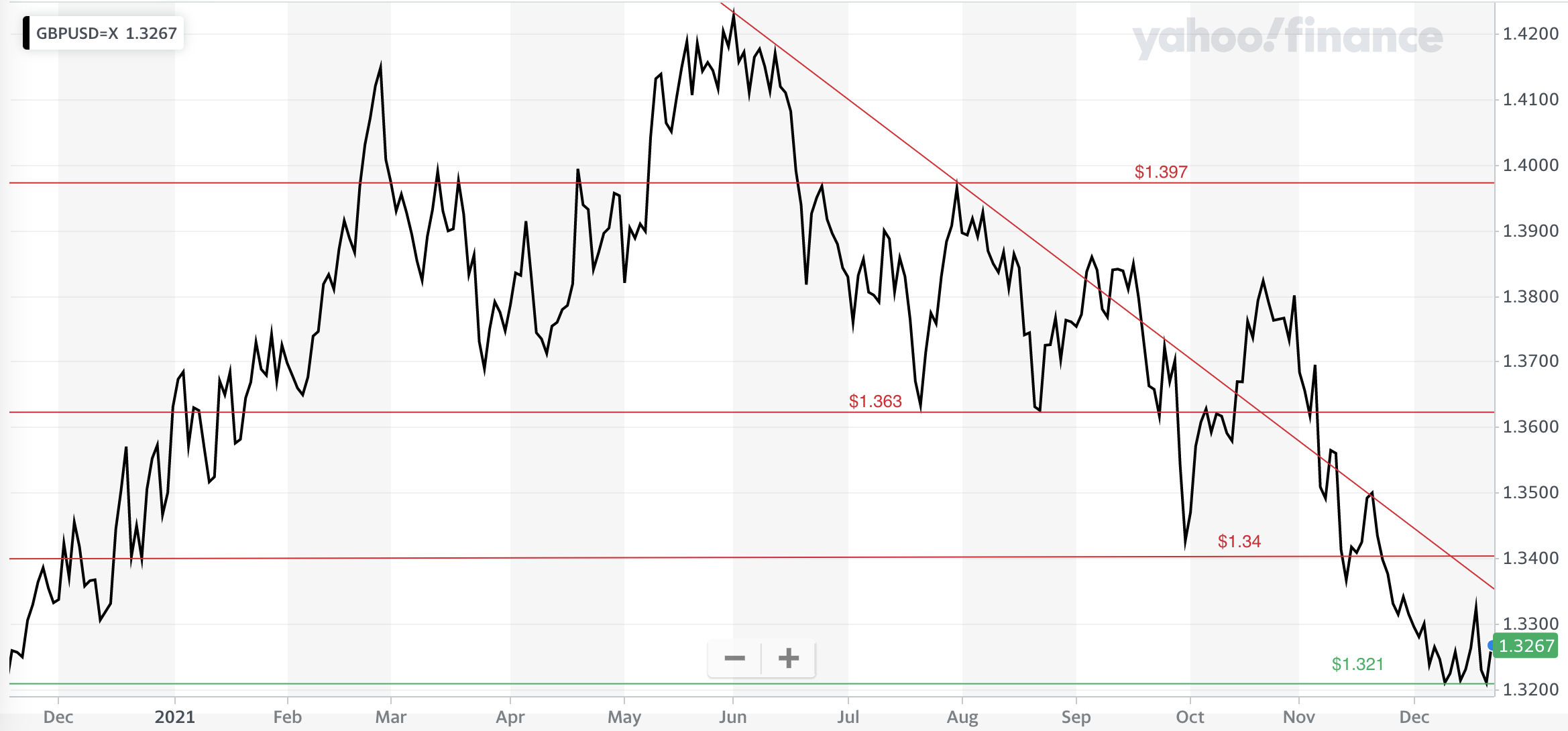
Last time I wrote that "if we break below [the double bottom at $1.363] then look towards $1.35, and below that things could accelerate towards $1.34 and ultimately $1.30 if the market doesn't find support". It turns out that is exactly what happened. Once the pair broke the $1.363 support line the pound crashed to $1.34. The pound then managed to form a rally and break out of the downtrend but ultimately the move failed. Not only did the pound break back down below $1.363 but it crashed down through $1.34 as well. All of these former support lines now act as resistance. The pound eventually found support at $1.321 and is now trending sideways in the band between $1.321 and $1.34.
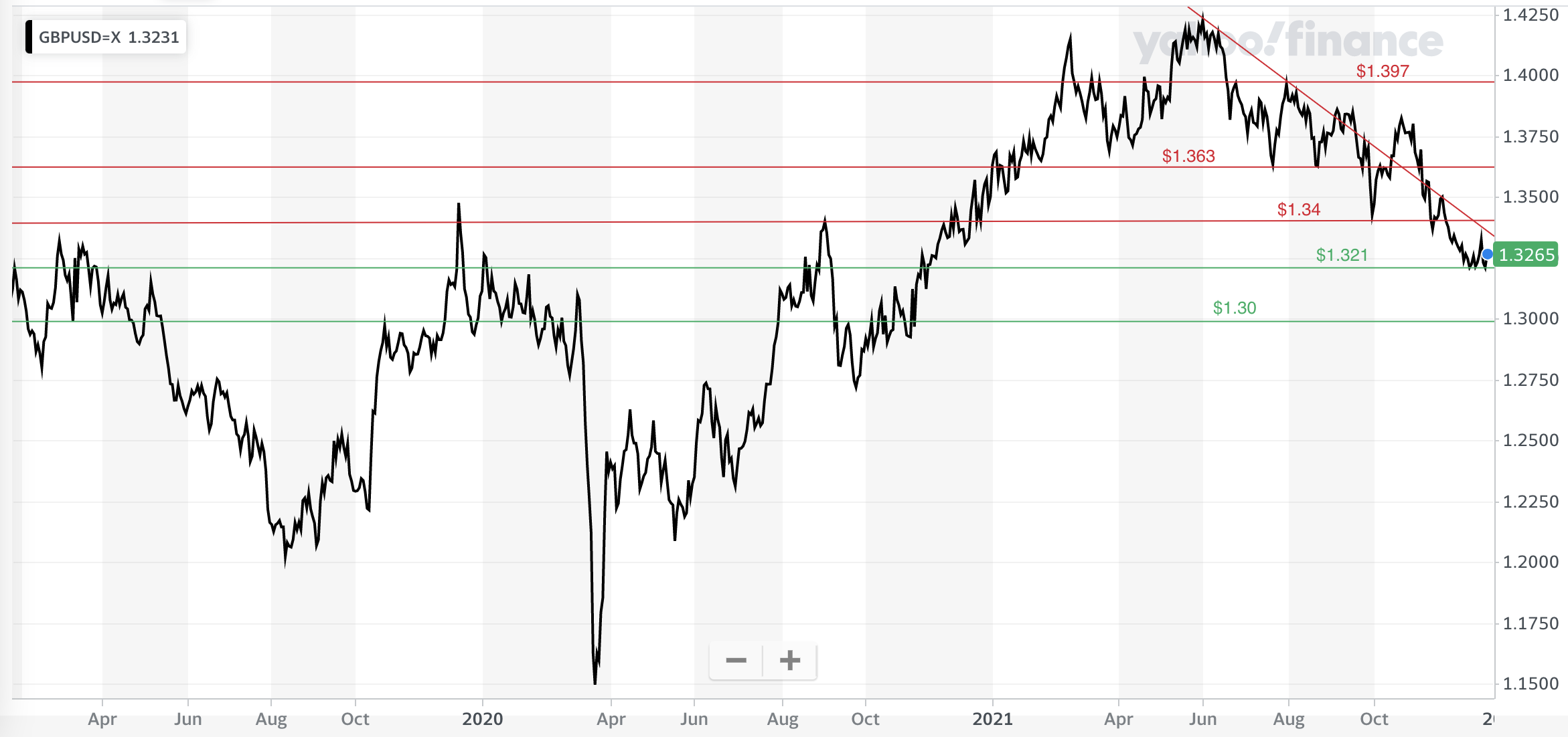
The pound has a lot of work to do to revisit its June highs of $1.42. In the short term, the $1.363 is an important level to recapture. On the downside, if we break below $1.32, then $1.30 is a strong line of support that would need to hold to avoid an even greater collapse in the pound, as shown in the chart below.

£200 Pension Cashback Offer
Make a qualifying deposit or transfer a pension to our partner Interactive Investor.
- Deposit or transfer a pension of at least £20k and you could earn £200 cashback
- Terms and Fees apply, Capital at risk
- New & Existing customers opening a SIPP
- Offer ends 31st July 2026
Before starting your transfer, check you won't lose any valuable benefits (such as guaranteed annuity rates or a lower protected pension age) and find out what exit fees you might have to pay
