

As regular 80-20 Investor members know, periodically I like to look at what technical analysis suggests about where key markets might be headed next. The last time I did this was back in October 2019, well before the coronavirus induced market sell-off. So I think now is a good opportunity to look at what technical analysis is telling us about the current market environment.
Technical analysis is not a crystal ball but instead gives you a range of possible outcomes and levels to watch. In volatile market conditions, such as those we are experiencing now, technical analysis tends to prove particularly useful and traders and professional investors start to pay greater attention to it.
As ever, I like to recap what technical analysis is and how it works. I always advise investors not to try and time the market because they will never get it right. However, there's nothing wrong with trying to determine a range of possible future outcomes within investment markets. Think of it like a weather forecast. It’s not 100% accurate but it will give you a better idea of whether a storm is on the horizon. Technical analysis is the nearest thing we have to weather forecasting in the investment world.
What is technical analysis? - A recap
For those who don't already know or have forgotten here is an explanation of what technical analysis is:
Trying to predict the future of the stock market is akin to reading tea leaves. Personal predictions are almost always clouded by prejudices which reaffirm what we ‘want’ to happen rather than what is ‘most likely’ to happen.
That is why one objective method is to use technical analysis to try and judge likely outcomes. So what is technical analysis? One line of thinking is that stock markets are driven largely by human behaviour. At the simplest level you could argue that fear and greed drive a lot of investors’ actions. Let’s say that an opportunity presents itself and some investors jump on it and buy the shares in question. The demand then drives up the price. More investors jump on the bandwagon looking to profit. Then at some point the tide turns (fear sets in) as people think the price for the shares is looking expensive and so people start selling. More and more people start selling to take profits and the price falls. At some point the price falls until others think the shares look cheap and start buying, outnumbering the number of sellers. Again demand outstrips supply and the price goes back up.
This see-sawing explains the movement you see in stock market charts such as those below. The prices at which investors start bailing and selling the shares is called a point of resistance while the point at which they pile in is called a point of support.
As such there is a surprising level of predictability to human behaviour. In terms of the stock market that means when the price goes through historic points of resistance or support it can indicate a new unfolding market rally or collapse. Why does it do this? Part of it will be because traders trading in millions of pounds will use these points of resistance and support to trigger trades. Yet for a lot of investors they might not even be aware of these inflexion points. They simply are reacting to how other people in the market behave. Put it this way, when stock markets fall you feel tempted to sell, right? Also once it starts to rally, you are tempted to jump in? That’s why these patterns have a tendency to repeat.
Some investors and traders swear by it and trade solely using technical analysis. I don’t fall into that camp. I view technical analysis like a road map drawn by someone who has already completed a journey to somewhere near where you are planning to drive to. The road map won’t take you exactly to your intended destination, nor will it be entirely accurate. However, it will give you a better sense of what to expect. Then if you decide you like the look of a particular market you can use 80-20 Investor’s ‘Best funds by Sector‘ data to choose an actual fund to invest in.
Latest technical analysis
There are different types of technical analysis, however, I find the most useful guide is to simply highlight the points of resistance and support, as I've done previously. So below I provide technical analysis, looking at areas of support (the green lines in the charts below) and resistance (the red lines), on the key global equity markets and the pound/dollar exchange rate. Occasionally I also look at moving average lines. Click on the charts to enlarge them.
US stock market
If we first of all focus on the short term movement of the S&P 500, the chart below shows just how aggressive the COVID-19 sell-off was. Its speed has almost been matched by the rebound from 23rd March, before it started to run out of steam.
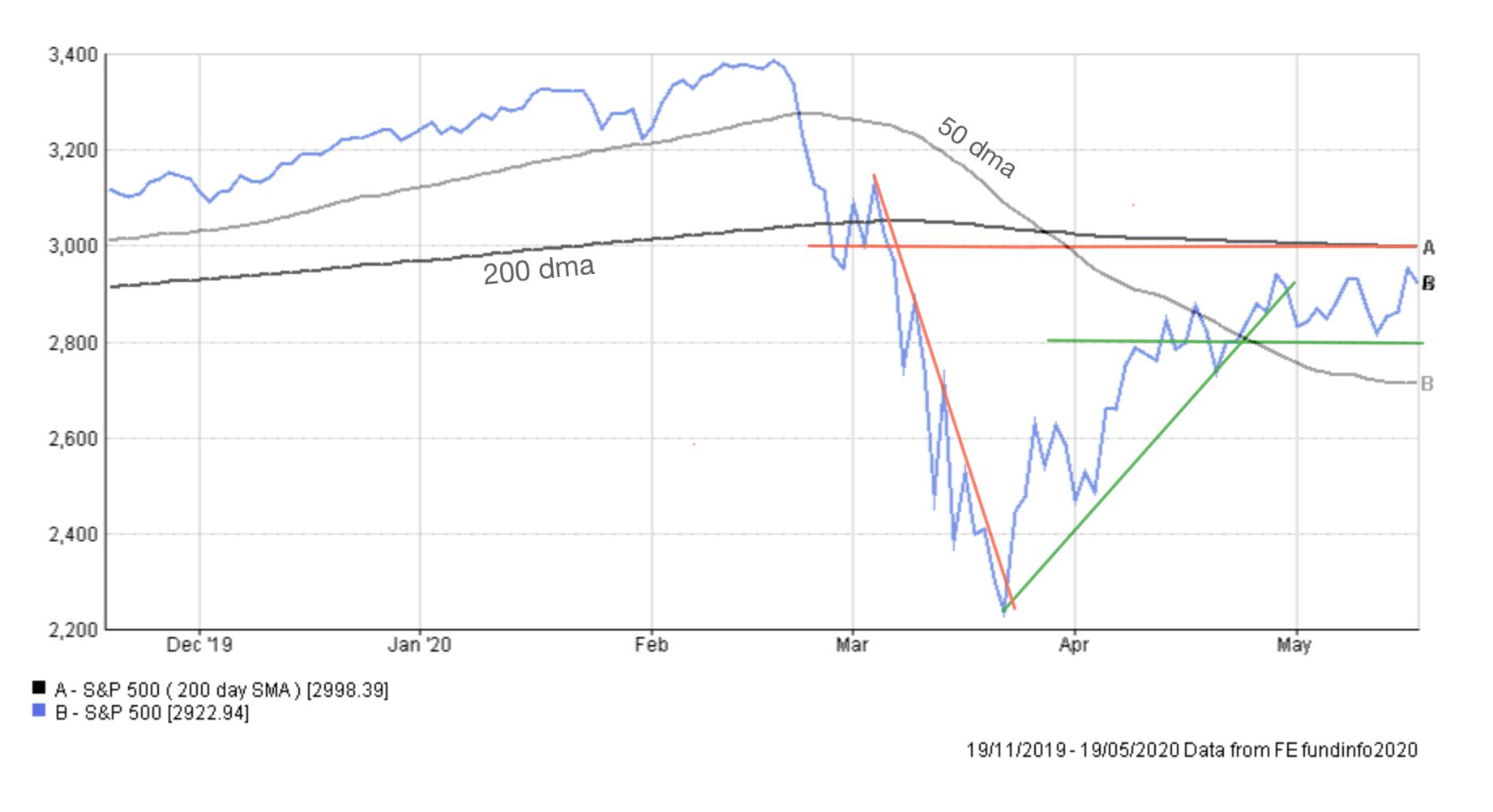
Usually, I don't focus too much on the 50 and 200 day moving averages in my technical analysis pieces but I have included them as they are clearly having a significant influence on the S&P 500 at the moment.
Following the rebound in March the uptrend ran out of steam towards the end of May. Since that time the market has been consolidating between 3000 and 2800 (the horizontal green and red lines). In fact, the range has been a little tighter than that, typically between 2950 and 2840. These levels are also long term support and resistance lines as shown in the chart below. Their significance is more than just a coincidence.
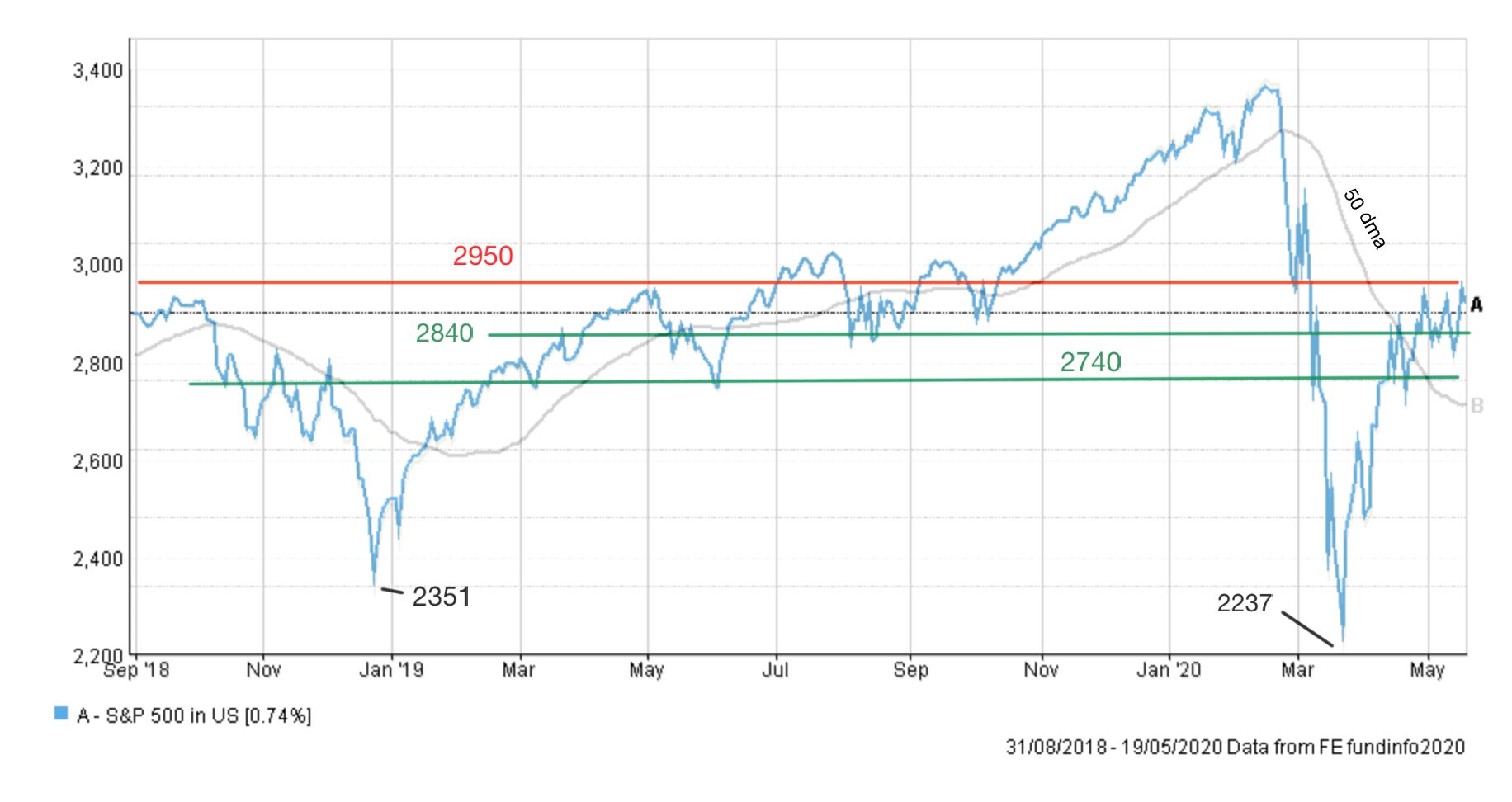
But looking back at the short term chart, you can see that the market is also trading between its 50 dma (day moving average) and 200 dma. The 200 dma also sits at the psychologically important level of 3000 which happens to also be the top of the current sideways range that the S&P 500 finds itself stuck in. In short, when we get a decisive move out of the 2800-3000 range we will then know that either the worst is behind us (and we push on to new highs) or there is more to come as the market unravels further into a deeper bear market. For that reason, the importance of the 3000 level, just above where the market is now (2922) can't be underestimated.
The longer-term chart shows there is plenty of support down towards 2740, beyond which the market would likely unravel. If we were to continue to move lower then the lows of March 2020 (2237) and December 2018 (2351) come back into play. Of course, the market could continue to consolidate sideways for some time but at some point a breakout, up or down, will occur.
UK stock market
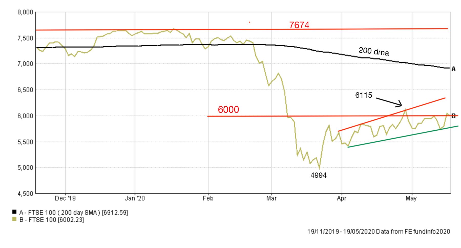
The FTSE 100 has not enjoyed the same kind of rebound that the US stock market has. In fact the same is true of most global equity markets and the US stock market is the outlier. The chart below shows the importance of the 6000 level for the FTSE 100. During the current rebound that started at the end of March the index has tried and failed a number of times to break above 6000. Not only is it a level of resistance but it is also a psychologically important round number. As I type this the index is once again trying to break above the 6000 level and if it manages it then 6115, the April high, becomes significant. There is a case for suggesting that the FTSE 100 is in an upward channel which bodes well for those bullish on the market. However, unlike the S&P 500 the FTSE 100 is well below its February highs and 200 dma. The latter is a particularly bearish sign.
On the downside 5740-5750 seems the first serious support level. However, if markets were to seriously roll over then 4994 (let's call it 5000) seems to be the floor. It is also a support level that dates back almost 10 years, when it was last tested.
Japanese stock market
If you look at the Japanese stock market over the short term it resembles the FTSE 100 much more than it does the S&P 500.
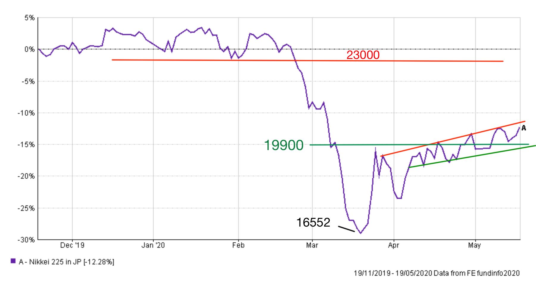
At the time of writing the Nikkei 225 sits around 20595 just above a support zone between 19900 and 20000. Much like the FTSE 100 the Nikkei is in a rising trend but unlike the FTSE 100 it hasn't flatlined. As such the current short term uptrend is certainly constructive but there is a long way to go before we reach 23000 (a significant resistance line) and the recent high of 24083. The longer-term chart below shows this more clearly.
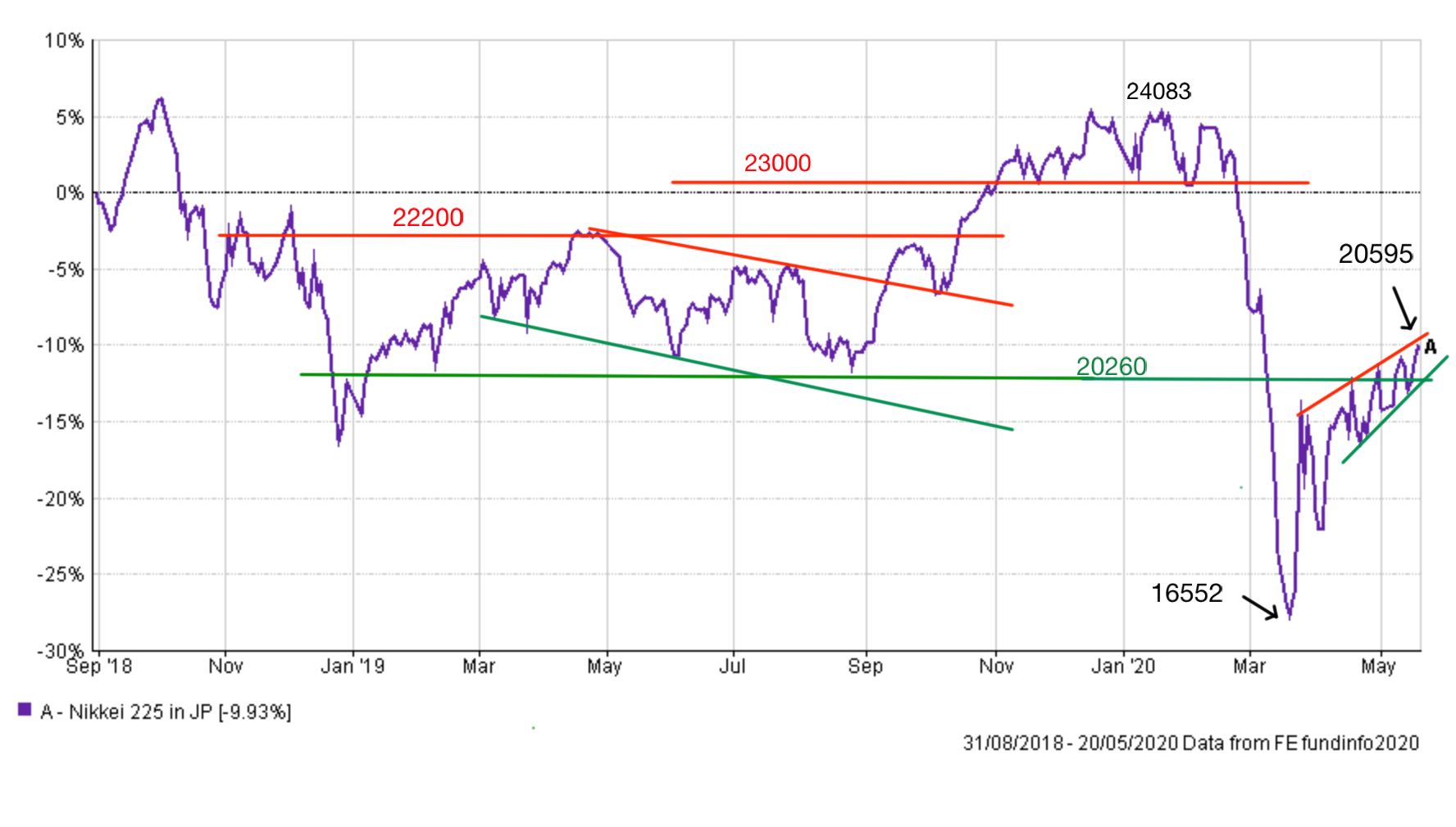
The longer-term chart also shows that Japanese equities were range-bound between 22000 and 20250 for almost a year, between October 2018 and October 2019. At one point an argument could have been made that the Nikkei had entered a downtrend last summer, but it ultimately broke free. Once the market moved above the 22000 resistance line it quickly climbed towards 23000. But 22000 could prove a tough resistance line to break this time around. There is a lot of work still to do.
On the downside keep an eye on the 20260 support level and beyond that watch December 2018's low of 19155 and then the recent low of 16552.
Pound vs Dollar
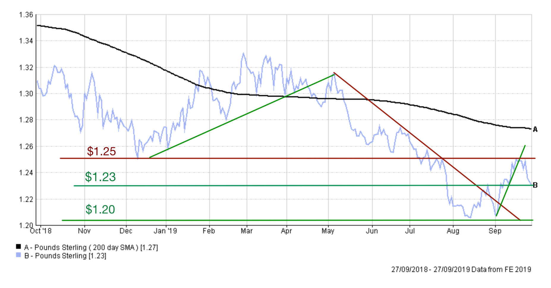
The last time I considered the outlook for the pound the chart looked like this...
Funnily enough, while the pound is once again trading at just above $1.22 it has been on a whirlwind trip over the last six months. The chart below shows the moves in the pound/dollar exchange rate over the last year.
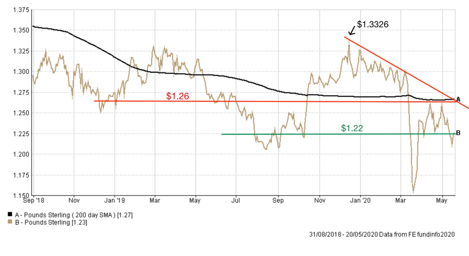
You can see how a Brexit deal in the autumn of 2019 followed by a landslide Conservative election victory catapulted the pound up to $1.3326. The rally certainly caught markets off guard and investors rushed to gain exposure to any future strength in the pound. However, as can be seen by the sloping red resistance line the pound quickly began to slump against the dollar. The reason for that was two-fold, uncertainty over the final Brexit agreement but also the strengthening of the US dollar against almost every global currency in the face of growing economic uncertainty. When COVID-19 hit in February this trend accelerated as global growth was decimated by lockdowns. Not only that, but the perceived failure of the UK government's handling of the pandemic also hit the pound. The pound tumbled towards $1.15, as shown in the chart above, a level we didn't even visit during the worst of the post-referendum no-deal hysteria. Until the pound manages to break above the resistance line of $1.26 it will remain under pressure. Crucially if we break below $1.22, which it is now within a whisker of doing, don't be surprised if the pound tumbles rapidly towards $1.20, a psychologically important level. If that doesn't hold then it opens up the door to a revisit of $1.15.

£200 Pension Cashback Offer
Make a qualifying deposit or transfer a pension to our partner Interactive Investor.
- Deposit or transfer a pension of at least £20k and you could earn £200 cashback
- Terms and Fees apply, Capital at risk
- New & Existing customers opening a SIPP
- Offer ends 31st July 2026
Before starting your transfer, check you won't lose any valuable benefits (such as guaranteed annuity rates or a lower protected pension age) and find out what exit fees you might have to pay
