

As regular 80-20 Investor members know, periodically I like to look at what technical analysis suggests about where key markets might be headed next. It's been 7 months since I last wrote a technical analysis piece. Therefore it's an opportune time to take a look at how key markets have fared so far in 2023 and where they may head next.
Remember, technical analysis is not a crystal ball but instead gives you a range of possible outcomes and levels to watch. In volatile market conditions, technical analysis tends to prove particularly useful and traders and professional investors start to pay greater attention to it.
As ever, I like to recap what technical analysis is and how it works. I always advise investors not to try and time the market because they will never get it right. However, there's nothing wrong with trying to determine a range of possible future outcomes within investment markets. Think of it like a weather forecast. It’s not 100% accurate but it will give you a better idea of whether a storm is on the horizon. Technical analysis is the nearest thing we have to weather forecasting in the investment world.
What is technical analysis? - A recap
For those who don't already know or have forgotten here is an explanation of what technical analysis is:
Trying to predict the future of the stock market is akin to reading tea leaves. Personal predictions are almost always clouded by prejudices that reaffirm what we ‘want’ to happen rather than what is ‘most likely’ to happen.
That is why one objective method is to use technical analysis to try and judge likely outcomes. So what is technical analysis? One line of thinking is that stock markets are driven largely by human behaviour. At the simplest level you could argue that fear and greed drive a lot of investors’ actions. Let’s say that an opportunity presents itself and some investors jump on it and buy the shares in question. The demand then drives up the price. More investors jump on the bandwagon looking to profit. Then at some point the tide turns (fear sets in) as people think the price for the shares is looking expensive and so people start selling. More and more people start selling to take profits and the price falls. At some point the price falls until others think the shares look cheap and start buying, outnumbering the number of sellers. Again demand outstrips supply and the price goes back up.
This see-sawing explains the movement you see in stock market charts such as those below. The price at which investors start bailing and selling the shares is called a point of resistance while the point at which they pile in is called a point of support.
As such there is a surprising level of predictability to human behaviour. In terms of the stock market that means when the price goes through historic points of resistance or support it can indicate a new unfolding market rally or collapse. Why does it do this? Part of it will be because traders trading in millions of pounds will use these points of resistance and support to trigger trades. Yet for a lot of investors they might not even be aware of these inflexion points. They simply are reacting to how other people in the market behave. Put it this way, when stock markets fall you feel tempted to sell, right? Also once it starts to rally, you are tempted to jump in? That’s why these patterns have a tendency to repeat.
Some investors and traders swear by it and trade solely using technical analysis. I don’t fall into that camp. I view technical analysis like a road map drawn by someone who has already completed a journey to somewhere near where you are planning to drive to. The road map won’t take you exactly to your intended destination, nor will it be entirely accurate. However, it will give you a better sense of what to expect. Then if you decide you like the look of a particular market you can use 80-20 Investor’s ‘Best funds by Sector‘ data to choose an actual fund to invest in.
Latest technical analysis
There are different types of technical analysis, however, I find the most useful guide is to simply highlight the points of resistance and support, as I've done previously. So below I provide technical analysis, looking at areas of support (the green lines in the charts below) and resistance (the red lines), on the key global equity markets and the pound/dollar exchange rate. Click on the charts to enlarge them.
US stock market
It is fascinating to look back at the technical analysis article that I wrote in November 2022. The key points at the time were:
- that after failing to break the significant resistance level at 4300 the S&P 500 sank to a new 2022-low during the autumn
- by November the S&P 500 was sitting at 3759 and remained firmly in the downtrend that started at the beginning of 2022
- the index needed to climb above 4100-4150 to break out of this trend which also happened to be where the 200-day moving average sat at the time
As my latest technical analysis chart below shows, after a number of failed attempts the S&P 500 did eventually break out of its downtrend, back above its 200 day moving average (which is not shown but currently sits at 3967) and also above the 4100 level in early February 2023. But this was short-lived and the index tumbled back below 4100 after stronger than expected US economic data and renewed concerns over high inflation saw the market price in further interest rate hikes from the US Federal Reserve.
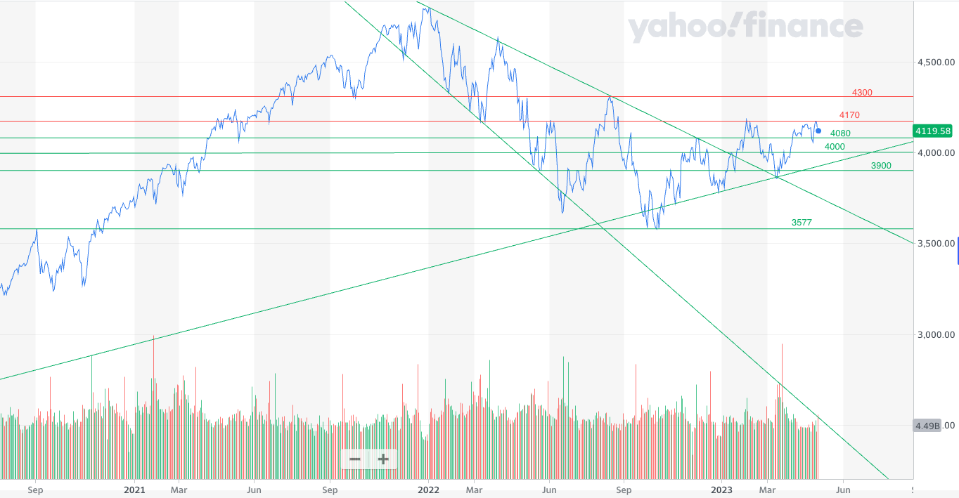
The banking crisis in March saw the index rollover again before it bounced off the top of the 2022 downtrend channel (at 3861) and started a new aggressive surge higher. Interestingly two of the sloping support lines for the index converge around 3861. The index has since faltered again and in the last month has become stuck between 4100 and 4170. It means that the S&P 500 has huffed and puffed a lot since my last technical analysis article but not really gone anywhere.
As such most of the key technical analysis support and resistance lines mentioned last time remain in play. In the short-term 4170-4200 is a resistance zone which the S&P 500 needs to push up through. If it does then it would likely go on to test the 4300 resistance line which has proven difficult on a number of occasions over the last 12 months. Since mid-March 2023 the buy-the-dip mentality has fuelled the recent rally in the S&P 500, but should this prove short-lived then a revisit to 4000 is on the cards. A significant break below 3900 would be problematic for the index, especially when you add in the fact that the index would also be well below the 200 day moving average of 3967. A move below could potentially signal a new downtrend especially if we break below the March low of 3861.
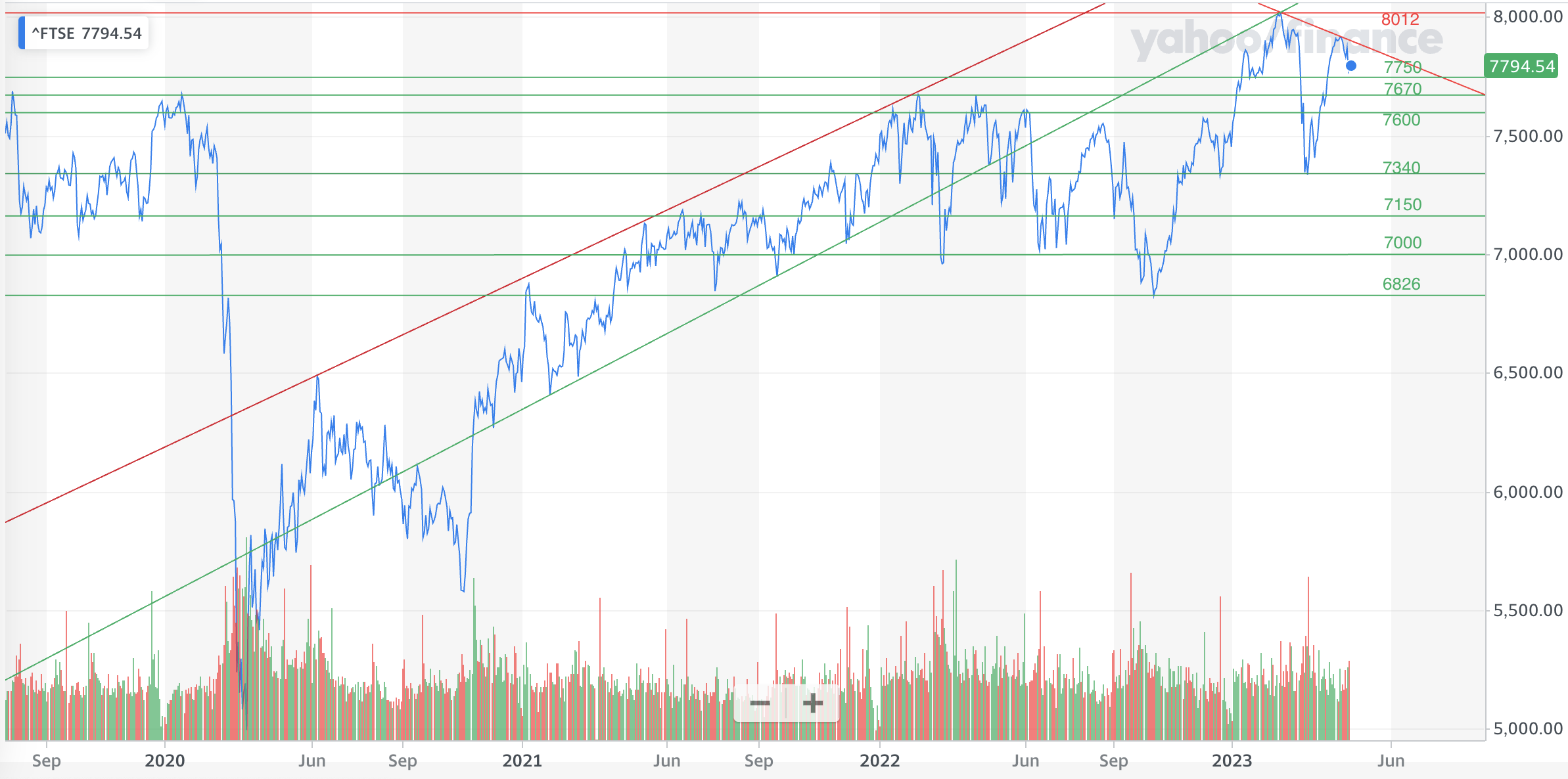
UK stock market
Back in the autumn of 2022, political and economic turmoil in the UK saw the FTSE 1000 break below the key 7150 level and other important support lines namely 7150, 7000, 6950 and 6900. The index eventually turned around at 6826 and regained the 7150 level. The key level that the index really needed to recapture was 7300, which also happened to sit just above the then 200 day moving average (which was at 7270). I closed out my technical analysis piece last time by stating that a close above 7600 (and ultimately the 2022 high of 7672) would open the door to the all-time high of 7877. In the end that's exactly what happened at the start of 2023, as can be seen from my latest technical analysis chart below.
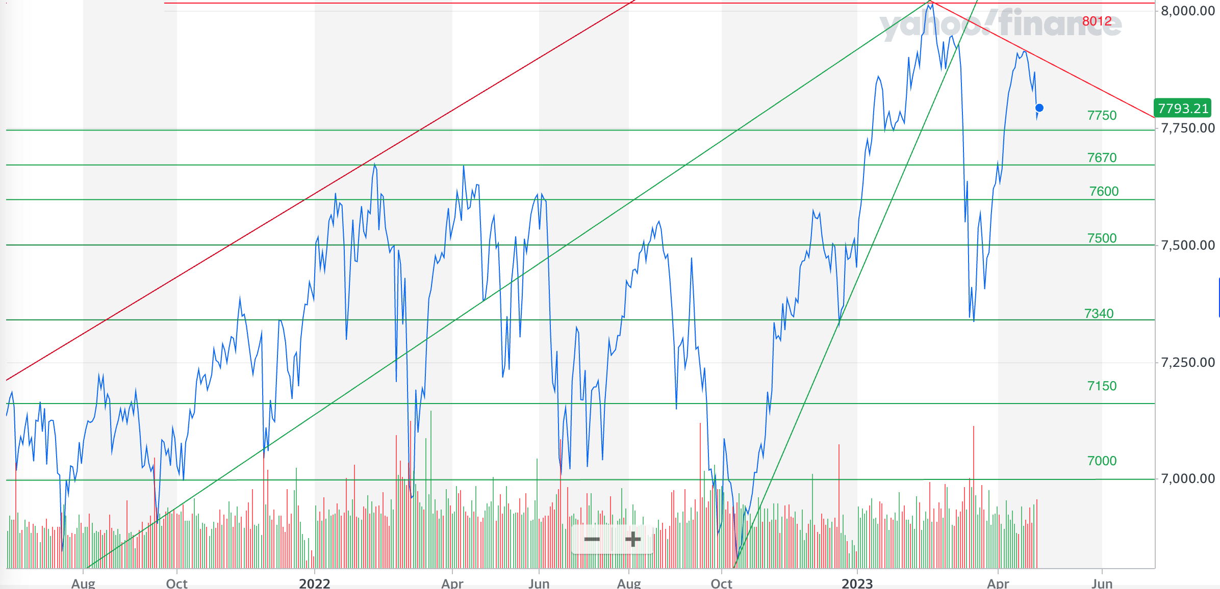
Once the index broke above the 2022 high it accelerated higher before finding support around 7750. After consolidating its extraordinary rally from the October 2022 lows it pushed on to set a new all-time high. However, the FTSE 100s exposure to banking stocks meant that the index suffered during the banking crisis in March which saw it pull back to the support line around 7340. As has historically been the case, a break below 7500 usually results in an aggressive move back towards 7300. However, the subsequent rebound matched the original aggressive move in early 2023. Yet at the time of writing the rally has faltered again and although still above 7750 it is in danger of forming a head and shoulders pattern with the peaks from early February and mid-January.
A head and shoulders pattern consists of three peaks, with the middle peak being the highest and the outer two peaks being roughly the same height. Hence it resembles a head with two shoulders either side. Such patterns are often seen as signals that a bullish trend is reversing. If this were to be the case then a move back below 7750 is possible. Of course, nothing is certain and the developing pattern could be nullified if the FTSE 100 rallies strongly instead.
In summary the FTSE 100 is in a period of consolidation and trying to build momentum back above the recent all-time high of 8012. If it were to breakdown, keep an eye on 7500 (which is also the current 200 day moving average), 7340 (which is the 2023 low) and ultimately the 7150 and 7000 levels. Below the 2022 low of 6826, the index would be in big trouble.
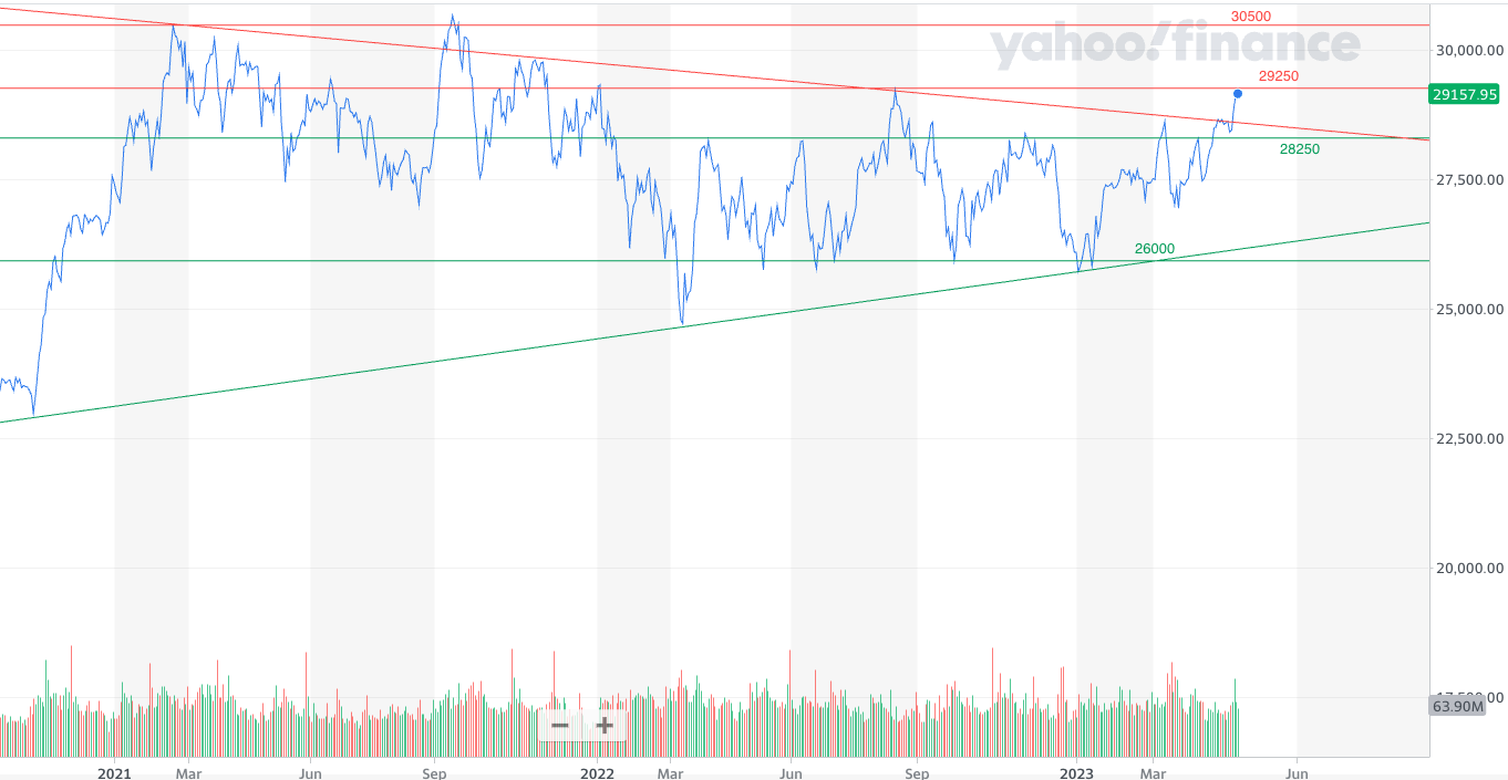
Japanese stock market
Last time I highlighted how the Nikkei 225 was being squeezed into a triangle and often such patterns resolve themselves with explosive moves higher or lower. Below is an updated chart with the downward sloping resistance line dating back to early 2021 shown in red as the top of the triangle. It shows that there's a case that the move higher in June 2022 was a failed breakout and the index has been trapped in the triangle ever since, repeatedly testing the upper and lower boundary lines. In the last couple of days the Nikkei 225 has finally broken above the downward resistance line, but it's too early to tell if this is another failed breakout. But either way, if you look at the horizontal lines of support and resistance it is clear that the Nikkei 225 has been stuck between 26000 and 28250 for more than a year.
As such the index is trading sideways, ultimately going nowhere. It's not until we break above 29250 and ultimately 30500 that this market gets interesting.
On the downside 26000 is important otherwise a revisit to the March 2022 low of 24717 is likely. Below there the Nikkei 225 could unravel very quickly towards 24000 (which was the high in the months before the pandemic) and beyond.
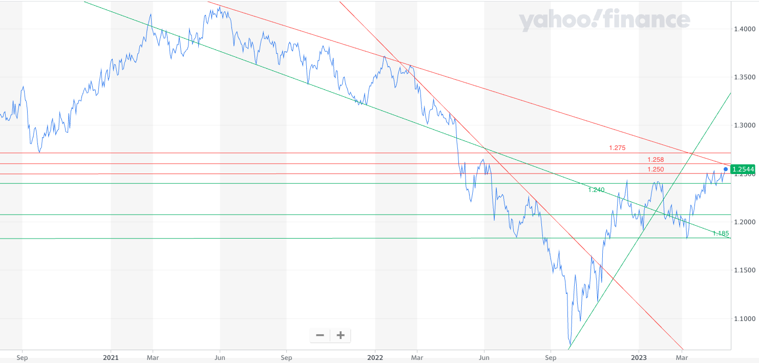
Pound vs Dollar
Back in November I wrote how there was no sign of the strong downtrend in the pound/dollar exchange rate abating until the pound clawed its way back above $1.17. As unlikely as that seemed at the time, the pound did turn its fortunes around versus the dollar as shown in my new technical analysis chart below. Much of the change in trend has been a result of the market's differing outlooks for monetary policy in the UK and the US.
The aggressive rebound from the post-mini Budget lows of September was aggressive but stalled at $1.24 and has only managed to break above this in the last few weeks. But despite the power of the rally the pound is facing a number of strong resistance lines, most notably $1.25 and $1.258. In addition it is now attempting to break out of the downtrend that is almost two years old. If it can manage it then we can look toward $1.275.
But should the pound break down below $1.24 then there are a number of weak support lines down to $1.20. Keep an eye on $1.185, because if we break below there it could start a new leg down. The pound is at an important juncture.

£200 Pension Cashback Offer
Make a qualifying deposit or transfer a pension to our partner Interactive Investor.
- Deposit or transfer a pension of at least £20k and you could earn £200 cashback
- Terms and Fees apply, Capital at risk
- New & Existing customers opening a SIPP
- Offer ends 31st July 2026
Before starting your transfer, check you won't lose any valuable benefits (such as guaranteed annuity rates or a lower protected pension age) and find out what exit fees you might have to pay
