

As regular 80-20 Investor members know, periodically I like to look at what technical analysis suggests about where key markets might be headed next. It's been almost 6 months since I last wrote a technical analysis piece. Therefore it's an opportune time to take a look at how key markets have fared and where they may head next, especially following the recent equity market weakness.
Remember, technical analysis is not a crystal ball but instead gives you a range of possible outcomes and levels to watch. In volatile market conditions, technical analysis tends to prove particularly useful and traders and professional investors start to pay greater attention to it.
As ever, I like to recap what technical analysis is and how it works. I always advise investors not to try and time the market because they will never get it right. However, there's nothing wrong with trying to determine a range of possible future outcomes within investment markets. Think of it like a weather forecast. It’s not 100% accurate but it will give you a better idea of whether a storm is on the horizon or when one might blow over. Technical analysis is the nearest thing we have to weather forecasting in the investment world.
What is technical analysis? - A recap
For those who don't already know or have forgotten here is an explanation of what technical analysis is:
Trying to predict the future of the stock market is akin to reading tea leaves. Personal predictions are almost always clouded by prejudices that reaffirm what we ‘want’ to happen rather than what is ‘most likely’ to happen.
That is why one objective method is to use technical analysis to try and judge likely outcomes. So what is technical analysis? One line of thinking is that stock markets are driven largely by human behaviour. At the simplest level you could argue that fear and greed drive a lot of investors’ actions. Let’s say that an opportunity presents itself and some investors jump on it and buy the shares in question. The demand then drives up the price. More investors jump on the bandwagon looking to profit. Then at some point the tide turns (fear sets in) as people think the price for the shares is looking expensive and so people start selling. More and more people start selling to take profits and the price falls. At some point the price falls until others think the shares look cheap and start buying, outnumbering the number of sellers. Again demand outstrips supply and the price goes back up.
This see-sawing explains the movement you see in stock market charts such as those below. The price at which investors start bailing and selling the shares is called a point of resistance while the point at which they pile in is called a point of support.
As such there is a surprising level of predictability to human behaviour. In terms of the stock market that means when the price goes through historic points of resistance or support it can indicate a new unfolding market rally or collapse. Why does it do this? Part of it will be because traders trading in millions of pounds will use these points of resistance and support to trigger trades. Yet for a lot of investors they might not even be aware of these inflexion points. They simply are reacting to how other people in the market behave. Put it this way, when stock markets fall you feel tempted to sell, right? Also once it starts to rally, you are tempted to jump in? That’s why these patterns have a tendency to repeat.
Some investors and traders swear by it and trade solely using technical analysis. I don’t fall into that camp. I view technical analysis like a road map drawn by someone who has already completed a journey to somewhere near where you are planning to drive to. The road map won’t take you exactly to your intended destination, nor will it be entirely accurate. However, it will give you a better sense of what to expect. Then if you decide you like the look of a particular market you can use 80-20 Investor’s ‘Best funds by Sector‘ data to choose an actual fund to invest in.
Latest technical analysis
There are different types of technical analysis, however, I find the most useful guide is to simply highlight the points of resistance and support, as I've done previously. So below I provide technical analysis, looking at areas of support (the green lines in the charts below) and resistance (the red lines), on the key global equity markets and the pound/dollar exchange rate. Click on the charts to enlarge them.
US stock market
Back in November 2023, when I last published a technical analysis piece, the S&P 500 was in the grip of a "sell the rip" mentality and was in the midst of a corrective downtrend as shown in the chart below.
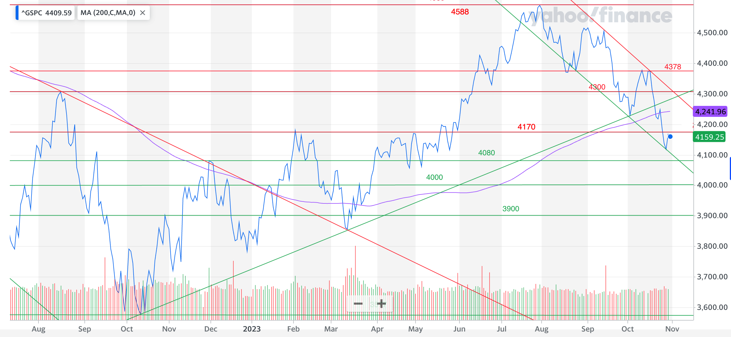
Fast forward to today and the revised chart below shows that, by pure chance, my previous update was published just days after the S&P 500 rebounded off the lower-bound of the downtrend channel, which ultimately marked the end of the autumn correction.
At the time I wrote "We've experienced a 10% correction and crucially the S&P 500 has fallen below the October 2022 uptrend line and also its 200 day moving average. These are both bearish signs for the S&P 500 and investors need to see the index swiftly move back above 4300 to break the recent downtrend and finally attempt a push above 4588...The 4170 line will be an important one in the short-term if the market is to gain momentum to push higher. Currently the index is trying to recapture it".
It's a great example of the usefulness and limitation of technical analysis, the limitation being that I obviously could not confidently predict that the S&P 500 had in fact reached a turning point and was about to burst towards new all-time highs. However, the usefulness was that I was able to highlight key levels that the S&P 500 had to achieve in order for the market to rally sustainably, which ultimately it did achieve and the rest is history.
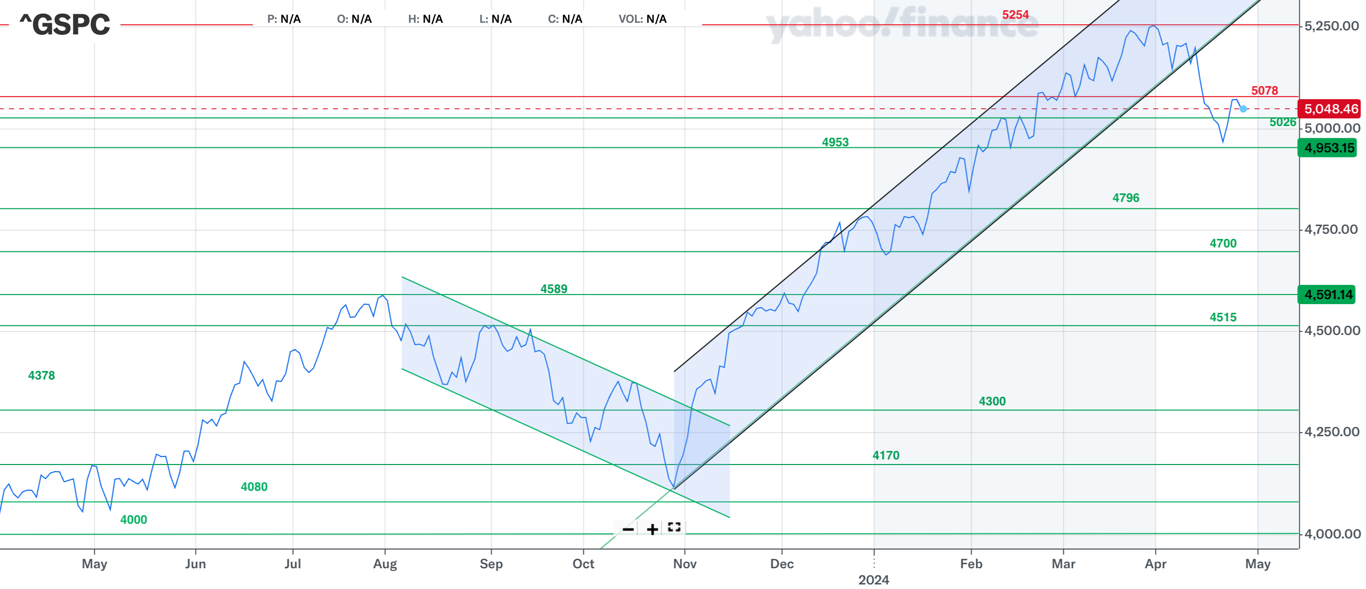
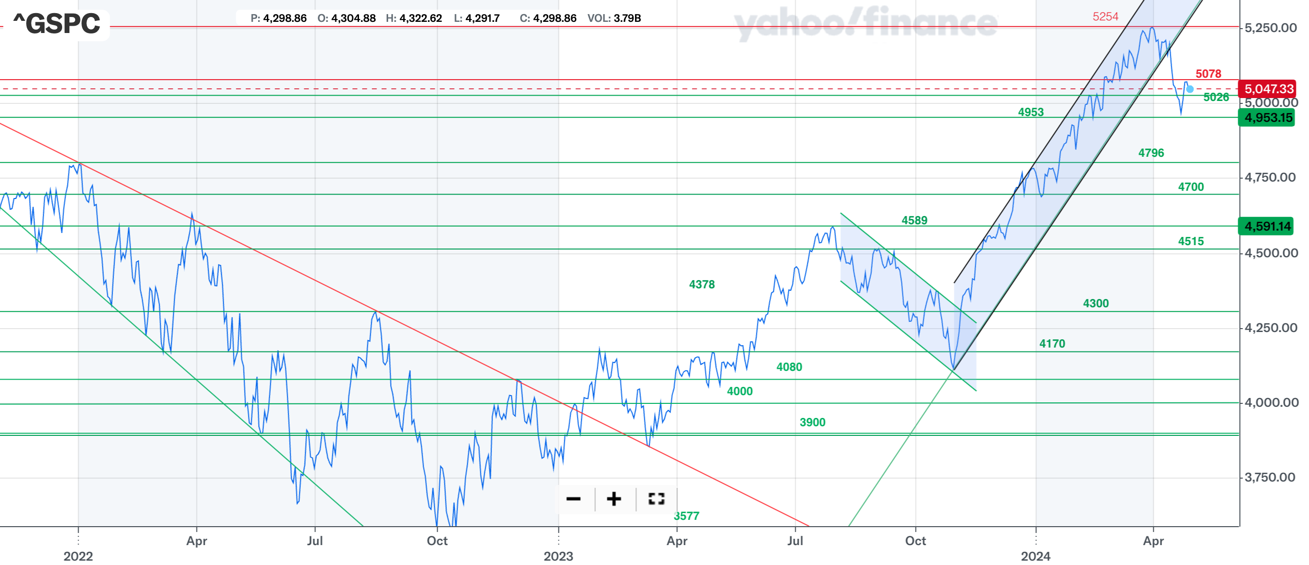
After breaking out of the downtrend the S&P 500 entered a powerful uptrend setting numerous new all-time highs along the way as the "sell the rip" mentality was replaced by "buy the dip". However, in recent weeks we've seen the S&P 500 break down out of its uptrend. As is often the case, once a rising support line is broken it leads to a strong sell-off. As I write this the S&P 500 sits at 5048 which is less than 5% from the all-time high of 5254, which gives the latest sell-off some much needed context (i.e. the world hasn't ended yet despite the headlines). For the sell-off to meet the official definition of a correction it would need to fall a total of 10% which means it needs to fall to 4728. Even if it does, just below there lies the support line of 4700 and the current 200 day moving average (not shown on the chart) at 4690. If these failed it would open the door to the 2023 high of 4589 and below.
The chart below shows a slightly longer term view of the S&P 500 which helps to illustrate the importance of the support lines 4796 and 4700. If the S&P 500 is to continue higher then it needs to recapture 5078 before moving on to the 5100, 5200 and ultimately the all-time high of 5254.
UK stock market
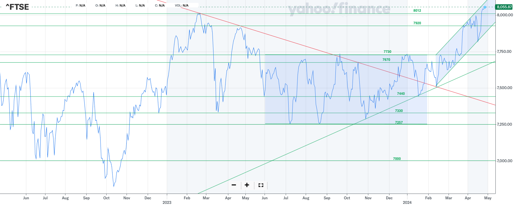
Back in November 2023 I wrote this about the FTSE 100... "There is an argument that the FTSE 100 is stuck in a wide trading range between 7670 and 7257 and consolidating before a significant move higher or lower. However, the FTSE 100 has made a series of lower highs in 2023 meaning that the outlook remains negative for the FTSE 100 in the medium term. If we zoom out, only a strong move above 7670 and then 7750 would put a new all-time high back in play but there is significant resistance on the way up".
Again, uncannily this note proved spot on in setting out the criteria that needed to be met in order for the market to turnaround and burst higher. As you can see from the chart below, the criteria were met. The market bottomed and broke higher, out from the descending triangle marked by the converging green and red lines. Such breakouts are usually powerful as it was in this instance, before pulling back. But despite the pullback a new uptrend began emerging. Then in March the FTSE 100 eventually broke out of the sideways 9-month consolidation zone (market in blue). The sustained move above 7730 caused the FTSE 100 to explode higher. The aggressive move finally propelled the FTSE 100 to a new all-time high. If the move is to be maintained then the FTSE 100 needs to stay above the 8012 level, which marks the previous all-time high set in 2023, otherwise it could complete a double-top formation, marking a failed breakout. This would ultimately be bearish for the outlook of the index and could see it move back towards its previous consolation zone. Below 7257 then 7150, 7000, 6950 and 6900 are key support levels.
But as I write, the FTSE 100 is in a bullish mode and proving a good portfolio diversifier to other global equity markets that are currently experiencing downturns in recent fortunes.
Japanese stock market
Last time, the Nikkei 225 was trying to consolidate after a breakout from the 26000-28250 zone where the index had spent most of 2022 and 2023 as shown in the chart below, which I've borrowed from my previous article.
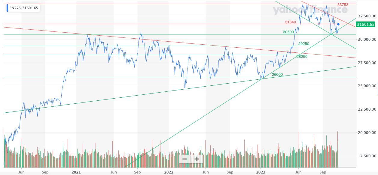
At the time I wrote that... "the 30500 line will be key in determining whether the index can consolidate at this elevated level before pushing higher. A break below 30500 would put 29250 back in play and then ultimately the 26000-28250 channel once again...Looking higher, 33753 needs to be broken if we are to have a chance of breaking to the all-time high of 38,915.87 achieved on 29th December 1989".
Jump forward to today and as you can see from the updated chart below, the 30500 support line proved pivotal and propelled the market to an incredible 34% rally to the all-time high of 40888. Interestingly, in April the Nikkei 225 has turned lower and is cornered once again in-between a new downtrend line (in red) and the uptrend line that dates back to November 2023. Moves out of such patterns tend to be explosive, either higher or lower. While the index is still in an uptrend for now, it is testing the lower bound of that trend.
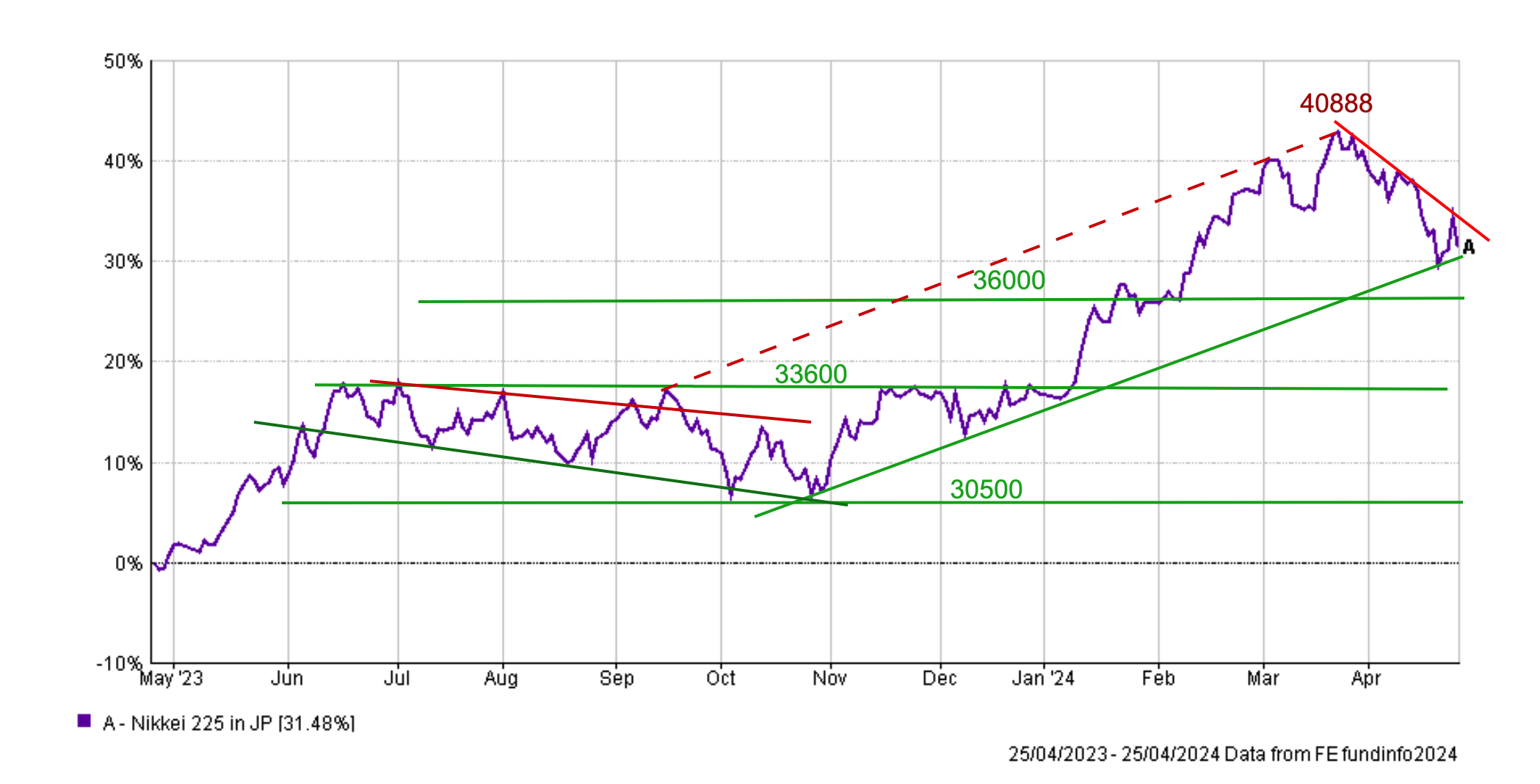
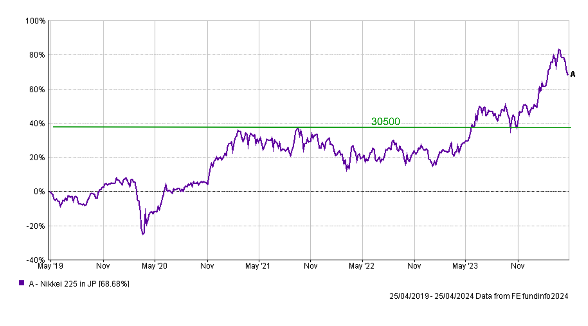
At present the Nikkei 225 sits at 37934 and the 36000 level and ultimately 33600 level will prove crucial support if the index breaks down. Below there 30500, once again, will become an important line of support as it was back in November 2023. The chart below gives context to the importance of the 30500 level over the last 3-4 years.
A break below 30500 would put 29250 back in play and then ultimately the 26000-28250 channel once again. Looking higher, 40000 is a psychologically significant level that the Nikkei 225 must push through in order to retain and set a new-all time high.
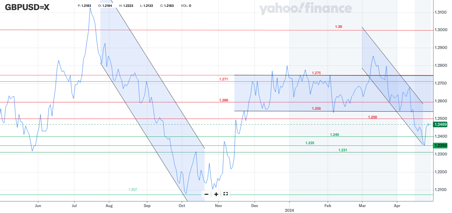
Pound vs Dollar
Back in November I explained how the pound had work to do if it was to break out of the negative pattern it was stuck in with $1.231 and then $1.24 being important hurdles to overcome (as shown in the chart below)
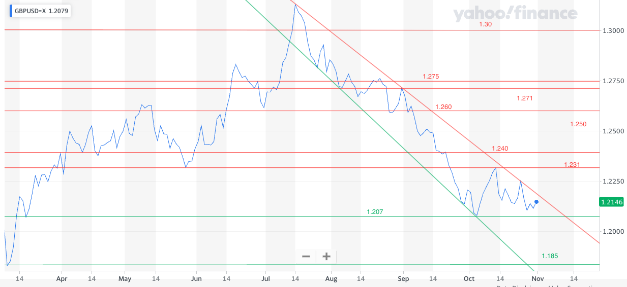
Below is an updated chart of the pound vs dollar exchange rate. You can see that the pound ultimately reversed its downtrend and broke higher before consolidating between $1.255 and $1.275 for much of this year. But a rapid strengthening of the US dollar saw the pound slump in comparison and enter a new downtrend. After finding support at $1.235 we've seen the pound rally in recent days. However, we'd need to see the pound move back above $1.255 and $1.260 to negate the latest downtrend. Looking higher $1.275 is a key threshold as is the recent high near $1.285 if we are to see the pound break back above $1.30.
Looking lower, a break below $1.231 will put $1.21 and the October 2023 low back in play.

£200 Pension Cashback Offer
Make a qualifying deposit or transfer a pension to our partner Interactive Investor.
- Deposit or transfer a pension of at least £20k and you could earn £200 cashback
- Terms and Fees apply, Capital at risk
- New & Existing customers opening a SIPP
- Offer ends 31st July 2026
Before starting your transfer, check you won't lose any valuable benefits (such as guaranteed annuity rates or a lower protected pension age) and find out what exit fees you might have to pay
