

As regular 80-20 Investor members know, periodically I like to look at what technical analysis suggests about where key markets might be headed next. It's been 5 months since I last wrote a technical analysis piece. Therefore it's an opportune time to take a look at how key markets have fared so far in 2022 and where they may head next as we enter a seasonally positive period for equity markets.
Remember, technical analysis is not a crystal ball but instead gives you a range of possible outcomes and levels to watch. In volatile market conditions, technical analysis tends to prove particularly useful and traders and professional investors start to pay greater attention to it.
As ever, I like to recap what technical analysis is and how it works. I always advise investors not to try and time the market because they will never get it right. However, there's nothing wrong with trying to determine a range of possible future outcomes within investment markets. Think of it like a weather forecast. It’s not 100% accurate but it will give you a better idea of whether a storm is on the horizon. Technical analysis is the nearest thing we have to weather forecasting in the investment world.
What is technical analysis? - A recap
For those who don't already know or have forgotten here is an explanation of what technical analysis is:
Trying to predict the future of the stock market is akin to reading tea leaves. Personal predictions are almost always clouded by prejudices that reaffirm what we ‘want’ to happen rather than what is ‘most likely’ to happen.
That is why one objective method is to use technical analysis to try and judge likely outcomes. So what is technical analysis? One line of thinking is that stock markets are driven largely by human behaviour. At the simplest level you could argue that fear and greed drive a lot of investors’ actions. Let’s say that an opportunity presents itself and some investors jump on it and buy the shares in question. The demand then drives up the price. More investors jump on the bandwagon looking to profit. Then at some point the tide turns (fear sets in) as people think the price for the shares is looking expensive and so people start selling. More and more people start selling to take profits and the price falls. At some point the price falls until others think the shares look cheap and start buying, outnumbering the number of sellers. Again demand outstrips supply and the price goes back up.
This see-sawing explains the movement you see in stock market charts such as those below. The price at which investors start bailing and selling the shares is called a point of resistance while the point at which they pile in is called a point of support.
As such there is a surprising level of predictability to human behaviour. In terms of the stock market that means when the price goes through historic points of resistance or support it can indicate a new unfolding market rally or collapse. Why does it do this? Part of it will be because traders trading in millions of pounds will use these points of resistance and support to trigger trades. Yet for a lot of investors they might not even be aware of these inflexion points. They simply are reacting to how other people in the market behave. Put it this way, when stock markets fall you feel tempted to sell, right? Also once it starts to rally, you are tempted to jump in? That’s why these patterns have a tendency to repeat.
Some investors and traders swear by it and trade solely using technical analysis. I don’t fall into that camp. I view technical analysis like a road map drawn by someone who has already completed a journey to somewhere near where you are planning to drive to. The road map won’t take you exactly to your intended destination, nor will it be entirely accurate. However, it will give you a better sense of what to expect. Then if you decide you like the look of a particular market you can use 80-20 Investor’s ‘Best funds by Sector‘ data to choose an actual fund to invest in.
Latest technical analysis
There are different types of technical analysis, however, I find the most useful guide is to simply highlight the points of resistance and support, as I've done previously. So below I provide technical analysis, looking at areas of support (the green lines in the charts below) and resistance (the red lines), on the key global equity markets and the pound/dollar exchange rate. Click on the charts to enlarge them.
US stock market
The chart below (click to enlarge) shows the S&P 500 when I last published a full technical analysis article.
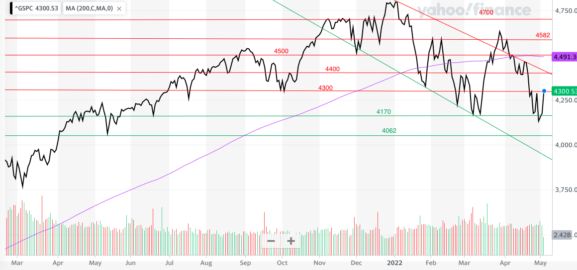
At the time I highlighted how 4300 remained a key resistance level even after an incredibly strong rally. Not only that but I wrote that if we broke below 4062 "then the market could go into freefall and crash through 4000....below there, there are numerous support lines, mostly every 100 points down to 3750". The chart below is an updated version of the chart and you can see what happened over the summer. No sooner had I published the above chart, the S&P 500 hit 4300 and immediately turned lower, breaking below 4062 and ultimately setting a new 2022 low in June at 3666.
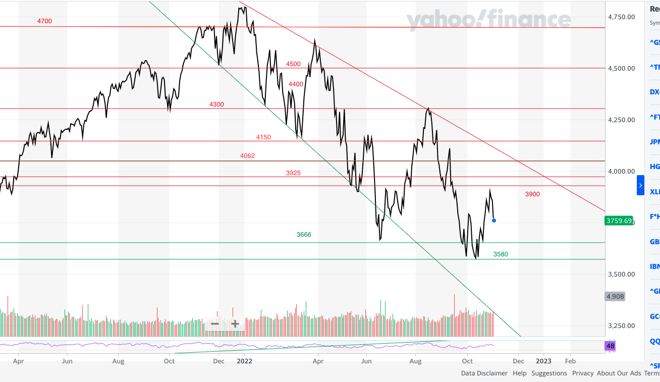
The S&P 500 attempted to rebound with a powerful summer rally but once again it failed at 4300 and ultimately set a new closing low at 3580. This level marks the peak of the initial post-pandemic rebound, prior to the explosive November 2020 move after the discovery of a Covid vaccine.
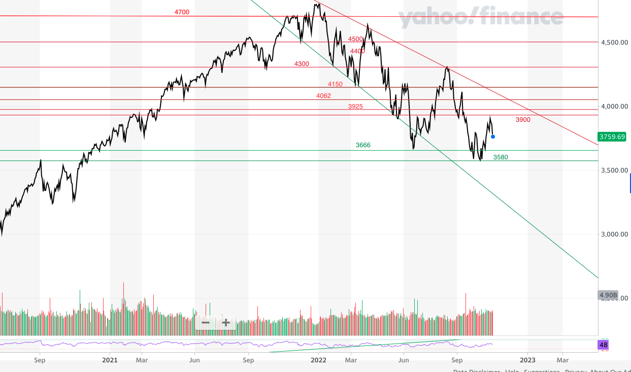
In the short-term 3900-3925 is a line of resistance that the latest rally needs to clear if the market is to build enough upward momentum. As you can see from the chart above, the S&P 500 is still in a downtrend that started at the beginning of 2022. At this moment in time the S&P 500 needs to move above 4100-4150 to break that downtrend. Interestingly, the 200 day moving average (which isn't shown) currently sits at 4100. If you recall, being below the 200 day moving average is seen as a bearish sign for the index while being above it is more bullish.
On the downside, 3580 is crucial. If we break below there, setting a new bear market low, then the market could unravel much further.
UK stock market
Last time the FTSE 100 was an outlier in global equity markets. It was still in an uptrend as shown in the chart below (which was published last time) and sat above the important 7300 level and its 200 day moving average.
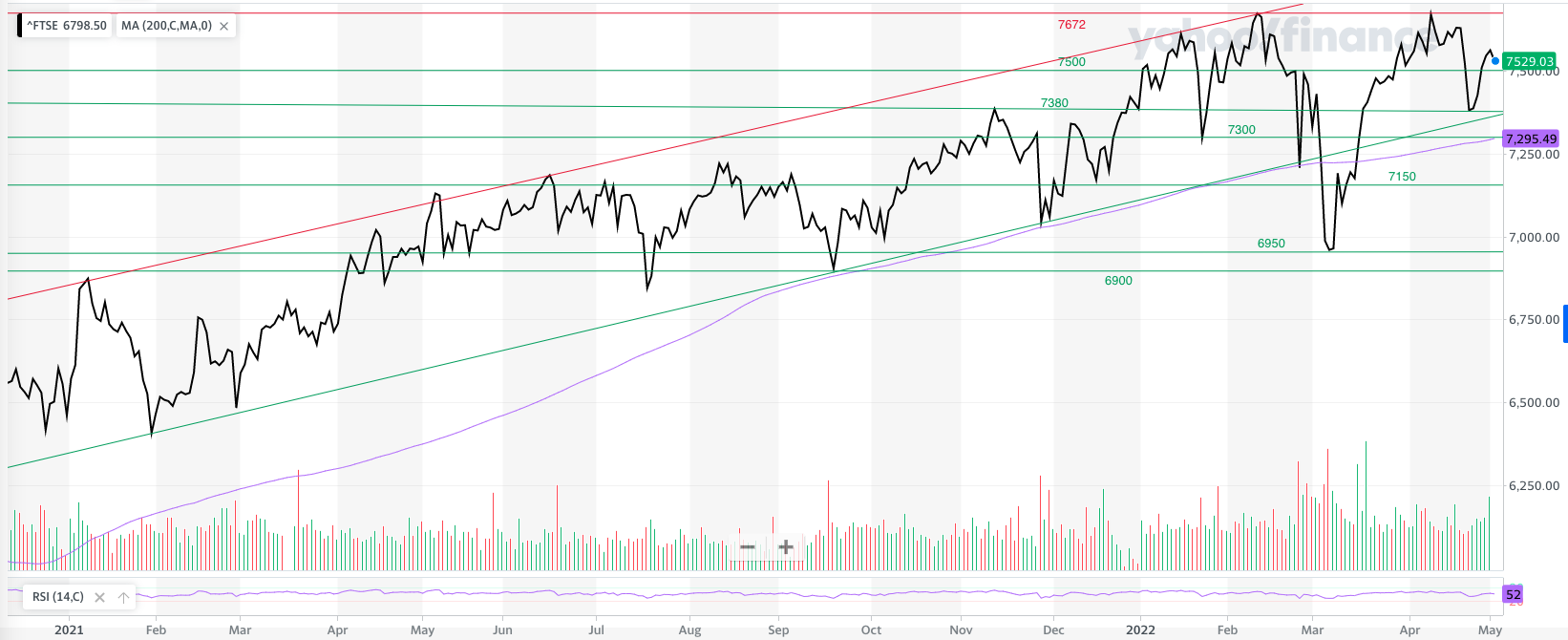
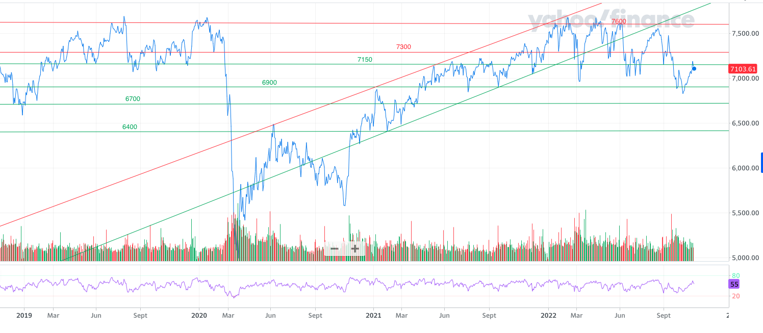
If we zoom in more closely you can see that the FTSE 100 broke below the 7300 level and spent most of the summer bouncing off support around the 7000 level before repeatedly failing to break above 7300.
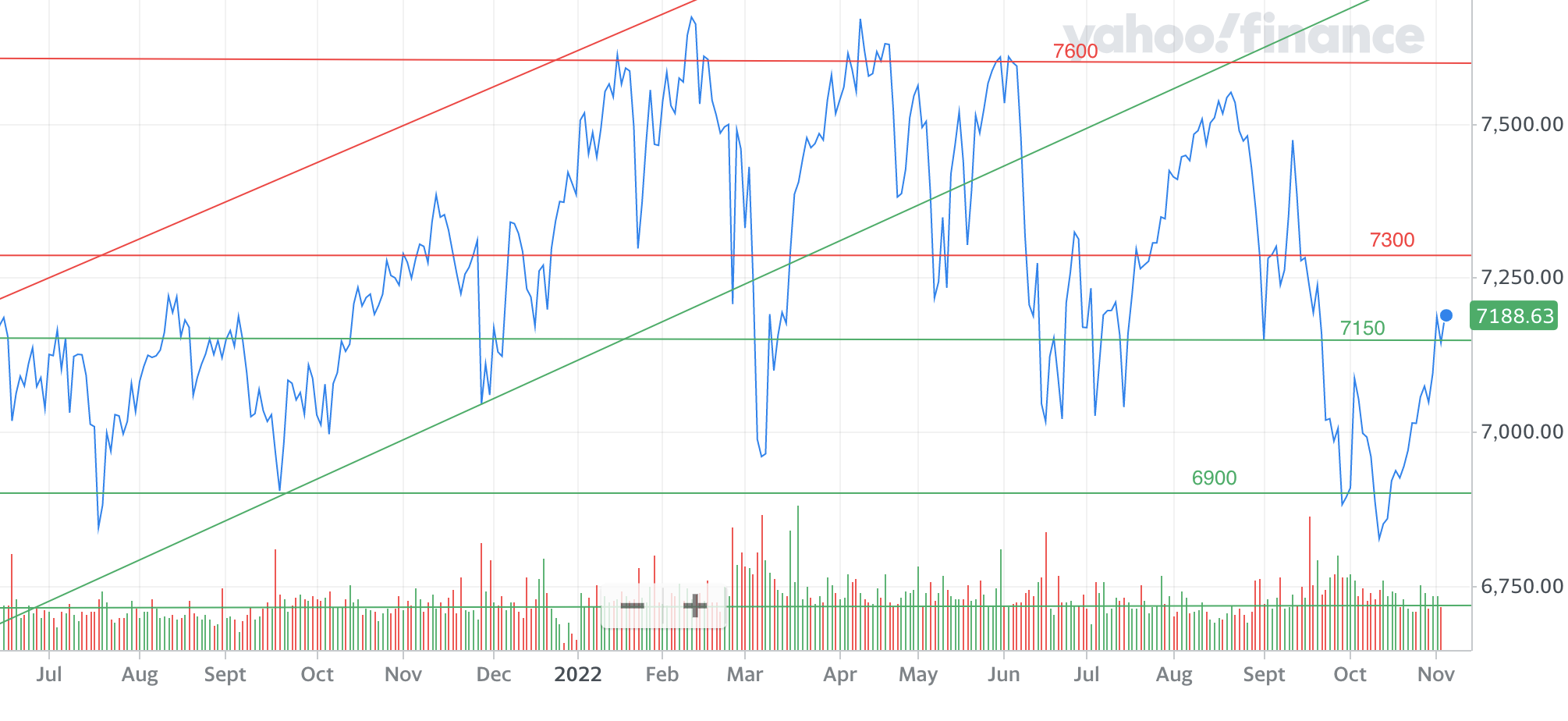
Eventually the FTSE 100 did break decisively above 7300 and, as is often the case, the index rapidly moved to 7500 but then ultimately failed. Moves between 7300 and 7500 tend to be aggressive and quick in either direction. Political and economic turmoil saw the index break below the key 7150 level and other important support lines namely 7150, 7000, 6950 and 6900. The index eventually turned around at 6826 and regained the all important 7150 level, which is once again acting as a support level now. Below 6900 then the long-term support lines of 6800 and 6400 remain obvious candidates if we unravel aggressively.
If the index is to break out of the sideways trading pattern that began in June it first needs to recapture 7300, which also happens to be just above the 200 day moving average (which is at 7270). But it must then close above 7600 and ultimately the 2022 high of 7672, the latter has proved a stumbling block on two occasions this year. If the index manages that then it opens the door to the all-time high of 7877.
Japanese stock market
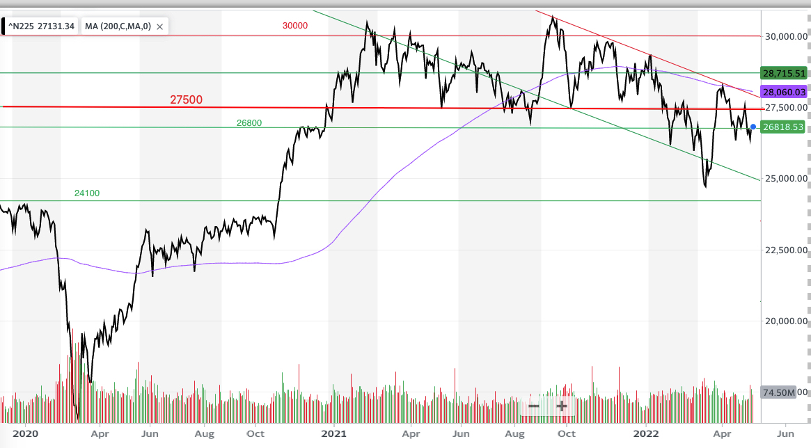
Last time I showed how the Nikkei 225 had established a new downtrend channel and was testing the horizontal support line at 26800, as shown below.
Fast-forward to today and the Nikkei 225 eventually broke below 26800 before bouncing off 26000 to complete the inverse head and shoulders pattern that I suggested was a possibility last time.
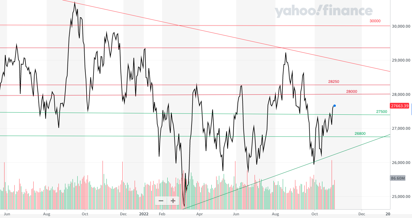
This led the index to rebound to 28250, the March high, before breaking back down to 26000. When global equity markets rallied from their June low the Nikkei followed suit, propelled by the weaker yen/dollar exchange rate.
But while the index has been trading in a sideways range between 26000 and 28000 since June, a series of lower highs and higher lows mean that it is becoming squeezed into a triangle. Often such patterns resolve themselves with explosive moves higher or lower.
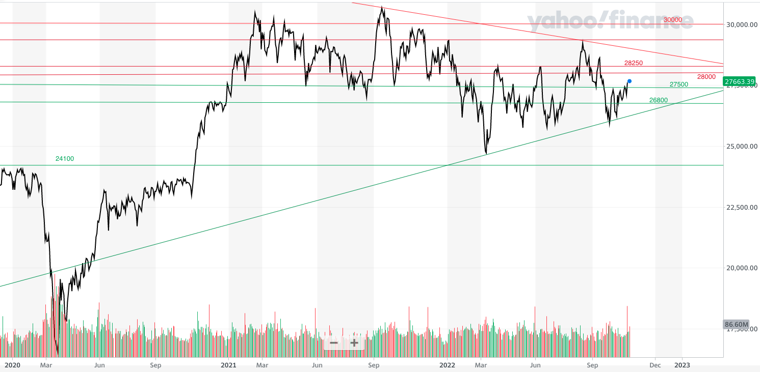
Looking below, the 2022 low of 24700 remains crucial. Below there, 24100 and 23000 remain key long term support lines if the index breaks. Looking higher, the August high of 29222 needs to be bettered in order to negate the downtrend line that goes back to 2021.
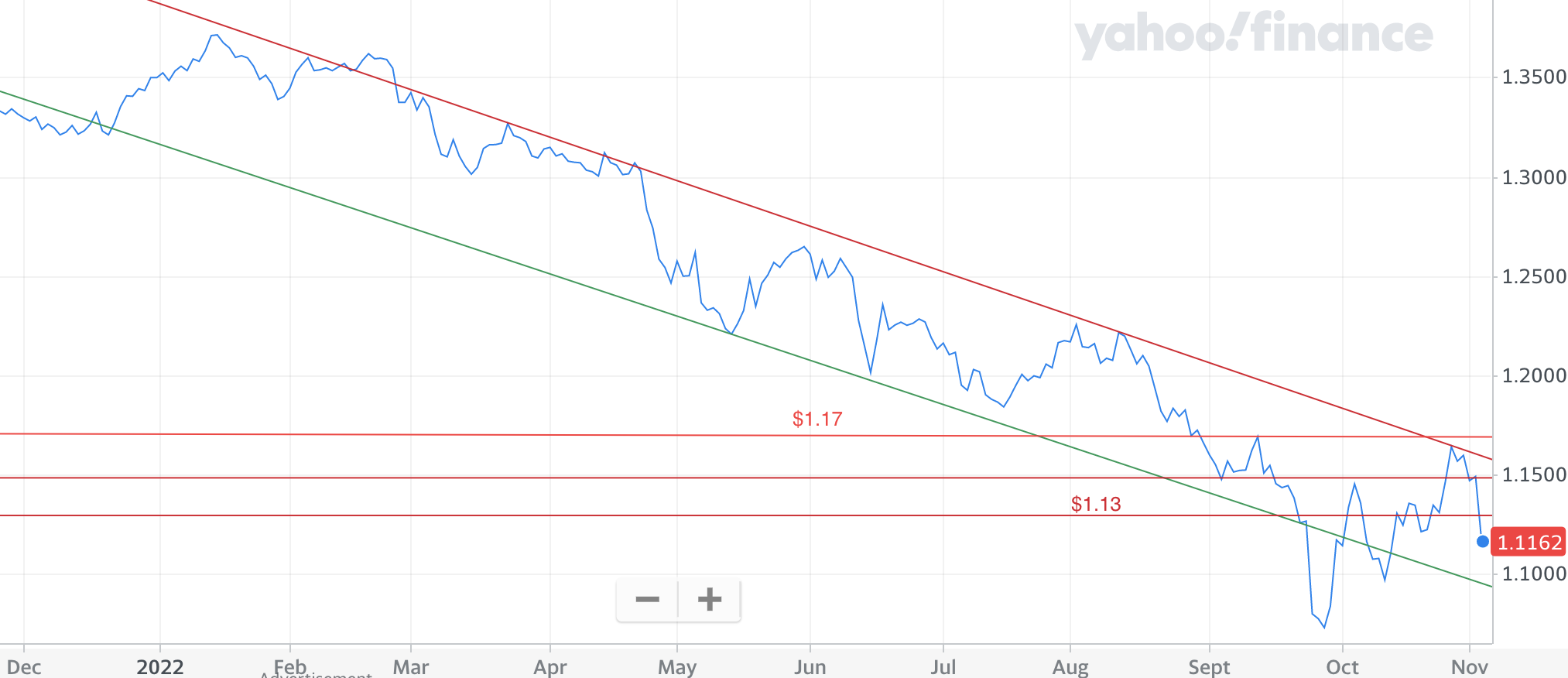
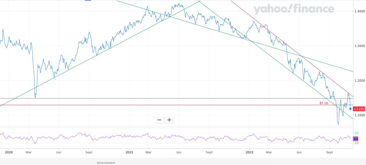
Pound vs Dollar
Yet again there really isn’t anything to like about the strength of the pound versus the US dollar. The chart below shows where we were last time.
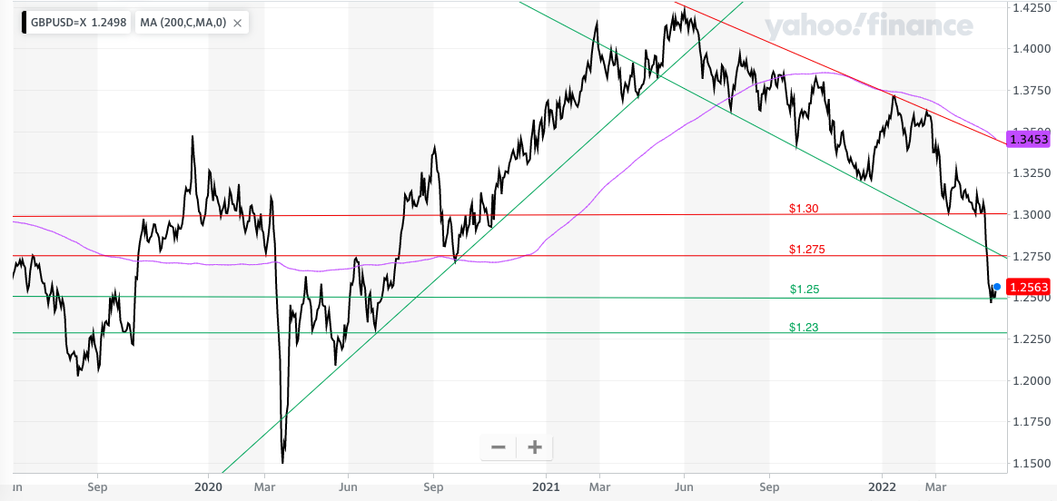
Ultimately the bottom fell out of this market (as shown in the chart below) and the strong downtrend has become entrenched and shows no sign of abating. It's not until the pound gets back above $1.17 that we can even begin to look higher. As for the downside, in the short term $1.10 remains likely and beyond that we have the recent low of $1.03.

£200 Pension Cashback Offer
Make a qualifying deposit or transfer a pension to our partner Interactive Investor.
- Deposit or transfer a pension of at least £20k and you could earn £200 cashback
- Terms and Fees apply, Capital at risk
- New & Existing customers opening a SIPP
- Offer ends 31st July 2026
Before starting your transfer, check you won't lose any valuable benefits (such as guaranteed annuity rates or a lower protected pension age) and find out what exit fees you might have to pay
