

As regular 80-20 Investor members know, periodically I like to look at what technical analysis suggests about where key markets might be headed next. The last time I did this was in May 2021, but given that most equity markets are near all-time highs (or at least multi-year highs) I think now is a good opportunity to look at what technical analysis is telling us about the current market environment into the year-end.
Technical analysis is not a crystal ball but instead gives you a range of possible outcomes and levels to watch. In volatile market conditions technical analysis tends to prove particularly useful and traders and professional investors start to pay greater attention to it.
As ever, I like to recap what technical analysis is and how it works. I always advise investors not to try and time the market because they will never get it right. However, there's nothing wrong with trying to determine a range of possible future outcomes within investment markets. Think of it like a weather forecast. It’s not 100% accurate but it will give you a better idea of whether a storm is on the horizon. Technical analysis is the nearest thing we have to weather forecasting in the investment world.
What is technical analysis? - A recap
For those who don't already know or have forgotten here is an explanation of what technical analysis is:
Trying to predict the future of the stock market is akin to reading tea leaves. Personal predictions are almost always clouded by prejudices that reaffirm what we ‘want’ to happen rather than what is ‘most likely’ to happen.
That is why one objective method is to use technical analysis to try and judge likely outcomes. So what is technical analysis? One line of thinking is that stock markets are driven largely by human behaviour. At the simplest level you could argue that fear and greed drive a lot of investors’ actions. Let’s say that an opportunity presents itself and some investors jump on it and buy the shares in question. The demand then drives up the price. More investors jump on the bandwagon looking to profit. Then at some point the tide turns (fear sets in) as people think the price for the shares is looking expensive and so people start selling. More and more people start selling to take profits and the price falls. At some point the price falls until others think the shares look cheap and start buying, outnumbering the number of sellers. Again demand outstrips supply and the price goes back up.
This see-sawing explains the movement you see in stock market charts such as those below. The prices at which investors start bailing and selling the shares is called a point of resistance while the point at which they pile in is called a point of support.
As such there is a surprising level of predictability to human behaviour. In terms of the stock market that means when the price goes through historic points of resistance or support it can indicate a new unfolding market rally or collapse. Why does it do this? Part of it will be because traders trading in millions of pounds will use these points of resistance and support to trigger trades. Yet for a lot of investors they might not even be aware of these inflexion points. They simply are reacting to how other people in the market behave. Put it this way, when stock markets fall you feel tempted to sell, right? Also once it starts to rally, you are tempted to jump in? That’s why these patterns have a tendency to repeat.
Some investors and traders swear by it and trade solely using technical analysis. I don’t fall into that camp. I view technical analysis like a road map drawn by someone who has already completed a journey to somewhere near where you are planning to drive to. The road map won’t take you exactly to your intended destination, nor will it be entirely accurate. However, it will give you a better sense of what to expect. Then if you decide you like the look of a particular market you can use 80-20 Investor’s ‘Best funds by Sector‘ data to choose an actual fund to invest in.
Latest technical analysis
There are different types of technical analysis, however, I find the most useful guide is to simply highlight the points of resistance and support, as I've done previously. So below I provide technical analysis, looking at areas of support (the green lines in the charts below) and resistance (the red lines), on the key global equity markets and the pound/dollar exchange rate. Occasionally I also look at moving average lines (the black line). Click on the charts to enlarge them.
US stock market
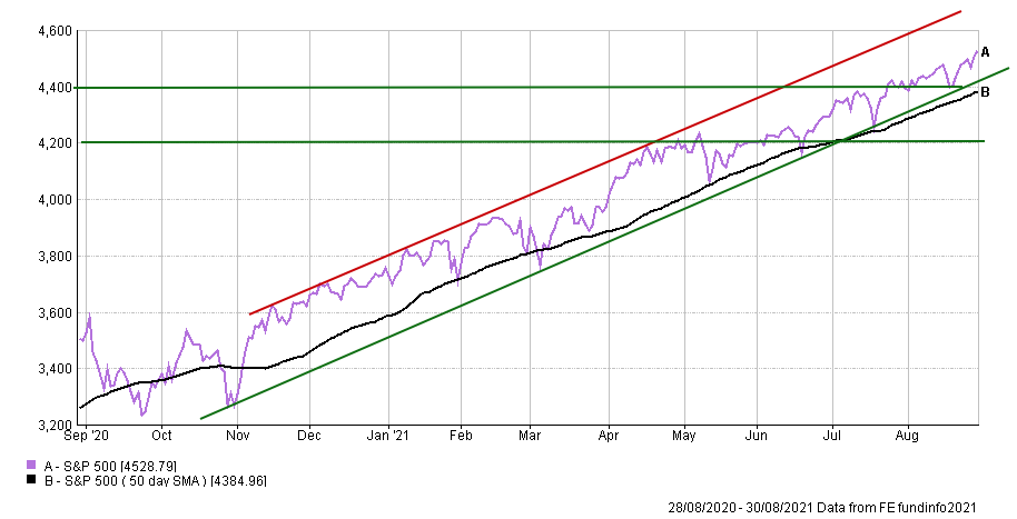
The chart below shows the movement of the S&P 500 over the last 12 months. You can see how the S&P 500 has continued to march higher and higher, setting 53 new all-time highs so far this year. There is a clear uptrend channel stretching back almost a year.
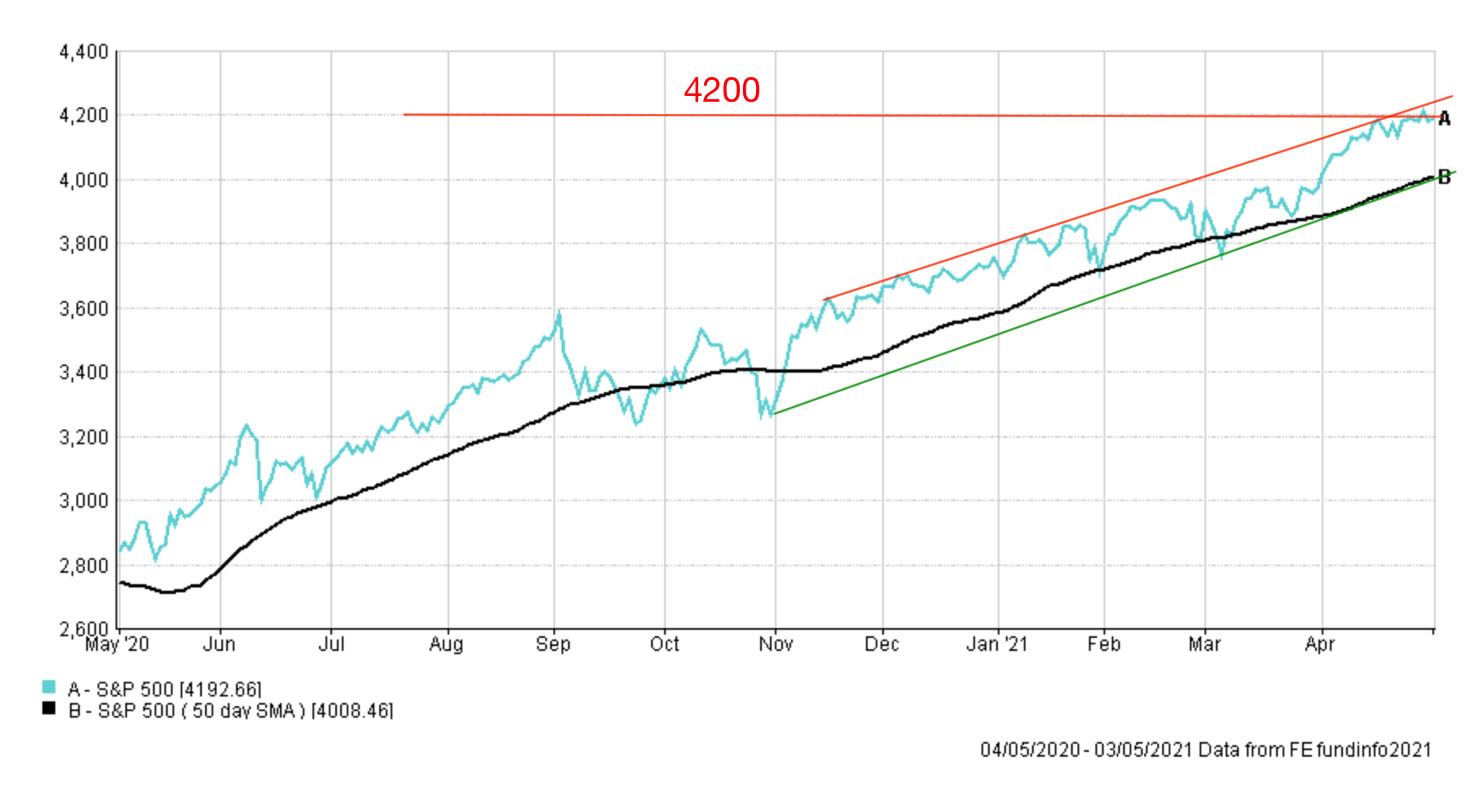
I published the chart below back in May 2021 when I wrote my last technical analysis piece. You can see how the S&P 500 eventually broke through the 4200 resistance level and burst higher.
Looking back at the first chart you can see there have been pullbacks and periods of consolidation along the way, but only down as far as the rising support line in green. On the upside, 4600 is the next logical target. But the S&P 500 is hugging the lower end of the uptrend channel - making the rally look a little tired right now.
On the downside, there is plenty of support. At present 4400 is a key level and proved supportive in August. Furthermore, 4400 is just above where the 200-day moving average currently sits. If the S&P 500 was to break below 4400 then 4200 and 4000 are obvious support lines, with the latter being almost 12% below current levels which would represent a technical correction. Below that, 3750 is supportive and would represent an almost 20% pullback. Both are levels to watch if we get a market crash. Ultimately this is a bullish market where investors' "buy the dip" mentality remains profitable for now.
UK stock market
As I write, the FTSE 100 sits just below 7150, which is proving a stubborn resistance line as shown in the chart below. If the FTSE 100 can break convincingly above there then it opens up the possibility of pushing higher. The index has spent most of the summer stuck in a narrow channel between 7000 and 7150.
If we zoom out further you can see the FTSE 100's recent moves in context. Back in May the FTSE 100 uptrend was testing the then resistance line of 7100, which it successfully overcame. Now the market is once again testing the narrowing uptrend triangle at 7100, which is also a long term resistance line that is now supportive (see below). If the market can hold above there then the market can begin to look higher, and if it can break above the recent high of 7220 then we might finally look towards reclaiming the pandemic losses. The narrowing uptrend triangle suggests that we may get a decisive move higher or lower in the near future.

On the downside, if the market breaks lower than 7000 then 6800 and 6400 seem like obvious support lines, the latter being 10% below current levels. A level to keep an eye on if we experience a market sell-off.
Japanese stock market
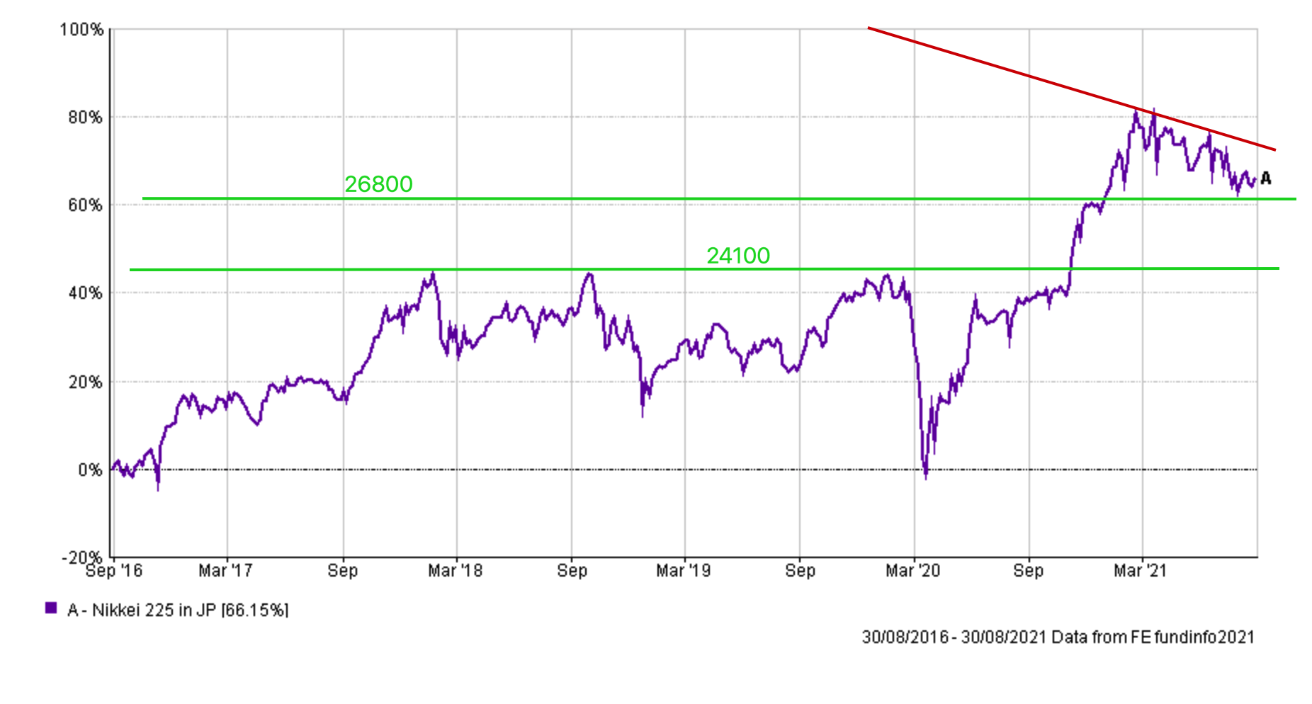
If you go back to May's technical analysis piece I wrote about there being early signs of lower highs on the Nikkei 225 which was ominous and something to watch. Fast forward to today and those lower highs were indeed a precursor of a now established downtrend as shown below.

The Nikkei 225 has been a slow-motion crash and the recent downtrend has remained intact for six months. However, the Nikkei 225 bounced off the key support line of 26800 in recent days. If it were to break below that there is a danger the market could unravel to 23000 (which is 20% below current price levels). But if we zoom out further there is an argument for 24100 being a potential support line too.
Pound vs Dollar
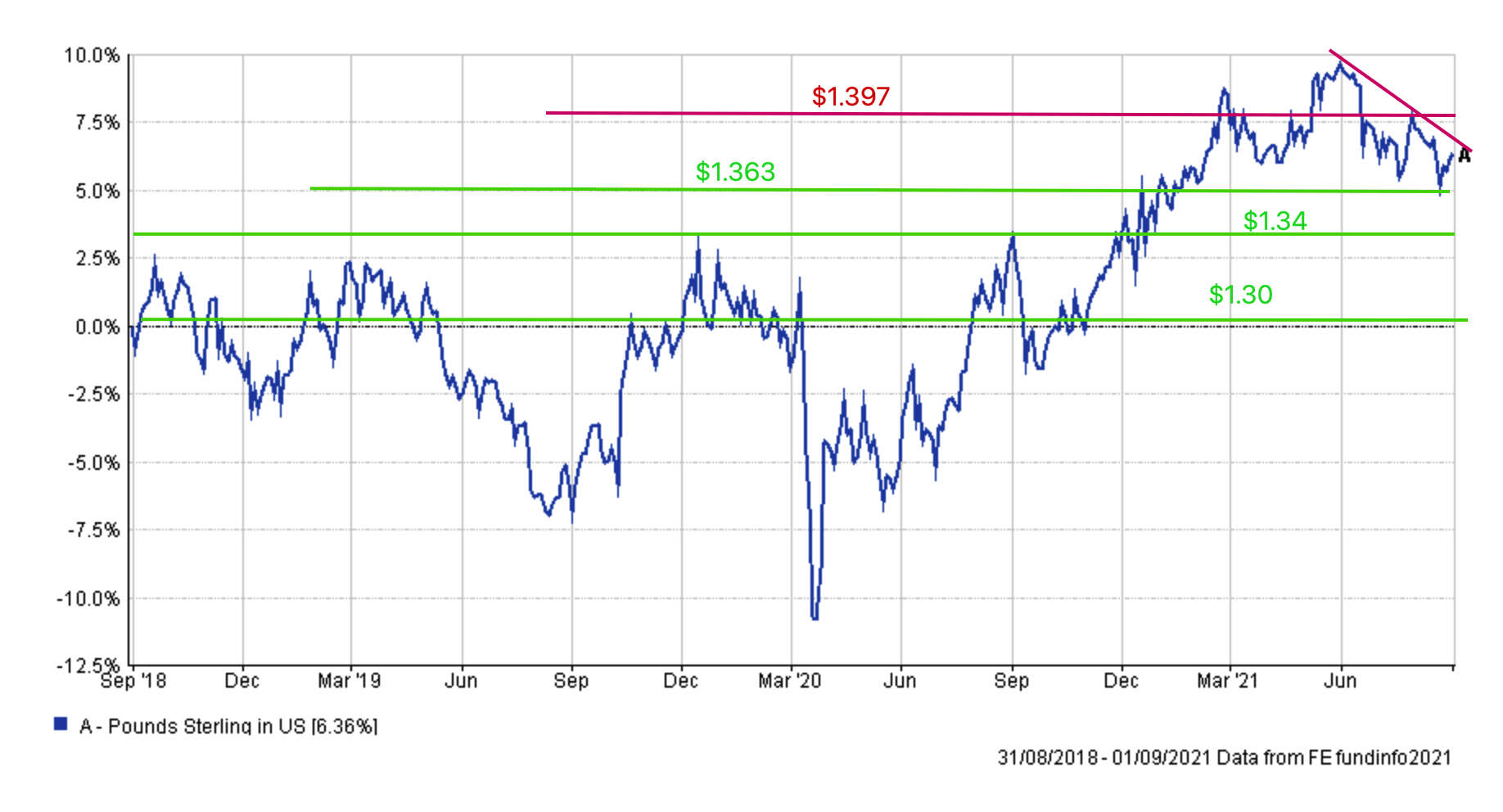
Back in May I wrote about how the pound vs dollar had broken out of a downtrend that had plagued the pairing. However, as the chart below shows the pound has been in a short-term downtrend since June, when it hit a peak of $1.42

That remains the current high for this market over the short term, but the pairing has to break the current malaise if it's to attempt to push higher. You can see on the right-hand side of the above chart that there are tentative signs of the pound testing the sloping downtrend resistance line but even if it does break above it, $1.397 will prove a tall order in terms of overhead resistance. If we break above there then we are likely to revisit the June highs pretty quickly, although pushing higher could prove difficult. On the downside, $1.363 is where we saw a recent double bottom (which is usually a positive sign) but if we break below there then look towards $1.35, and below that things could accelerate towards $1.34 and ultimately $1.30 if the market doesn't find support.

£200 Pension Cashback Offer
Make a qualifying deposit or transfer a pension to our partner Interactive Investor.
- Deposit or transfer a pension of at least £20k and you could earn £200 cashback
- Terms and Fees apply, Capital at risk
- New & Existing customers opening a SIPP
- Offer ends 31st July 2026
Before starting your transfer, check you won't lose any valuable benefits (such as guaranteed annuity rates or a lower protected pension age) and find out what exit fees you might have to pay
