

My last technical analysis piece was written just after the initial stock market sell-off in October. I always find it a useful exercise to go back and read what I wrote with the benefit of hindsight. Technical analysis is not a crystal ball but instead gives you a range of possible outcomes and levels to watch. In volatile market conditions, such as those we are experiencing now, technical analysis tends to prove particularly useful and traders and professional investors start to pay greater attention to it. As such, now represents an opportune time to look at what the technical charts are telling us about where markets are likely to head next.
As ever with these pieces I like to recap what technical analysis is and how it works. I always advise investors not to try and time the market because they will never get it right. However, there's nothing wrong with trying to determine a range of possible future outcomes within investment markets. Think of it like a weather forecast. It’s not 100% accurate but it will give you a better idea of whether a storm is on the horizon. Technical analysis is the nearest thing we have to weather forecasting in the investment world.
What is technical analysis? - A recap
For those who don't already know or have forgotten here is an explanation of what technical analysis is:
Trying to predict the future of the stock market is akin to reading tea leaves. Personal predictions are almost always clouded by prejudices which reaffirm what we ‘want’ to happen rather than what is ‘most likely’ to happen.
That is why one objective method is to use technical analysis to try and judge likely outcomes. So what is technical analysis? One line of thinking is that stock markets are driven largely by human behaviour. At the simplest level you could argue that fear and greed drive a lot of investors’ actions. Let’s say that an opportunity presents itself and some investors jump on it and buy the shares in question. The demand then drives up the price. More investors jump on the bandwagon looking to profit. Then at some point the tide turns (fear sets in) as people think the price for the shares is looking expensive and so people start selling. More and more people start selling to take profits and the price falls. At some point the price falls until others think the shares look cheap and start buying, outnumbering the number of sellers. Again demand outstrips supply and the price goes back up.
This see-sawing explains the movement you see in stock market charts such as those below. The prices at which investors start bailing and selling the shares is called a point of resistance while the point at which they pile in is called a point of support.
As such there is a surprising level of predictability to human behaviour. In terms of the stock market that means when the price goes through historic points of resistance or support it can indicate a new unfolding market rally or collapse. Why does it do this? Part of it will be because traders trading in millions of pounds will use these points of resistance and support to trigger trades. Yet for a lot of investors they might not even be aware of these inflexion points. They simply are reacting to how other people in the market behave. Put it this way, when stock markets fall you feel tempted to sell, right? Also once it starts to rally, you are tempted to jump in? That’s why these patterns have a tendency to repeat.
Some investors and traders swear by it and trade solely using technical analysis. I don’t fall into that camp. I view technical analysis like a road map drawn by someone who has already completed a journey to somewhere near where you are planning to drive to. The road map won’t take you exactly to your intended destination, nor will it be entirely accurate. However, it will give you a better sense of what to expect. Then if you decide you like the look of a particular market you can use 80-20 Investor’s ‘Best funds by Sector‘ data to choose an actual fund to invest in.
Latest technical analysis
There are different types of technical analysis, however, I find the most useful guide is to simply highlight the points of resistance and support, as I've done previously. So below I provide technical analysis, looking at areas of support (the green lines in the charts below) and resistance (the red lines), on the key global equity markets and the pound/dollar exchange rate. Click on the charts to enlarge them.
US stock market
In a recent newsletter, I discussed how US stock markets were at an important juncture. A zone of resistance between 2600 and 2650 on the S&P 500 had become a battleground for bears and bulls. If we now take a closer look we can see that US stock markets seem increasingly on a knife edge. The below chart shows the path of the S&P 500 over the last 12 months, the start of which is just before the equity market sell-off in the spring of 2018. As usual, the green lines in the chart below are lines of support while the red lines are resistance. I have also added an additional line which is the 50-day moving average of the S&P 500. The 50-day moving average line charts the average closing price of the S&P 500 over the last 50 days. Some technicians and traders pay a lot of attention to these moving averages. While I tend not to pay too much attention to them they can be useful indicators of a change in direction or market sentiment, especially when they coincide with support and resistance lines. 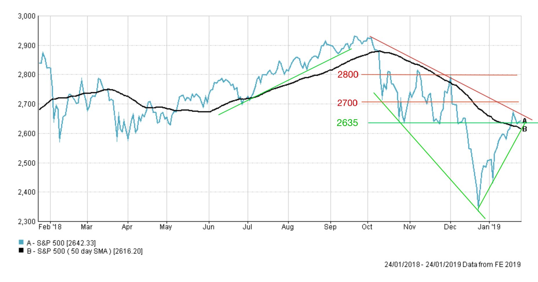
You can see that the S&P 500 has made an unbelievable turnaround in 2019 up over 10% from the low on Christmas Eve when it hit 2351, which was crucially below the market low of 2018. It may seem strange but round numbers (such as 2400, 2500, 2600 etc) on the S&P 500 have a psychological hold over traders and can act as resistance or support levels themselves. As the market rebounded the S&P 500 broke above 2600 and now sits above the key support line around 2635. The S&P 500 is also now supported by the 50-day moving average which is marked in black. You can see on the far right of the chart that the S&P 500 has tested the support level around 2635, and in fact broke below it on an intraday basis, before closing back above it. That means there is now a significant amount of support below the S&P 500, including the uptrend line, the 2635 support level and the 50-day moving average.
However, the downward sloping resistance line from the highs in October shows that the market is still in that downtrend which it hasn't negated fully. If the market is to head higher then we have to break through this red line. Similarly, 2700 is another resistance level which could prove problematic in the short term. Keep an eye on whether the S&P 500 breaks above this level. If it does then it's likely to head back into the trading range between 2700 and 2800 for a period of time.
Right now you can see how the market is being squeezed by the rebounding uptrend from January and the downtrend line from October. We need a convincing move up or downwards to break out of the current holding pattern. On the downside, if we break lower and through 2600 it could open the door to a retest of the low we hit in December. In any event, it's unusual for the market to rebound in a v shape without a re-test, but not impossible. If you look at the left-hand side of the above chart you can see the successful retest in the sell-off in early 2018 which gave the all-clear for stocks to rally to new highs later that year. So if the market does roll over then we want to watch what happens near the low hit on Christmas Eve.
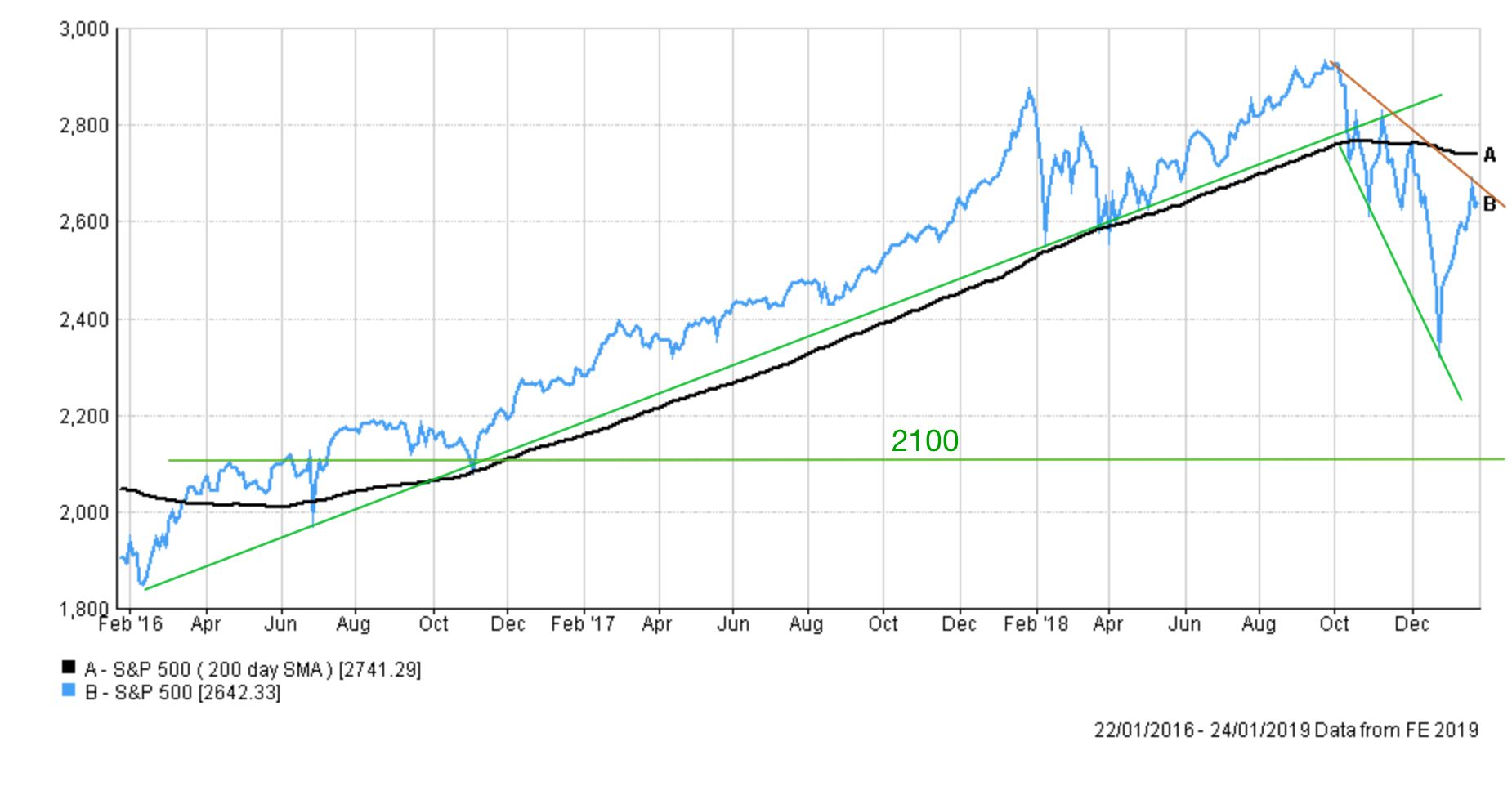
If we continue through it then it does open the door to 2100 as shown in the chart below. Most market participants are pricing this as less likely to occur and favour the market pushing higher. However, at the moment it's almost a coin toss which way it will break out. There's still a lot of negative headlines surrounding the Chinese-US trade tensions, global central bank tightening, earnings season and slowing global growth plus the index is still below the 200 day moving average (the black line below) which is often seen as a bearish sign. Right now it's safest to avoid the cheerleading from either camp, the bulls and the bears.
UK stock market
Aside from the wider stock market sell-off pulling UK stocks lower, they've also had to contend with Brexit and the fluctuations in the value of the pound (more on that later). In my last technical analysis piece I highlighted the importance of the 7000 level (which we were still above at the time) and the 6888 level (which was the market low in 2018).
In the end, the FTSE 100 broke down through these support lines, which have since become lines of resistance, making a move back towards all-time highs that bit harder. The first thing to note is that the FTSE 100 is currently still in a downtrend, highlighted by the downward sloping line. The FTSE 100 seems to be stuck in a 200 point range below 6950 and we need to break above 7000 and then 7050 if we can make an attempt at 7250. In recent history breaking above that level sees us quickly regain 7500.
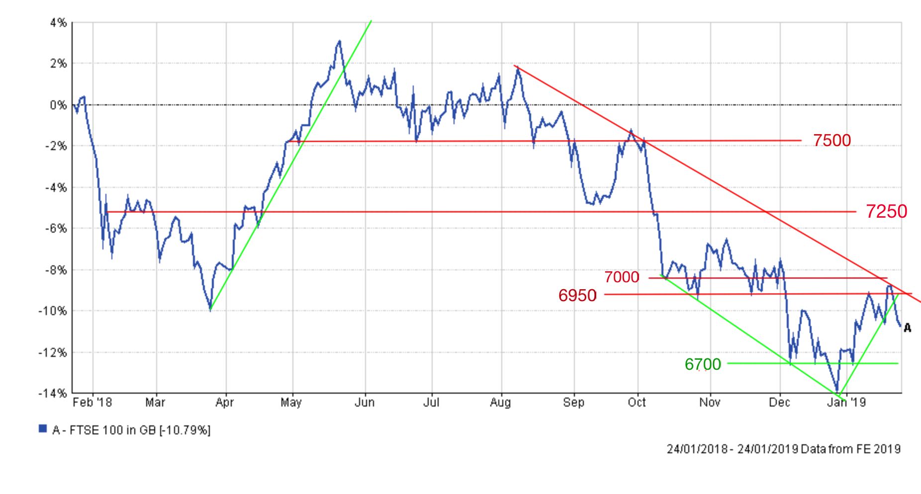
On the downside a break below the recent low of 6584 could see us visit the 6400 level we last saw before the Brexit referendum. However, Brexit and the value of the pound are going to play a major influence in where the FTSE 100 goes from here.
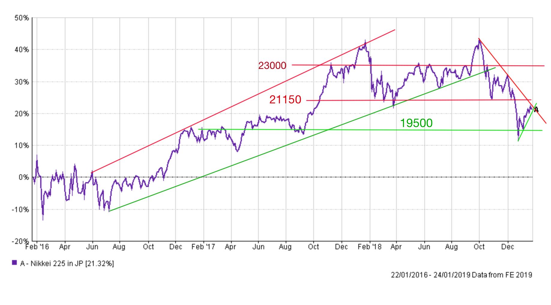
Japanese stock market
The Nikkei currently sits at 20773 just below a fairly strong resistance level of 21150. The Nikkei 225 broke out of its uptrend, that dates back to 2016, during the latter half of October and currently remains in a short term downtrend. Much like the US stock market we are waiting to see if the rebound since the New Year is the return of the bull market or actually a bear market rally (trap). Looking at how the index has become boxed in by support and resistance lines we should see a break higher or lower soon. If it breaks higher then it is likely to trade within a 1000 point range as it did for most of 2018, unless it can break above 23000 which is 10.7% higher than where we are now. That's ambitious. There's a lot of ground to make up. Looking lower, a retest of the recent low would see the index lose around 7%
Pound vs Dollar
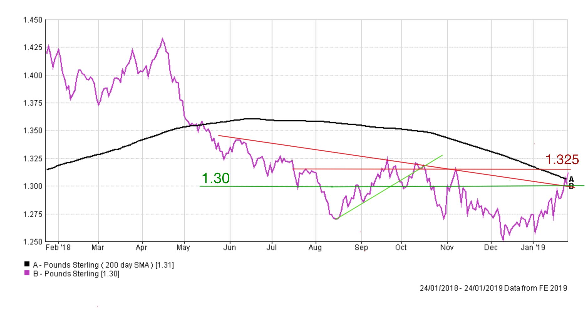
The recent move higher in the value of the pound versus the dollar has caught a lot of fund managers and traders by surprise. As you can see from the chart below the pound was in a downtrend which saw it break through the key $1.30 support line and then $1.27. If you extrapolated the move into the future it suggested we were likely to see $1.22.
However, the pound is extremely sensitive to Brexit headlines and recent suggestions that Brexit could be delayed or that we may have a second referendum has boosted the pound. So much so that those shorting (betting against) it had to scramble to cover their losses and buy the pound. This sent the pound higher still so we now sit near $1.32.
Right now the pound has broken above $1.30 and the 200-day moving average which is the black line (a bullish sign) and is eyeing resistance at $1.325. But continued strength is far from certain. The outlook for the pound has much to do with the outcome of Brexit. A positive outcome could send the pound higher and on its way to $1.37 which is fair value for the currency. Conversely, bad news could see the $1.30 level breached and a retest of the recent lows. But right now the pound has regained some of its swagger and once again shows that trying to predict the future direction of the pound while Brexit is unresolved is folly.

£200 Pension Cashback Offer
Make a qualifying deposit or transfer a pension to our partner Interactive Investor.
- Deposit or transfer a pension of at least £20k and you could earn £200 cashback
- Terms and Fees apply, Capital at risk
- New & Existing customers opening a SIPP
- Offer ends 31st July 2026
Before starting your transfer, check you won't lose any valuable benefits (such as guaranteed annuity rates or a lower protected pension age) and find out what exit fees you might have to pay
