

As regular 80-20 Investor members know, periodically I like to look at what technical analysis suggests about where key markets might be headed next. Technical analysis is not a crystal ball but instead gives you a range of possible outcomes and levels to watch. In volatile market conditions, such as those we are experiencing now, technical analysis tends to prove particularly useful and traders and professional investors start to pay greater attention to it.
As ever, I like to recap what technical analysis is and how it works. I always advise investors not to try and time the market because they will never get it right. However, there's nothing wrong with trying to determine a range of possible future outcomes within investment markets. Think of it like a weather forecast. It’s not 100% accurate but it will give you a better idea of whether a storm is on the horizon. Technical analysis is the nearest thing we have to weather forecasting in the investment world.
What is technical analysis? - A recap
For those who don't already know or have forgotten here is an explanation of what technical analysis is:
Trying to predict the future of the stock market is akin to reading tea leaves. Personal predictions are almost always clouded by prejudices which reaffirm what we ‘want’ to happen rather than what is ‘most likely’ to happen.
That is why one objective method is to use technical analysis to try and judge likely outcomes. So what is technical analysis? One line of thinking is that stock markets are driven largely by human behaviour. At the simplest level you could argue that fear and greed drive a lot of investors’ actions. Let’s say that an opportunity presents itself and some investors jump on it and buy the shares in question. The demand then drives up the price. More investors jump on the bandwagon looking to profit. Then at some point the tide turns (fear sets in) as people think the price for the shares is looking expensive and so people start selling. More and more people start selling to take profits and the price falls. At some point the price falls until others think the shares look cheap and start buying, outnumbering the number of sellers. Again demand outstrips supply and the price goes back up.
This see-sawing explains the movement you see in stock market charts such as those below. The prices at which investors start bailing and selling the shares is called a point of resistance while the point at which they pile in is called a point of support.
As such there is a surprising level of predictability to human behaviour. In terms of the stock market that means when the price goes through historic points of resistance or support it can indicate a new unfolding market rally or collapse. Why does it do this? Part of it will be because traders trading in millions of pounds will use these points of resistance and support to trigger trades. Yet for a lot of investors they might not even be aware of these inflexion points. They simply are reacting to how other people in the market behave. Put it this way, when stock markets fall you feel tempted to sell, right? Also once it starts to rally, you are tempted to jump in? That’s why these patterns have a tendency to repeat.
Some investors and traders swear by it and trade solely using technical analysis. I don’t fall into that camp. I view technical analysis like a road map drawn by someone who has already completed a journey to somewhere near where you are planning to drive to. The road map won’t take you exactly to your intended destination, nor will it be entirely accurate. However, it will give you a better sense of what to expect. Then if you decide you like the look of a particular market you can use 80-20 Investor’s ‘Best funds by Sector‘ data to choose an actual fund to invest in.
Latest technical analysis
There are different types of technical analysis, however, I find the most useful guide is to simply highlight the points of resistance and support, as I've done previously. So below I provide technical analysis, looking at areas of support (the green lines in the charts below) and resistance (the red lines), on the key global equity markets and the pound/dollar exchange rate. Click on the charts to enlarge them.
US stock market
It is worth going back to read my last technical analysis article to get a sense of how the US stock market has behaved since. At the time the market was showing some early signs of exhaustion, with the possible formation of a double-top. We were keeping a close eye on the 200 day moving average, as well as a narrowing triangle formation which was boxing the market into a corner.
As the chart below shows, ultimately the S&P 500 did break lower and even breached the 200 day moving average before rebounding off the March low of 2744. The doggedness of the market in 2019 and the buy the dip mentality were evident once again and propelled the market higher, through 2900 and ultimately to new all-time highs.
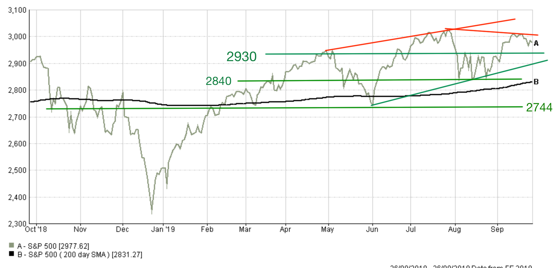
However, we saw a repeat of the Trump trade war tantrum in August and markets tumbled once again, before bouncing off 2840. The market then spent time consolidating between 2840 and 2930 before attempting and, importantly, failing to set a new all-time high.
At the moment the market is trading within an upward channel framed by the upward sloping green and red line and hasn't yet broken through the bottom of this, nor its 200 day moving average. The recent sector level rotations we've seen within the S&P 500 has helped to sustain the recent uptrend but we now need to see the market set another new all-time high above 3025 if we are to push higher. This would require the lagging non-defensive sectors to finally set respective new all-time highs.
On the flip side there is a case that the market could be in a process of setting a lower high, or even a 'head and shoulders' pattern which would be a bearish sign, shown by the downward sloping line on the right hand side of the chart. However, it is too early to say. If the market was to break lower then 2930, 2900, 2840 and 2744 would all be important resistance lines on the way down, as well as natural entry points for dip buyers. Of course, one eye has to be kept on the December low of 2351.
Last time, I observed that the S&P 500 cold be in a larger and longer-term sideways trading pattern which began in March. This could still be the case, if we don't see a new all-time high, which means that a pullback towards 2744 is a distinct possibility in the near term. Interestingly there are signs that the market is once again starting to get boxed into a corner by a sloping resistance line and a rising line of support. If that's the case then we should get a resolution soon, higher or lower.
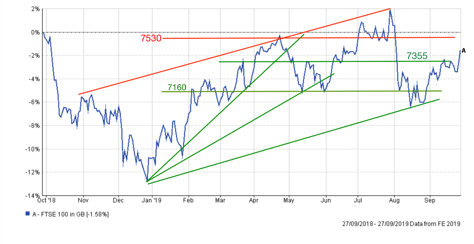
UK stock market
At the time of writing the FTSE 100 sits at 7415 but as the chart below shows it's been a bit of a mess since the start of August. The FTSE 100 was buffeted by the twin titans of the US-China trade war and Brexit. In fact the latter has played havoc with the value of the pound (see later in this article) which in turn has had a huge impact on the fortunes of the FTSE 100.
Where the US stock market (see above) began to stabilise and find a floor during August the FTSE 100 continued to tumble as the angst over Brexit increased. Having said that, if you look at the technical chart below there is a case for the FTSE 100 still being in a medium-term uptrend which started from the Christmas Eve low. The uptrend is sandwiched between the parallel upward-sloping red and green lines.
Right now the FTSE 100 is back within a wide trading range between 7160 and 7530, with 7355 proving a pivotal support line. In recent months when we've broken above 7355 we've tended to visit 7500, while conversely when we've broken below 7355 the index almost inevitably has revisited the lower bound of 7160. Interestingly, 7355 also happens to be the current 200-day moving average giving it even more gravitas. 7350-7355 will be a crucial support area in the coming weeks and months.
If we do break below 7160 then 7090 and 7000 remain crucial support levels. Below there then we'd need to consider a retest of the December low (6584).
On the upside, 7530 needs to be tested and broken and then we could go looking for the recent high point of 7686, which is 3.65% higher than where the index currently stands. Ultimately, Brexit and UK politics are going to have a huge bearing on where we are headed next (higher or lower) and as August shows the move could be violent in either direction. Expect continued levels of short term volatility.
Japanese stock market
Unlike UK and US equities, Japanese stocks entered a new downtrend this summer breaking the important 21150 support line and retesting February's low of 20260. Had that level given way then a retest of the December low of 19155 was on the cards. As it turned out the market bounced off 20260, partly helped by a weakening of the yen versus the US dollar. The Nikkei's latest move upwards has been particularly aggressive, although it faltered at 22300, the peak from April, which is now proving a strong level of resistance. If the Nikkei can break above that it could potentially push towards 23000, which is 5.7% above where the index currently resides at 21755. This also happens to be roughly the same level that the index was at during my last technical analysis update.
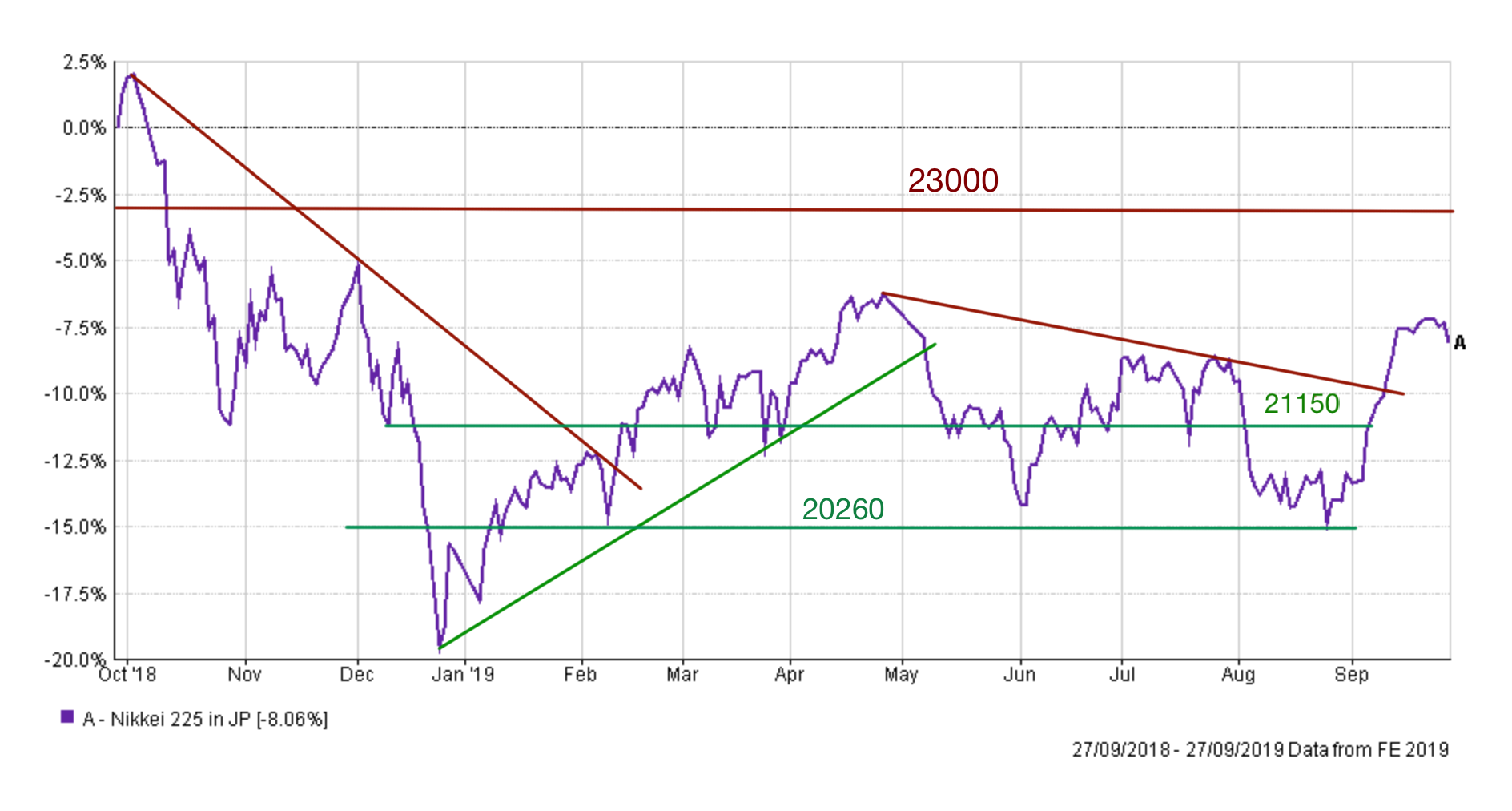
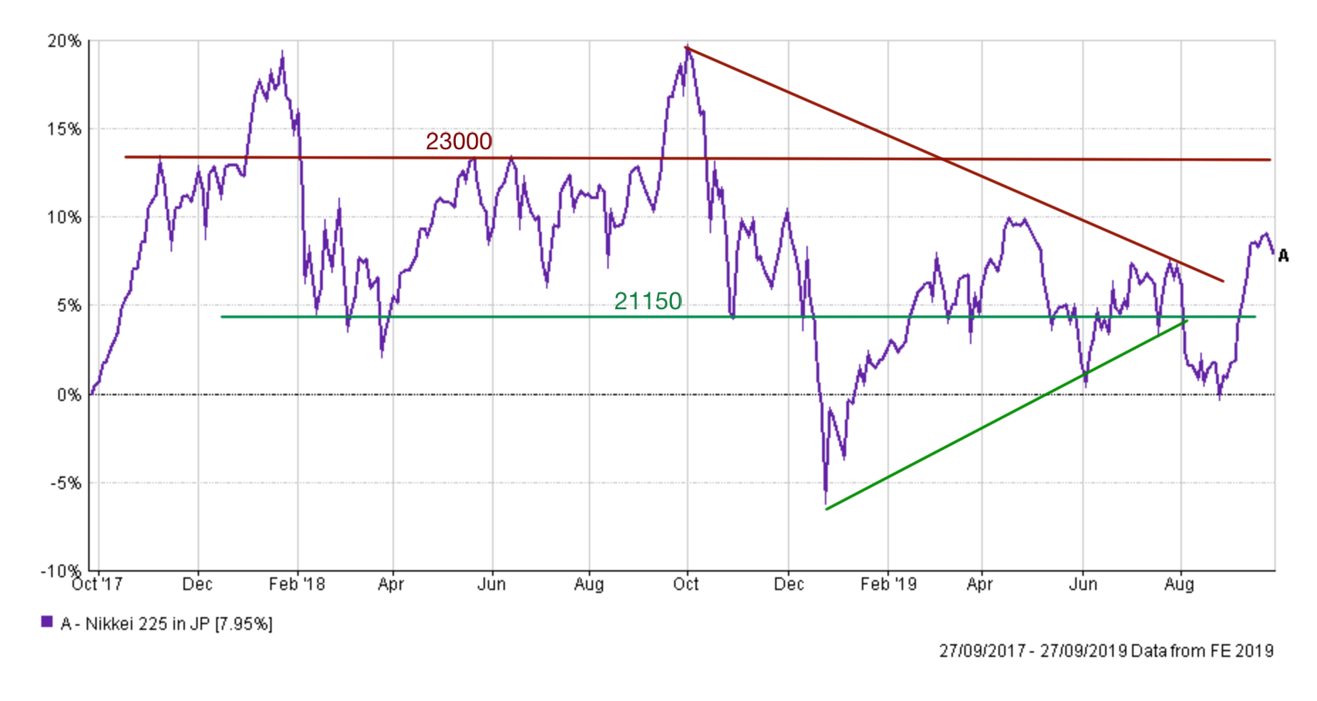
If we zoom out and look at the price action over the last two years you can see that the Nikkei 225 is back in a range between 21150 and 23000 as shown below. I have also included a green uptrend line which crossed the 21150 support level at the exact point that the market broke down in August. This highlights how important 21150 will be going forward from a support perspective. Fall below that and we could retest 20260 again and ultimately December's low of 19155.
Pound vs Dollar
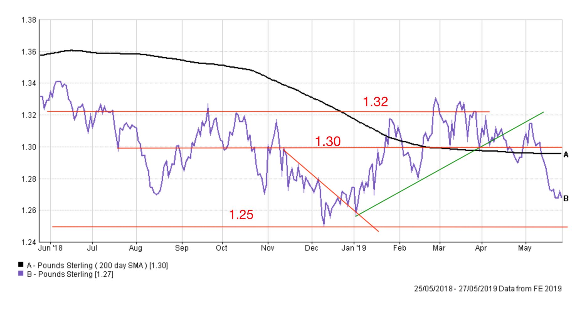
The outlook for the pound is much bleaker than when I published my last analysis. The chart below is the chart I published in May when the market was looking to retest $1.25
The updated chart now looks like this...
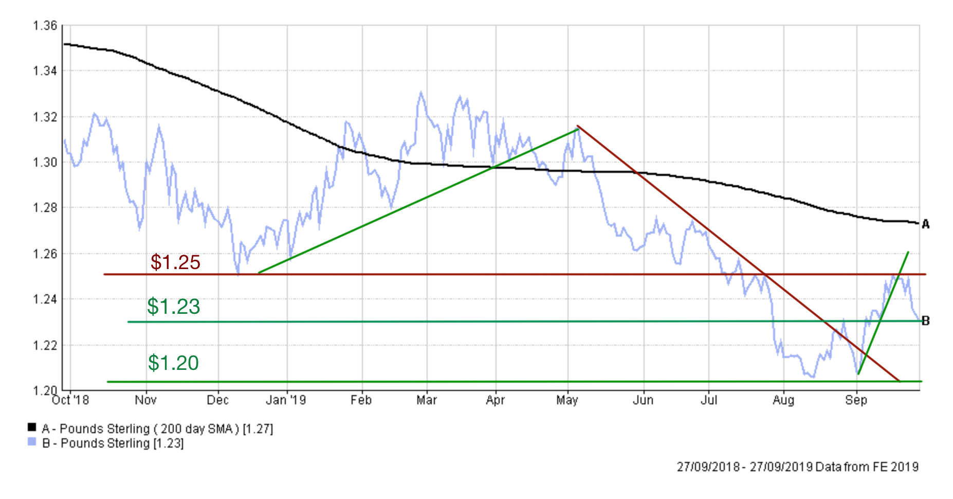
Last time I wrote about "the pound crashing through the important $1.30 support line and through its 200 day moving average to paint a bearish picture". That move ultimately sparked an aggressive downtrend over the summer which broke the key support level of $1.25 and ultimately saw the pound test the $1.20 support line. This level of weakness had not been seen since the aftermath of the Brexit vote. September has now seen some value hunters come back into the market pushing the market back above $1.23 but ultimately failing to hold above the, now, resistance line of $1.25.
The level of volatility in the value of the pound, as a result of Brexit, is on a par with that seen in emerging market currencies which will give investors a headache. Much depends on UK politics in the short term and if the pound is to break higher then it needs to hold above $1.25. Then $1.27 and $1.30 become key resistance lines which must also be broken.
While that seems unlikely right now if a deal is suddenly struck between the EU and the UK or we revoke Article 50 then the pound could shoot higher, as those shorting (betting against) the pound would scramble to close their positions and buy the currency. Conversely, if the pound breaks below $1.23 again, there is a real chance that $1.20 will be tested once again.

£200 Pension Cashback Offer
Make a qualifying deposit or transfer a pension to our partner Interactive Investor.
- Deposit or transfer a pension of at least £20k and you could earn £200 cashback
- Terms and Fees apply, Capital at risk
- New & Existing customers opening a SIPP
- Offer ends 31st July 2026
Before starting your transfer, check you won't lose any valuable benefits (such as guaranteed annuity rates or a lower protected pension age) and find out what exit fees you might have to pay
