

One of the most frequent questions I receive on 80-20 Investor is what asset mix should you follow? Which sectors should people invest in and in what proportions?
Of course my answer is that I can't provide advice and it is a personal choice. It is also dependent on your attitude to risk and objectives. The more risk-averse you are the less you will invest in higher-risk assets such as emerging market equities. The more adventurous you are the more investment risk you will be comfortable with taking.
My 50k portfolio approach
Next I often point people towards my own £50k portfolio and the monthly review articles. These demonstrate how I invest money using 80-20 Investor but most importantly they demonstrate how I manage risk. Or in other words how I attempt to gain the optimum return without taking excessive risk. Personally, when investing my portfolio I am usually guided by the asset mix of the BOTB, but I do also deviate from it. Admittedly my portfolio tends to be more on the cautious side.
Fixed allocation approach
As you know, 80-20 Investor was built to be flexible so that members could use it to fit their own investment style, views or desired asset mix. For example, they may want to mainly invest in US equities so by using the BOTB and BFBS tables they could research the funds showing momentum within US equity sectors, be they unit trusts, investment trusts or ETFs.
Of course, not everyone will have a specific asset allocation in mind, most people don't. For investors who want to determine a static asset mix (or framework) within which they can invest, the question is how do you decide that base asset mix?
Perfect Portfolios
Over the years there have been a number of famous books and research articles that have produced 'perfect portfolios', which their authors claim have proven track records. For the purposes of this article I have sought out and analysed four of these portfolios. Each of these portfolios has been constructed with the aim of trying to simplify the investment process by giving a core asset mix which investors should invest in accordance with and periodically rebalance. I will call them the 'perfect portfolios' as most have been heralded by their creators (and advocates) for their ability to produce strong returns in almost all market conditions.
The portfolios I have included in this analysis are listed below with links to articles or books where you can find out more about them:
You will also be aware of the 80-20 Investor Perfect Portfolio which I constructed based upon research that I carried out for 80-20 Investor members. This portfolio prioritises downside protection (more so than the above portfolios) and you can read more about it in my article 'The Perfect ISA portfolio 2020 – setting new records'. The portfolio still maintains a perfect track record of making money in every tax year since the inception of ISAs in the year 2000.
I have also included a Perfect Gold Portfolio which replaces the cash element of the original 80-20 Investor Perfect Portfolio with gold.
The problem with each of the four portfolios listed earlier is that they are American. So have been designed for American investors in mind and the assets/funds they have access to. So in order to carry out this research I first had to anglicise them. Below I list each of the portfolios and their asset allocations:
80-20 Investor Perfect Portfolio
- 9% Cash
- 20% UK Equity Income
- 71% UK Gilts
80-20 Investor Perfect Gold Portfolio
- 9% ETFS Physical Gold
- 20% UK Equity Income
- 71% UK Gilts
Harry Browne Permanent Portfolio
- 25% ETFS Physical Gold
- 25% Cash
- 25% UK Equities
- 25% UK Gilts
Ivy League Portfolio
- 30% UK Equities
- 15% Global Equities
- 5% Emerging Market Equities
- 20% Property Equities
- 15% Gilts
- 15% Index-Linked Gilts
Gone Fishin' Portfolio
- 5% Ruffer Gold
- 10% Asia ex-Japan Equities
- 10% Europe ex-UK Equities
- 10% Global Bonds
- 10% Global Emerging Market Equities
- 15% UK Equities
- 15% UK Smaller Companies
- 5% Property Equities
- 10% Sterling High Yield
- 10% UK Gilts
Ray Dalio All Weather
- 7.5% ETFS Gold Physical
- 7.5% Commodities and Energy ETFs
- 15% Sterling Corporate Bond
- 30% UK Equities
- 40% UK Gilts
In order to chart the performance of each portfolio I have assumed that investors achieved the average return for the sectors relating to each asset mix. I have assumed that unit trusts were used unless stated otherwise. So for UK Equity I have assumed the average return for the UK All Companies sector etc.
Now while most portfolios suggested domestic equities in their construction the Gone Fishin' portfolio assumes US equities as standard. In fact it has zero UK equity exposure. This means that if I was to make a like for like comparison I need to change this to UK Equities to be in line with the other portfolios. This portfolio is called the Gone Fishin' UK version.
The first chart below shows the performance of each portfolio year to date:
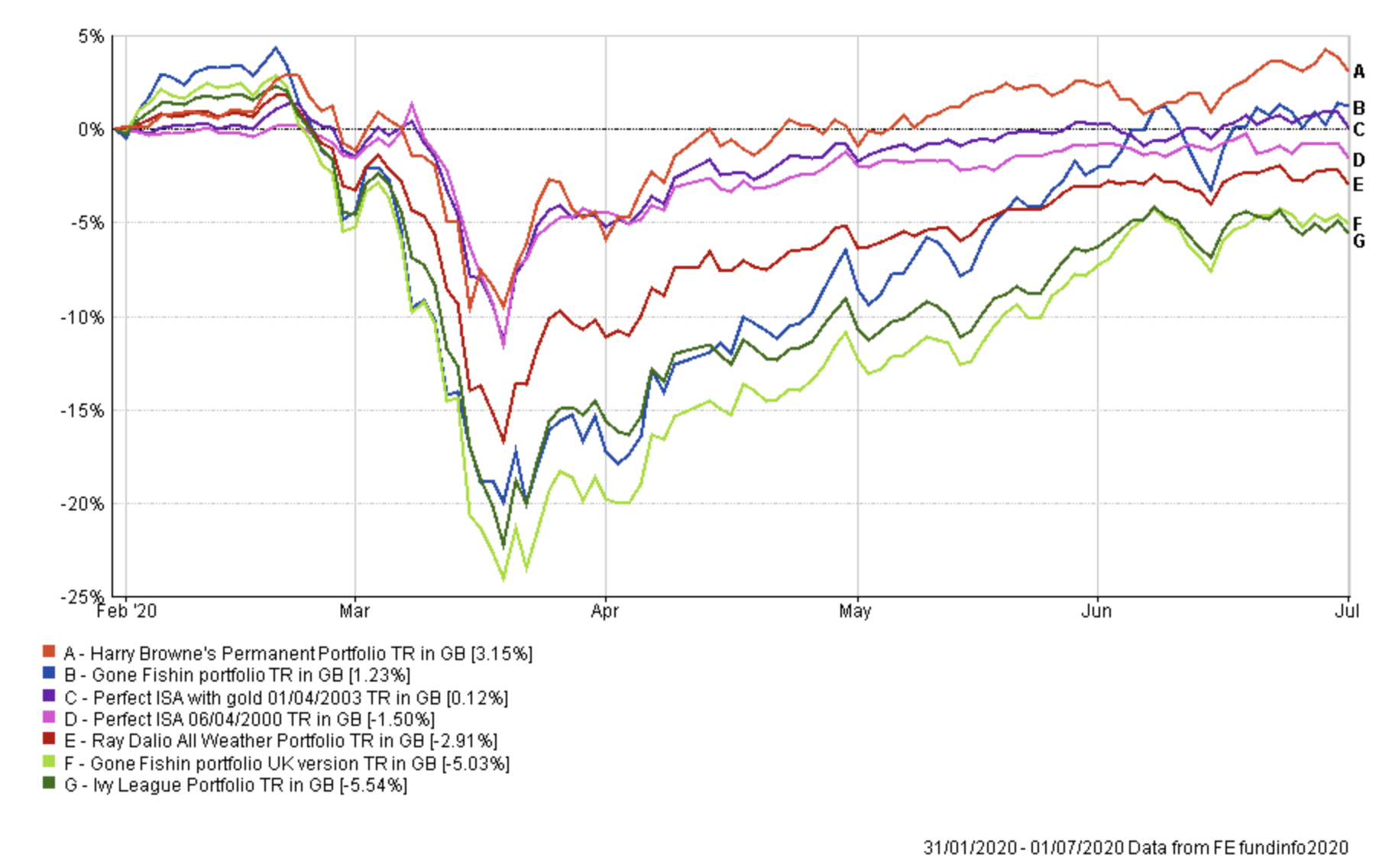
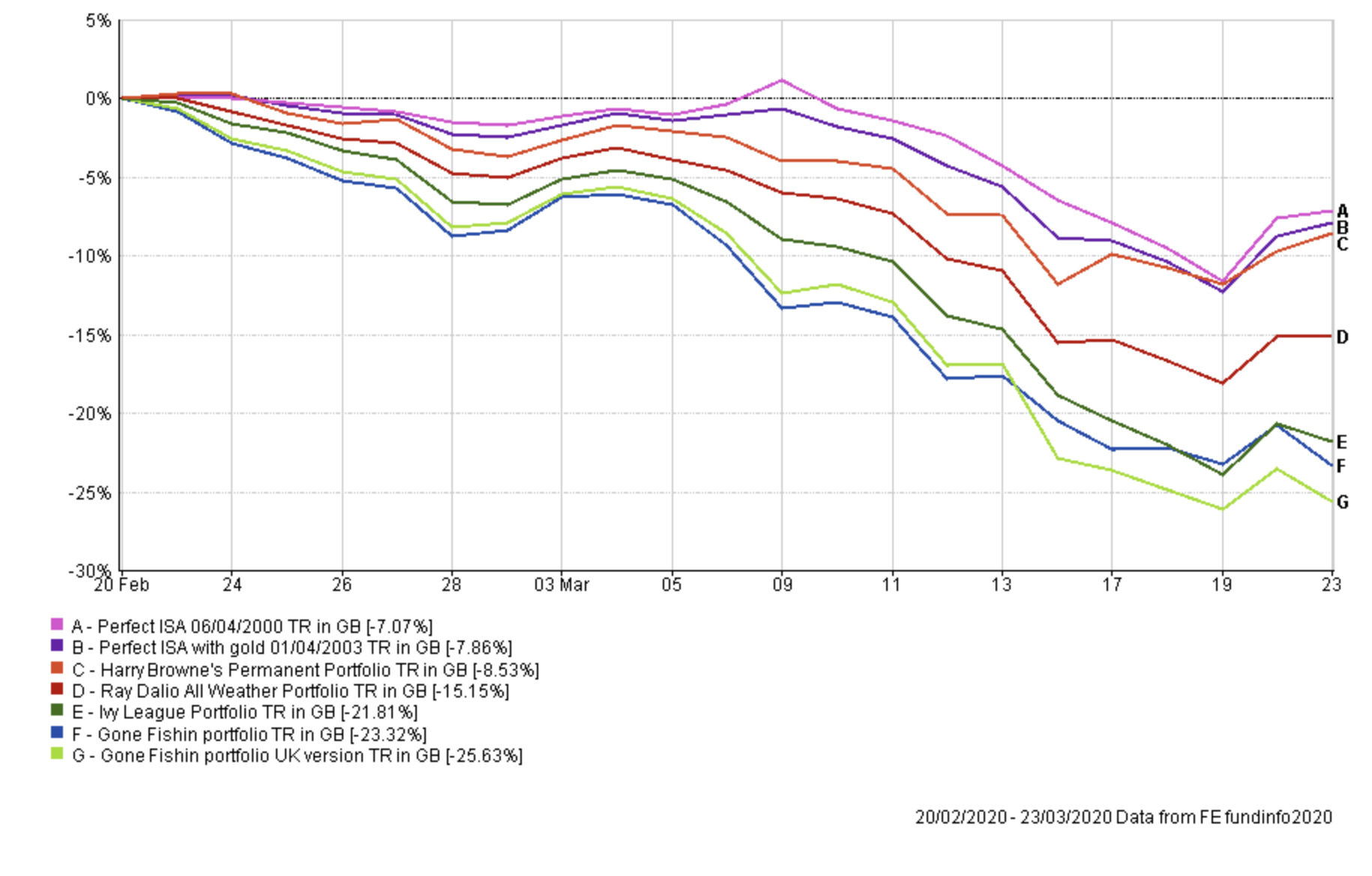
In the next chart I focus on the drawdown during the worst of the coronavirus sell-off. This gives you an idea of the overall level of risk each portfolio takes and which prioritise downside protection. It is great to see the 80-20 Investor Perfect Portfolios protecting capital the best, as they were designed to do.
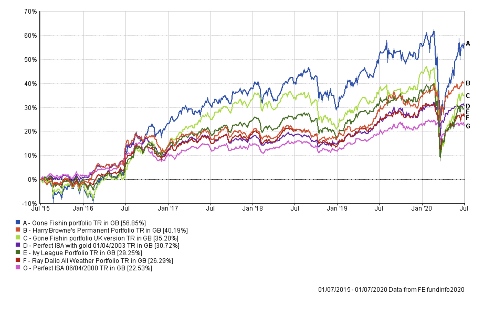
Now we'll zoom out and look at the performance over 5 years to date:
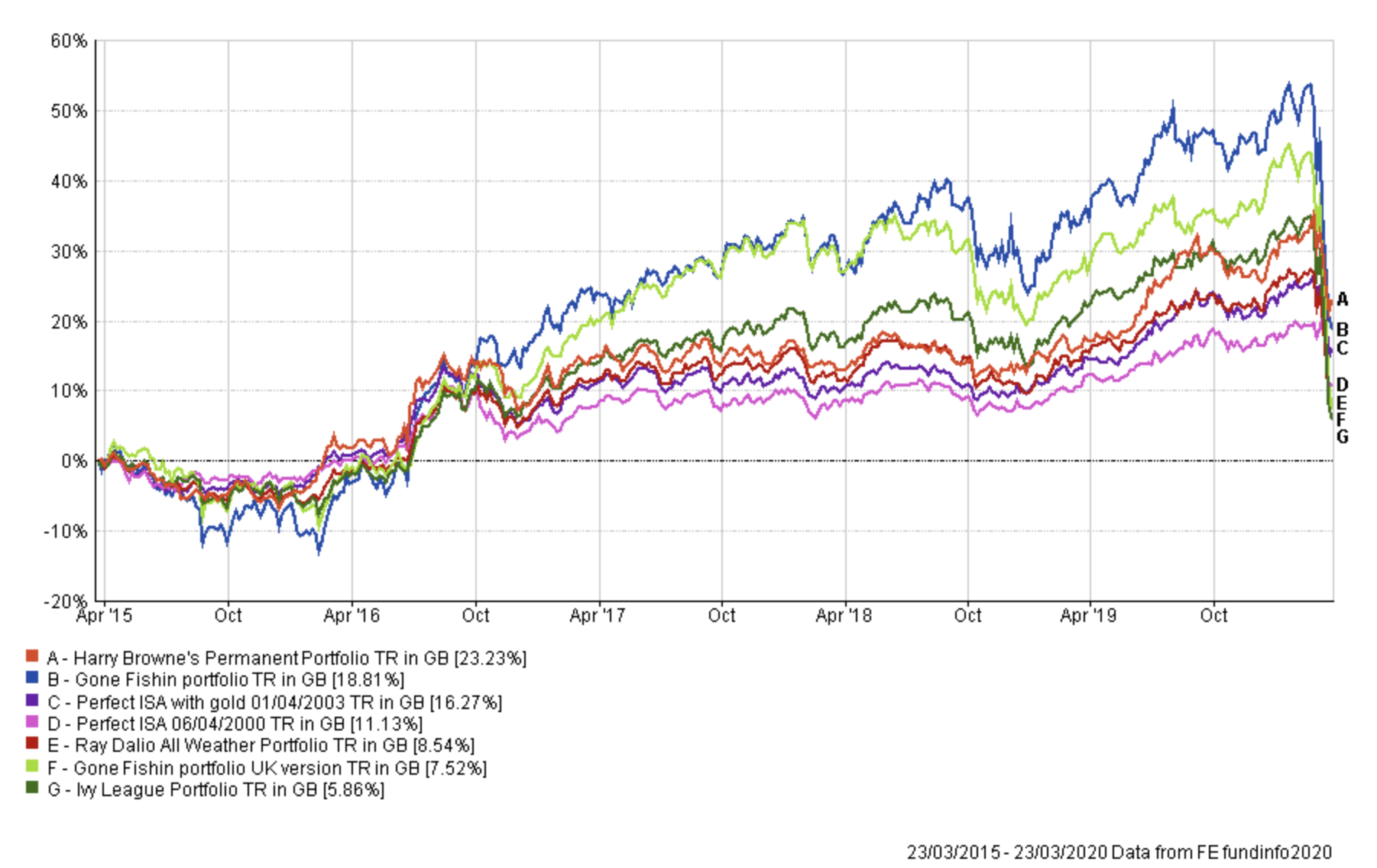
Interestingly if you took the 5 year period to the March low, the rankings performance figures look very different:
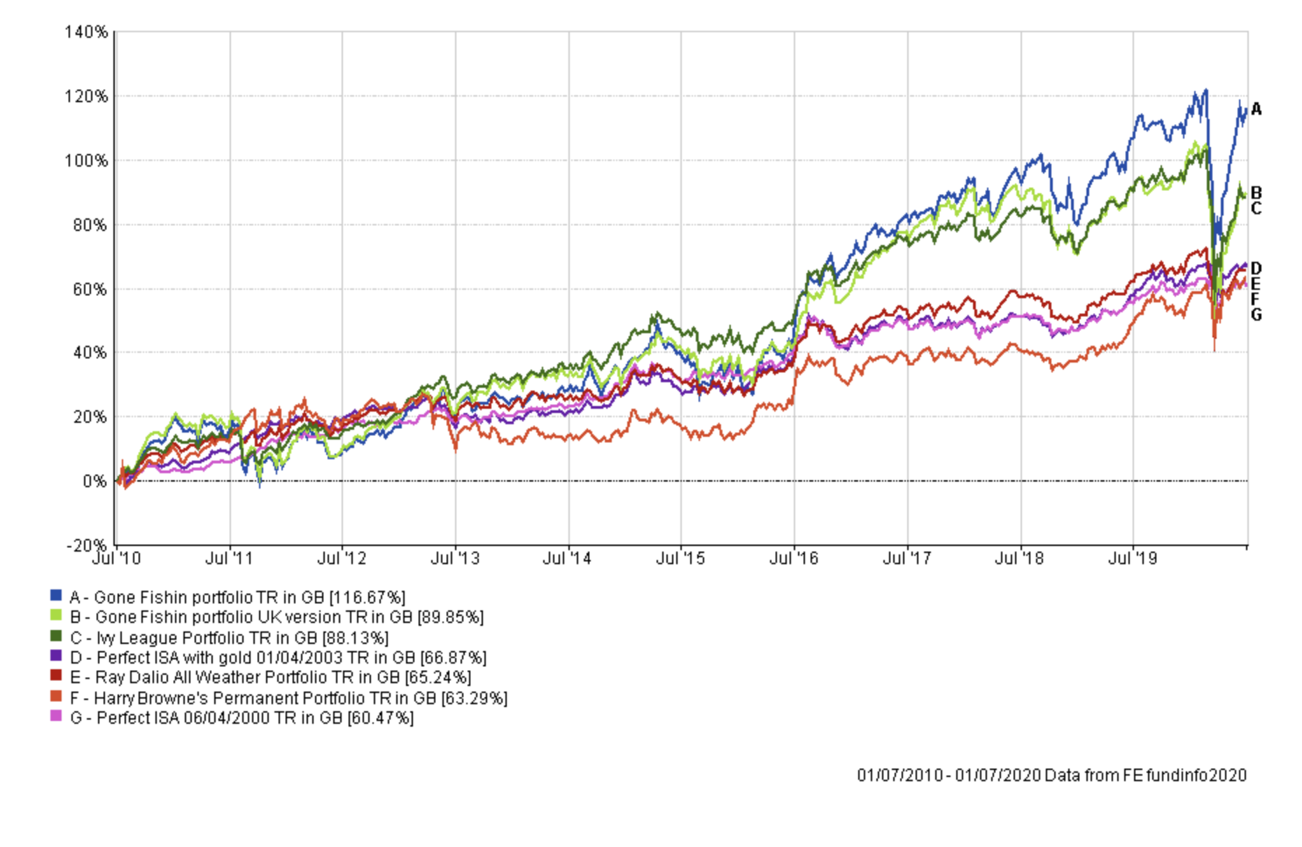
Here is the performance of all of the portfolios over the last 10 years to date:
Observations
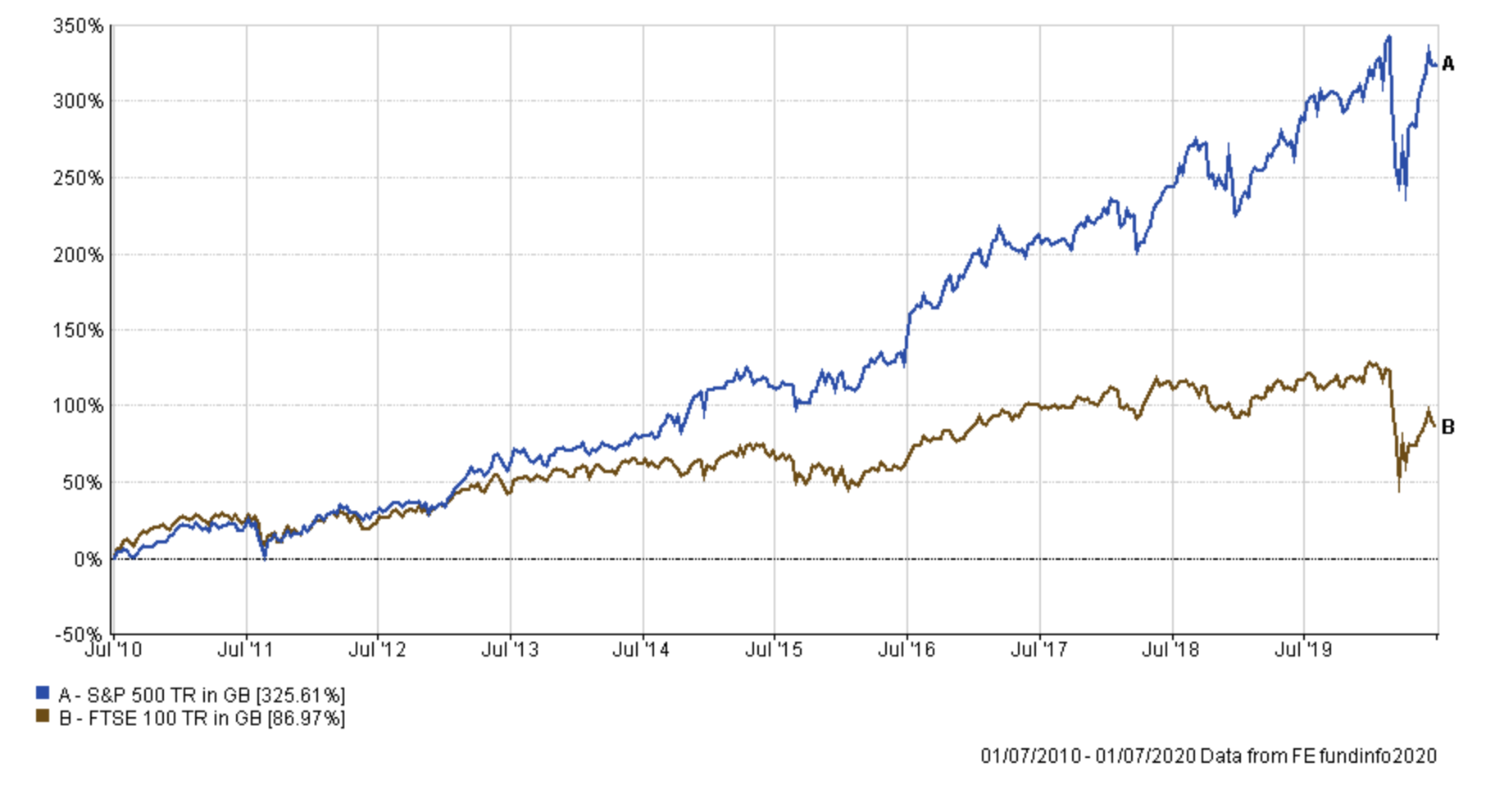
The first observation to make is that the original Gone Fishin' portfolio should almost be excluded from the comparison because of its exclusive US equity exposure. When you compare this Gone FIshin' portfolio to its UK version you can see how much the former has benefited from a lack of UK equity exposure and its significant exposure to US equities and currency movements. If you compare the FTSE 100 versus the S&P 500 over the last 10 years you can see that since the financial crisis US equities have massively outperformed UK equities.
It does demonstrate how you could adapt any of the portfolios by replacing the UK equity exposure with US equity exposure (or at least favouring the latter). Of course there is no certainty that the outperformance of US equities shown above will continue into the future, but there is also no evidence that it won't. The US equity bias with limited UK equity exposure is exactly why Vanguard's Lifestrategy funds have performed so well in recent years.
The earlier performance charts also show the benefits of keeping it simple, with the Harry Browne portfolio and the 80-20 Investor Perfect Portfolios performing the best across and into a major downturn. It is only when we extend the time period to 10 years that the Ivy league and Gone Fishin' portfolio start to outperform significantly, but then they should do as they have a 70% equity exposure versus 20% for the 80-20 Investor portfolios and 25% for the Harry Browne portfolio. But gold has equity-like volatility so the Harry Browne portfolio has a much higher level of investment risk than its equity content suggests. The same goes for any portfolio that has exposure to gold.
What is interesting is that the portfolios that have held up the best in 2020 are those with gold exposure. There have been increasing questions raised as to whether a simple bond/equity portfolio is losing its diversification benefits in this QE era.
The table below provides key summary statistics for each portfolio which allow for comparison and for people to decide which they might want to model their portfolio on. The key metrics are colour coded in each column with dark green being the best and red being the worst. Below the table I explain what each key statistic represents. You can see that some of the best performing portfolios don't manage risk particularly well or generate much alpha. They simply ride the market moves.
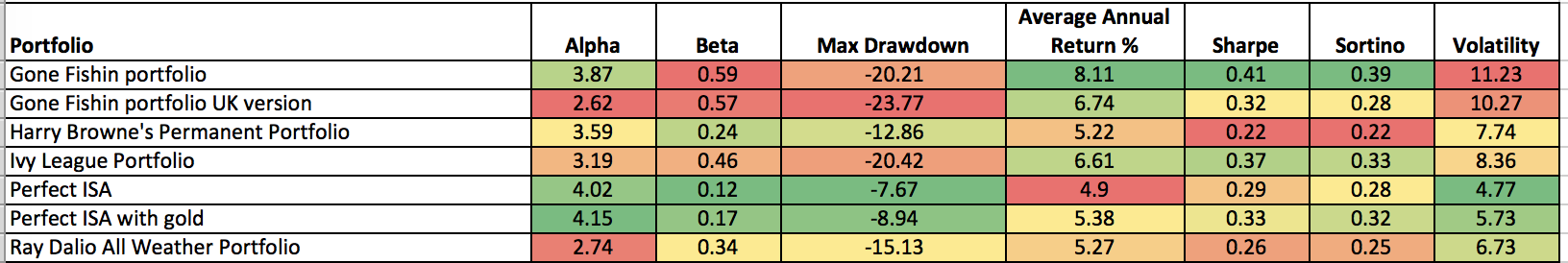
Alpha
Alpha is a figure which measures a manager’s apparent skill at picking winning investments versus their benchmark. Alpha is the excess return versus the return of a fund’s benchmark (i.e the market). So a fund with a positive alpha indicates that the fund manager has outperformed through skill. While a negative alpha figure would indicate underperformance. The higher the alpha figure the better
Beta
Beta measures a fund’s sensitivity to the general market in which it operates. The market always has a beta of 1 by definition. So if a fund also has a beta of 1 that would mean that if the market rose by 5% then so should the fund. If the fund has a beta of -1 then as the market rises so the fund falls. A well-managed index fund will have a beta of exactly 1. Funds that outperform the market when it does well but do even worse when the market is going down will have a beta above 1.
Maximum Drawdown
This is the biggest fall experienced in a given week.
Sharpe Ratio
The Sharpe Ratio is a measure of the excess return a manager is achieving for the risk they are taking. The higher the Sharpe Ratio the better.
Sortino Ratio
This is very similar to the Sharpe Ratio but places more emphasis on the manager's ability to manage on the downside.
Volatility
This is a measure of a funds dispersion of returns, or in plain English the variability in those returns. Think of it as a measure of how much a building is prone to wobble. The more prone it is (the higher the volatility) the more it will sway in an earthquake.
Using 80-20 Investor with the Perfect Portfolios
Of course, one thing to bear in mind overall is that you can't buy the average performance of a sector. It is possible to buy trackers of major equity indices. But if you were to use a portfolio such as the Harry Browne portfolio but had bought and held the wrong funds, instead of achieving the average 10-year performance of 63.29% shown in the chart above you would have received 38.26%.
Which raises the question of how to pick the right funds? This is where 80-20 Investor comes in.
Whatever the asset pick you choose, whether it's one of the above or something else then you can use the research in 80-20 Investor to help identify funds within those sectors showing momentum. The chart below shows the hypothetical scenario of the original Gone Fishin' portfolio assuming you secured at least the sector average performance versus that of following the Gone Fishin' asset mix but using 80-20 Investor to pick one fund within each sector and changing every six months. The 80-20 Investor version wins.
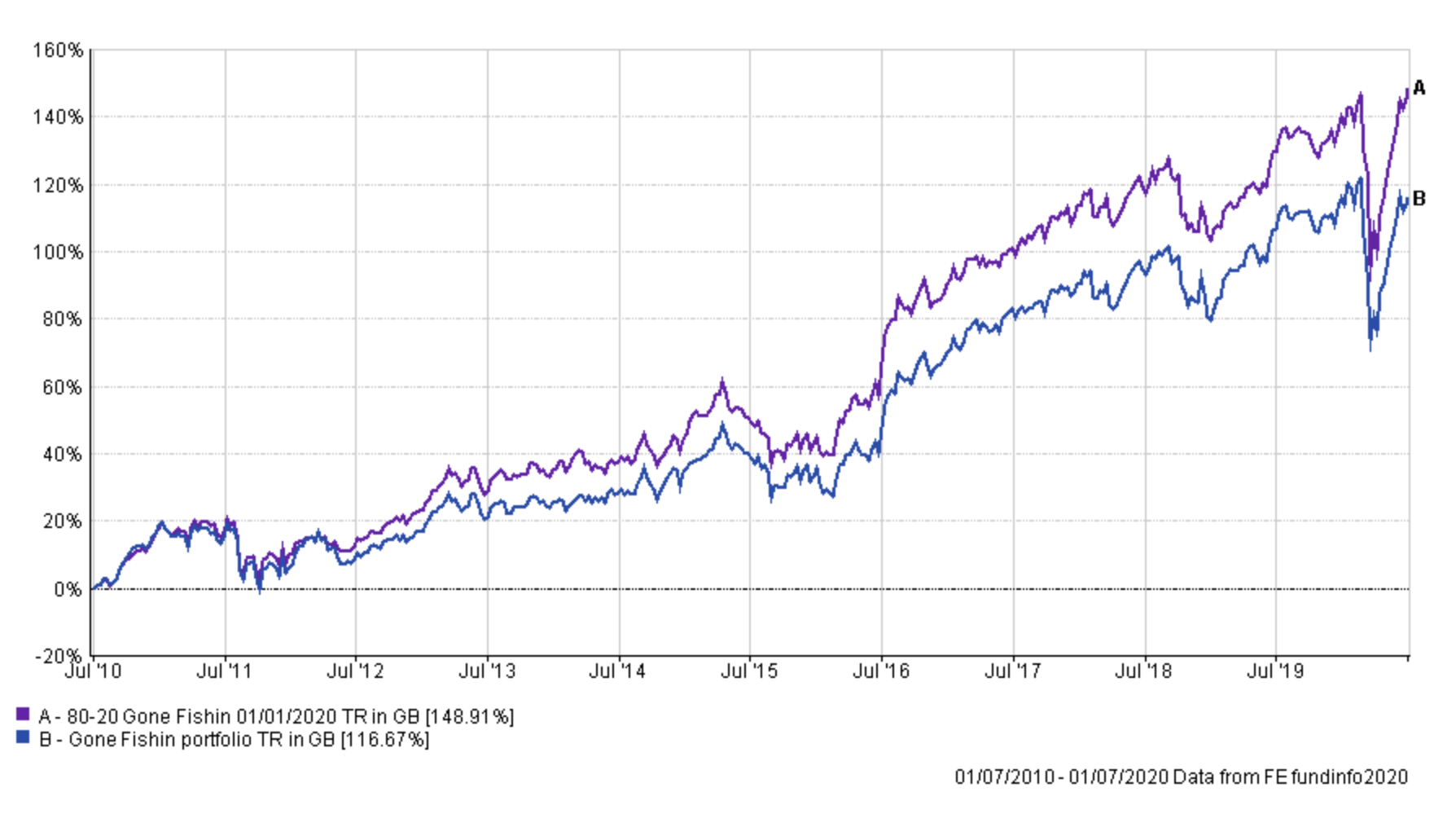
I previously produced a similar piece of analysis on the 80-20 Investor Perfect Portfolio which showed the same impact.
Hopefully, this article provides insight and a basis to build your own asset allocations, based upon tried and tested research. How you use and adapt them is up to you and you can mix and match, focusing on the key characteristics (perhaps downside protection) that matter to you.
Further reading
Should you ever invest in gold? If so how much?
Rebalancing your portfolio: is it worth it and how often should you do it?
The sectors where active funds beat passives

£200 Pension Cashback Offer
Make a qualifying deposit or transfer a pension to our partner Interactive Investor.
- Deposit or transfer a pension of at least £20k and you could earn £200 cashback
- Terms and Fees apply, Capital at risk
- New & Existing customers opening a SIPP
- Offer ends 31st July 2026
Before starting your transfer, check you won't lose any valuable benefits (such as guaranteed annuity rates or a lower protected pension age) and find out what exit fees you might have to pay
