

In a recent Chatterbox an 80-20 Investor member asked the following...
"Just an idea for the BOTB and BFBS. I note that some funds stay in the aforementioned lists for several months and others don’t. Some will appear and then disappear only to resurface once more. I hope I explained this okay.
What do you think to the idea of creating some sort of chart perhaps a simple bar graph that shows the frequency of how many times a particular fund appears in either list over say a 12 month period? Maybe not the best examples but the T. Rowe Price US Large Cap Growth Equity fund would demonstrate some serious staying power whereas the UK Aberdeen real estate fund I think it was called, made a mere one appearance in the BOTB list I recall a few months ago and then disappeared and never reappeared. Others were closer. Fidelity American and L&G Global 100 index would be somewhere in the middle.
Perhaps done by sector or just as more of a best of the best across all sectors and risk profiles?
Perhaps some usefulness towards smoothing out the ups and downs further when picking funds by highlighting those with more persistent performance and therefore maybe help towards creating a portfolio with fewer fund changes required?"
At the time I responded...
"I really like the suggestion although it would require a redesign of the site. Perhaps it could make a useful research piece in its own right. Something for me to ponder."
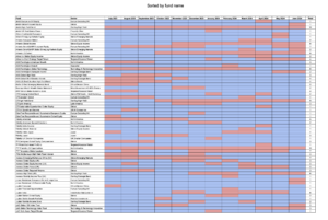
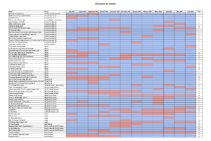
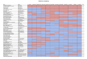
The BOTB scorecard
Having now had time to collate the information I have produced a BOTB scorecard (If you have a better name please let me know). To create the scorecard I went back and determined which months each fund had appeared in the BOTB over the last year. Where a fund appeared in the BOTB in a given month it is represented by a red square. If it did not appear in the BOTB in a given month then the square is coloured blue. At the far right of the table you can see the total number of months in the last year that each fund has appeared in the BOTB (with 12 being the maximum number obviously).
The first table is ranked by the fund name in alphabetical order. The second table is grouped by sector while the third table is ranked by the total number of times funds have appeared in the BOTB over the last year. By using the three tables you can seek out funds that performed well in given time periods or the most consistent funds within a given sector. Additionally, you might look for the most consistent fund over the entire year, irrespective of the sector a fund resides in. Of course, the tables don't state the risk profile of each fund, as they can change over time, but you can use the existing 80-20 Investor heatmap to gauge a sector's general risk level.
Click on each image to download the PDFs.
Scorecard sorted alphabetically

Scorecard sorted by sector

Scorecard sorted by consistency


£200 Pension Cashback Offer
Make a qualifying deposit or transfer a pension to our partner Interactive Investor.
- Deposit or transfer a pension of at least £20k and you could earn £200 cashback
- Terms and Fees apply, Capital at risk
- New & Existing customers opening a SIPP
- Offer ends 31st July 2026
Before starting your transfer, check you won't lose any valuable benefits (such as guaranteed annuity rates or a lower protected pension age) and find out what exit fees you might have to pay
