

Over the last couple of years I've explored the idea of fund costs and performance. The first piece of research I carried out was for the article 'Buy cheap, buy twice?'
In that particular research piece I looked at the UK All Companies sector and the performance of funds versus their annual charge (OCF) over numerous five year periods. In order to carry out the research I grouped the cost of funds within the largest unit trust sector (namely UK All Companies) into quartiles based on cost (from cheapest to most expensive). I then examined the average performance of each band over multiple five year periods.
The result was that there wasn't a direct relationship between cost and net performance (that's performance after charges). However there was an anomaly whereby funds with an OCF of around 1.22% fared worse while those nearer 1.6% fared best. I then went on to explore what might explain this anomaly, although I didn't know for sure at the time.
You will recall that recently I carried out research on whether fund manager performance is purely down to luck. There was evidence to suggest that while luck plays a part in the consistent outperformance of the best funds it can not be explained solely by chance. Other factors such as the narrowness of the manager's investment mandate were contributing factors but interestingly cost was also a factor. Around 71% of the outperforming funds charged less than 1% a year. Whereas only 33% of the worst performing funds charged under 1% a year.
While the first piece of research looked at multiple time frames the second focused on the most recent five year period. The first was the more exhaustive piece of research on the cost vs net performance debate as the latter research merely provided an observation which needed further exploration.
It did raise an interesting question? Had the goal posts moved at all? Was the so called sweet spot for charges vs performance now much lower? Did I need to review my conclusions? What would happen if we also included ETFs and not just unit trusts.
Funds are getting cheaper
As a starting point I went back to the original data that I analysed in 2015 and calculated the average OCF at the time. This was 1.39%. I repeated the same exercise, using the same funds, but at today's prices and the average OCF had dropped to 1.11%. That's over a 20% drop! We have to of course assume that there is no change in the way the data is reported by the fund houses. On that basis it would appear that investing in funds is getting cheaper. This doesn't surprise me as clean pricing (which is where an adviser's fee is no longer automatically included in a fund's cost) is increasingly the norm. Clean unbundled funds will inevitably have a lower OCF than the old bundled funds which is good news for DIY investors because in the past the adviser fee was still deducted and retained by the fund house even if you didn't have an adviser. This bumped the cost up by around 0.5%. The advent of cheap robo-advice propositions has also put extra scrutiny on the cost of funds. While there is still plenty of scope for fund charges to fall in the future it is at least a step in the right direction.
What is the optimum OCF?
In the last two years, since my original piece of research, we've also seen a flood of cheap exchange traded funds (ETFs) come to the market. These typically track a benchmark such as the FTSE 100 and charge as little as 0.2% per annum. The media and those selling passive tracking funds have been quick to point out the amount expensive funds cost investors in charges over time. Of course, it is true as shown in the table below which I've borrowed from my previous research article:
If fund A and fund B both grow at a rate of 7% a year BEFORE charges and we invest £50,000 in each then the table below shows the compounding effect of higher fund charges over time. But of course not all funds grow at the same rate. If a fund charged more but delivered far better performance it would theoretically be worth paying for. But is that likely?
| Value in Year 5 | Value in Year 10 | Value in Year 20 | Value in Year 30 | |
| Fund A (1.5% annual charge) | £65,057 | £84,649 | £143,309 | £242,621 |
| Fund B (1% annual charge) | £66,706 | £88,993 | £158,398 | £281,929 |
| Difference in £ | £1,649 | £4,344 | £15,089 | £39,308 |
| Extra % growth at end | 2.53% | 5.13% | 10.53% | 16.20% |
To tackle the charge vs net performance conundrum I've once again looked at the UK all companies sector and the net performance of each fund versus its annual charge (OCF). I then plotted all of these on a scatter chart and calculated the line of best fit to see if there was any correlation. I've also included ETF's in the chart alongside unit trusts. The chart below looks at the net return (that means after charges) over the last five years (on the y-axis) versus the annual charge on the x-axis. So each blue dot represents a real fund. In an ideal world you want to invest in dots (funds) that are highest up the chart's y-axis. Where they are positioned along the x-axis (the cost) is not as important because the performance is after these charges are deducted. So with the benefit of hindsight you'd have wanted to be in any of the four funds that are up by the 150% year performance line. Click to enlarge the image.
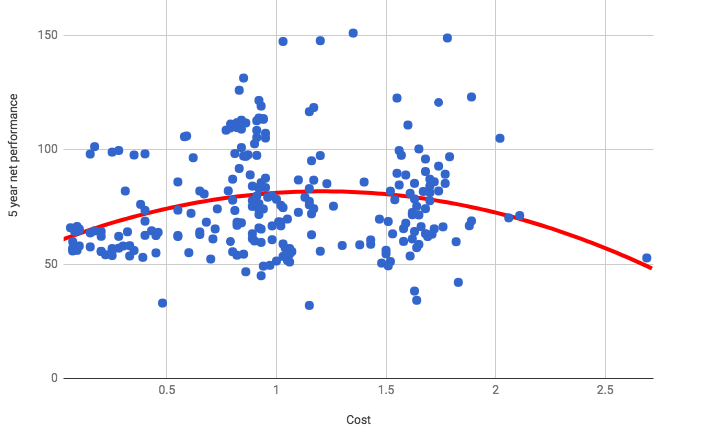
When you look at the chart first of all there doesn't seem to be much correlation between performance and cost. The average cost of the funds in this piece of research is 0.97% (the reason it is lower than previous bits of research is because I've included ETFs). The average return achieved by the sector was 77% over five years. Or in other words the typical investor in a UK focussed unit trust/etf mix of funds would have paid 0.97% and achieved 77%, which is the point roughly where the red line intersects the 1% cost gridline. With that in mind, look at the chart again and unfocus your eyes a little bit and you'll get a feel for where most of the dots are that are above the 77% return imaginary line. Clearly there's a grouping just below 1% OCF and around 1.6%. Also you can see that the greatest frequency of outperformance (i.e the biggest group of dots higher up the chart) occurs around the 1% cost line.
If we focus on the line of best fit (the red line) the first thing to say is that it is a far from conclusive relationship, although the line is calculated based upon something called polynomial equations (fancy mathematics in other words). Clearly simply focusing on fund costs limits your propensity to outperform. If you look at the funds that cost less than 0.5% (on the far left) they have generally lagged the group average return of 77%. These are predominantly ETFs and given that they track market indices by definition they won't outperform. As you move up the cost line towards 1% the performance improves, as does the range of possible outcomes (good and bad). Beyond 1% the increase in costs seemingly ceases to be warranted. Once you head above 1.5% very quickly costs start damaging your returns.
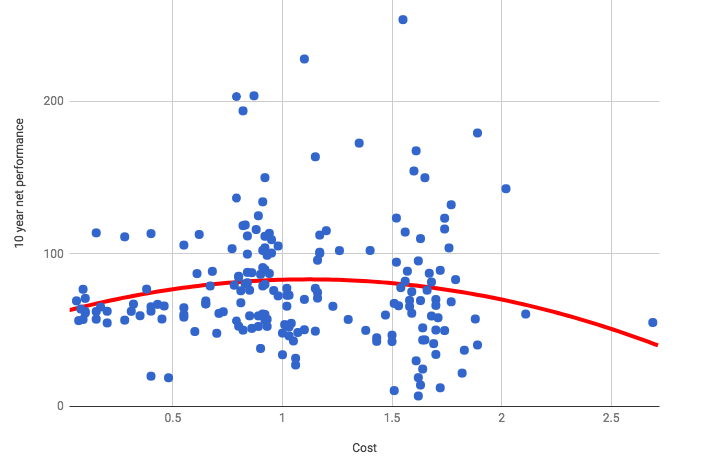
But what if we extend the time horizon to 10 years rather than 5? In this instance you can see that the red line quickly dips away as we head beyond 1.1% OCF, More importantly as costs increase the range of possible outcomes increases, but worryingly you are much more likely to underperform even at the 1.5% OCF level. The average return for all the funds in the chart was 79%.
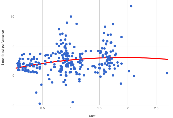
So what happens if you go the other way. Here is the chart for 3 month performance versus costs. The average 3 month performance overall was 2.5%. If you compare the general shape of this chart to those above you can see the cheapest funds are grouped around a return of 2.5% while further up the cost scale the actively managed funds have had a greater chance of outperforming (and underperforming - but to a lesser degree).
Conclusion
Firstly simply buying cheap funds is not an investment strategy that will maximise your potential investment returns. Cutting costs certainly doesn't guarantee to improve net performance. If you were investing for 5 years then paying up to 1.5% can still be worth it in a buy and hold strategy. However, the longer you buy and hold the more costs have an impact. For a ten year investment time frame keeping costs nearer 1% would appear to be the optimum.
However, the impact of reviewing your funds regularly, as we do in 80-20 Investor, actually minimises the impact of charges. In fact the cost of the fund is almost irrelevant. So as a general rule of thumb those investing for five years shouldn't pay more than 1.6% for a fund. Those investing for 10 years plus should be more cost orientated and aim for nearer 1% per annum charge. However if you are regularly reviewing your funds (and hopefully riding momentum and picking more winners) costs become a minor issue. Indeed if investing in cheap funds eventually becomes the most profitable thing to do then momentum will start to favour these.
Despite this it is probably good practice to check the cost of a fund when you can't decide between two funds in the 80-20 Investor fund shortlists and opt for the cheapest. On that note I decided to calculate my own £50,000 average OCF and interestingly it is 0.987%. Costs are important but clearly sound investment process is arguably more important. Furthermore as costs become increasingly scrutinised by the media and regulators this can only be a good thing for investors and your overall OCF will be driven down.
To sum up, only buying the cheapest funds limits your upside potential. You will most likely achieve average 'net performance' while paying below average price for it. The next time you read an investment story in the national that just talks about costs, just remember it's more complicated than that. Net performance (after charges) is more important and even then you only need to keep an eye on costs so that you are not overpaying.

£200 Pension Cashback Offer
Make a qualifying deposit or transfer a pension to our partner Interactive Investor.
- Deposit or transfer a pension of at least £20k and you could earn £200 cashback
- Terms and Fees apply, Capital at risk
- New & Existing customers opening a SIPP
- Offer ends 31st July 2026
Before starting your transfer, check you won't lose any valuable benefits (such as guaranteed annuity rates or a lower protected pension age) and find out what exit fees you might have to pay
