

I was asked the following interesting question in November's Chatterbox:
“Hi Damien, I was wondering if there’s any merit to Warren Buffett’s advice “Be fearful when others are greedy and greedy when others are fearful”? Is it possible to do a research piece looking at an investment strategy that follows this rule? Maybe using the VIX index or the CNN fear & greed index that you have written about before."
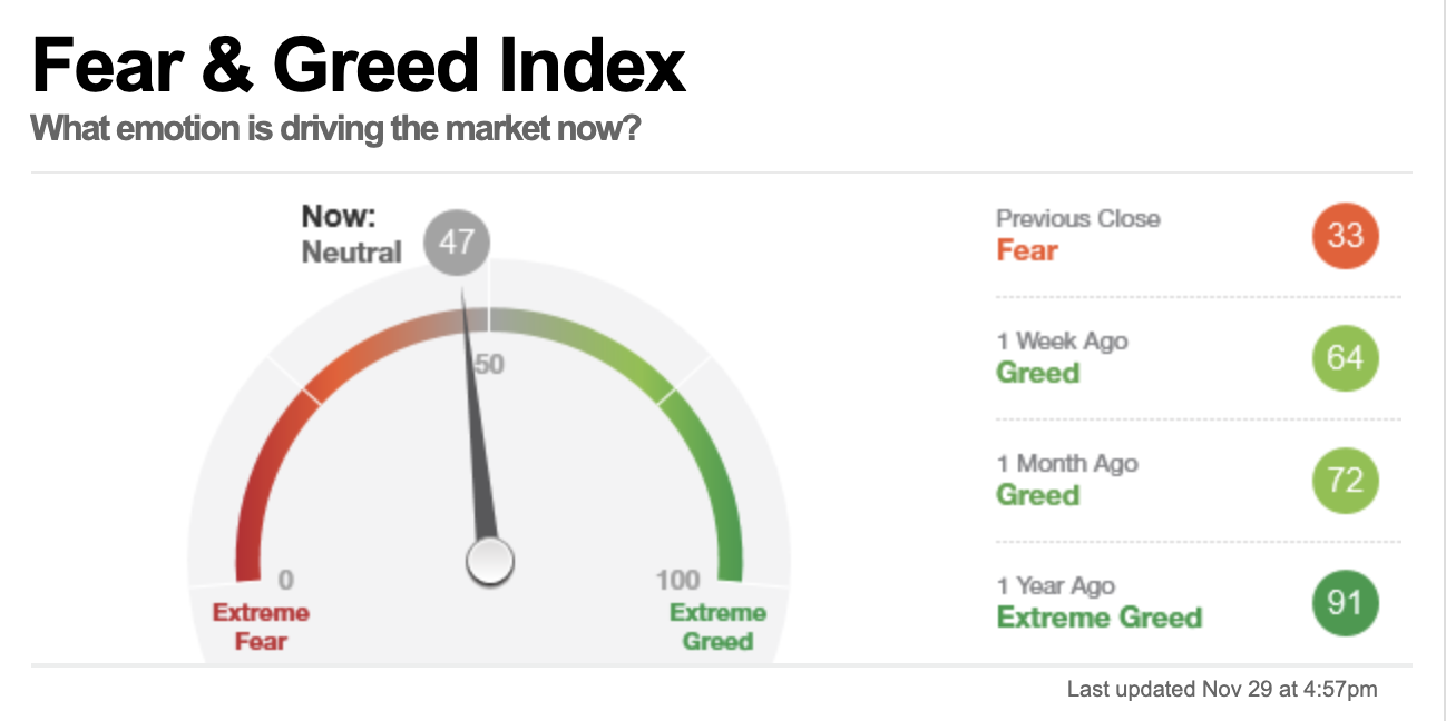
As a reminder, the CNN Fear and Greed Index is a multi-factored gauge that quantifies market sentiment on a scale from 0 to 100 - with 0 representing extreme fear as the emotion driving the market and 100 representing extreme greed. There is therefore an interesting parallel with Warren Buffet’s famous investment adage, mentioned above. The chart below shows the CNN Fear and Greed Index as of 29th November 2021:
However, there is not enough reliable historical data to determine the usefulness of using the CNN Fear and Greed Index as a market-timing tool over the long term. A possible alternative indicator, as mentioned in the original question, is the VIX. The VIX, otherwise known as the Chicago Board Options Exchange's CBOE Volatility Index, is especially popular with day traders thanks to its sensitivity to market sentiment. However, it is an extremely volatile indicator and as such doesn't lend itself particularly well to longer-term investing strategies. In a single day we can see violent moves in either direction in the VIX, which ultimately moderate. Again the historical data surrounding particular levels on the VIX that could potentially represent entry and exit points in equity markets is sketchy.
Another interesting indicator that I've written about in the past is the 10-month moving average of your chosen index as a means of marking potential market tops and bottoms. You can find out more in my 80-20 Investor article "Navigating market tops and bottoms". However, this indicator is related to price movements on an index, and not directly to the emotion that is driving it.
The Relative Strength Index
Another indicator that it is worth keeping an eye on is the Relative Strength Index (RSI). The RSI is a momentum-based indicator that uses the recent price fluctuations of an asset to determine if it is currently overbought or oversold, providing an indication of the risk of a significant rise or fall in price in the near future. The RSI is displayed as an oscillator - a line graph sandwiched between two extreme boundaries - and is measured as a reading between 0 and 100.
An RSI of 70 is deemed as indicating that an asset is becoming either overbought or overvalued, in which case there is a greater risk of a corrective pullback in price, whereas an RSI of 30 or below indicates an asset may be oversold or undervalued, which could be seen as a sign that it may be a potentially profitable time to invest. In the context of an RSI, we can think of overbought as “greed” and oversold as “fear”.
I won’t go into detail about how the RSI is actually calculated as it’s maths-intensive, but in simple terms, it’s computed using the average gains and average losses of an asset over a period of time - typically 14 days - and is then plotted on a graph between 0 and 100. You will see the index quoted as RSI(14) if it is a 14 day RSI.
The graph below (produced by Fidelity) gives a good example of what a typical RSI may look like. The black line above charts the price movement of the chosen asset over the specified length of time, while the blue line underneath demonstrates when that asset is believed to be becoming either overbought or oversold as determined by the RSI(14).
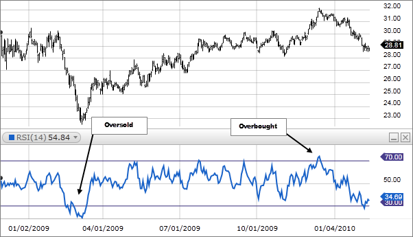
You can see that, typically, both lines follow a similar trajectory. A stock that has seen a bullish price increase is likely to become overbought and climb towards the key 70 RSI level, whereas one that has seen a bearish reversal is likely to become oversold and slip back towards the 30-point threshold as investors sell out. If an investor had bought when the asset had been oversold and sold when the asset became overbought they would have made a handsome profit.
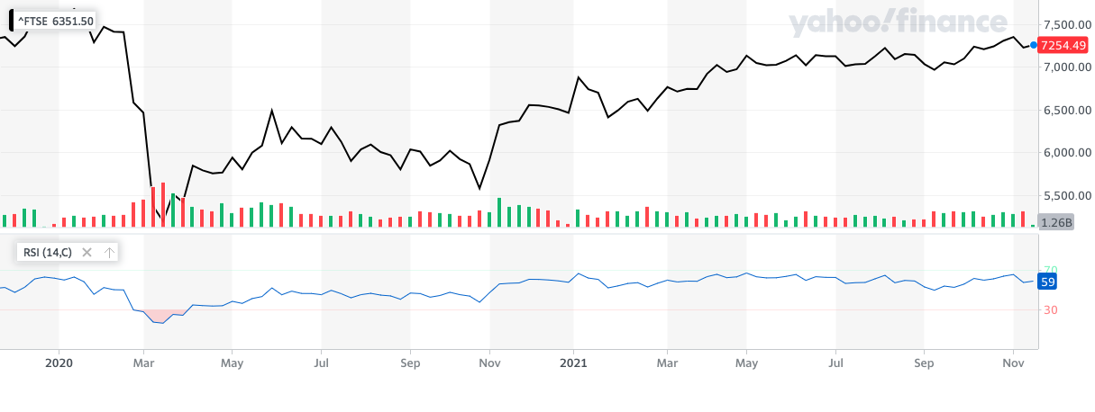
Now let’s put it into practice. Below is a chart that shows the performance of the FTSE 100 index over the past 2 years (up to 25th November) as a black line, while the blue line underneath provides its RSI score over the same period (click to enlarge the image). This is a great example of how we would expect the RSI to respond to wider macroeconomic events. Note the significant drop during March 2020 as the COVID-19 pandemic forced the UK into a national lockdown. You can see that the RSI similarly dipped, falling below that all-important 30 point threshold, indicating that the FTSE 100 had become oversold as investors panicked about how the economy would cope. If an investor had bought when people were at their most fearful, back in March 2020 when the RSI was below 30, they would have made a nice profit when the market rebounded.
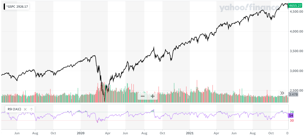
Now let’s see the RSI in action in the US. The chart below shows the performance of the S&P 500 over the last two and a half years, with the purple line underneath providing its RSI score over the same period. You can clearly see when the market became overbought and oversold in the RSI chart. Whenever the market became overbought the S&P 500 eventually saw some kind of correction, including this November 2021. Similarly, when the S&P 500 became oversold (namely in March 2020) it represented a good buying opportunity. Of course, the relationship between the S&P 500 and its RSI(14) is not one of course and effect, an overbought signal does not always bring about a sell-off or signify a short term market top. But it is still clearly useful as a momentum indicator.
Divergences
While the 30 and 70 thresholds are of course noteworthy, but it is also noteworthy when we see a divergence between the S&P 500 (the index) and its RSI. These can give a greater hint that we could be about to see a market reversal once we've hit overbought or oversold conditions. For example, a bullish divergence occurs when an RSI score portrays an oversold reading (< 30) which rises while the asset’s price actually falls lower. This indicates growing bullish momentum, suggesting that even though the price is decreasing, it could be due an uptick. On the other hand, there are also bearish divergences, where an RSI score portrays an overbought reading (> 70) which begins to fall even as the asset’s price continues to rise.
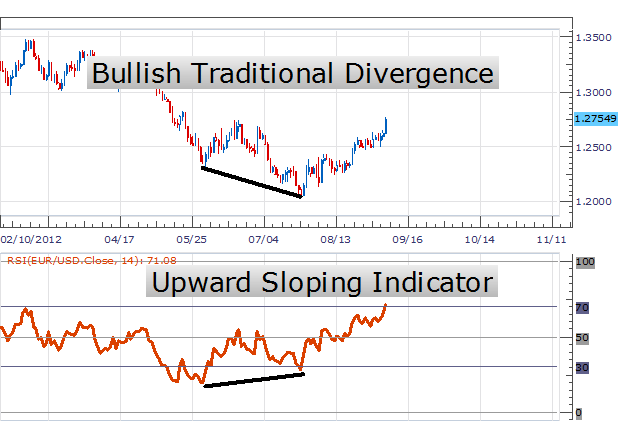
Check the graph below for a fantastic example from DailyFX of what bullish divergence on an RSI can look like. You can see the asset price continues to fall while the RSI starts to trend higher which can be (and was) an indication that the asset price was about to reverse higher.
But once again, as with all of these indicators, an asset’s RSI should never be viewed in isolation when making an investment decision. Looking back at the RSI in retrospect can be enlightening, but there is no way for any gauge or marker to predict a so-called black swan - a large unforeseen event, such as a terror attack or natural disaster - which can send markets into disarray no matter how much research an investor has done to try and stay one step ahead of the market.
Conclusion
There is no investment strategy that can perfectly emulate Warren Buffet’s famous “be fearful when others are greedy and greedy when others are fearful” mantra without exposing you to the risk of getting it wrong. But RSI is another useful information tool, like the 10-month moving average mentioned earlier, which updates at a greater frequency and can give you an indication if/when a market could turn. There are other ways to use the RSI which I haven't covered in this article as they are more suitable to day trading. For those that are curious about the current RSI of some of the largest stock market indices in the world, these are shown in the table below (prices are as at 25th November 2021). You can find the latest live figures by clicking on the links in the table, or by searching on google. RSI(14) data is freely available online which is useful.
| Index | S&P 500 | NASDAQ | Dow Jones | FTSE 100 | CAC 40 | DAX |
| RSI(14) Score | 53.656 | 50.838 | 53.364 | 57.738 | 50.928 | 46.663 |
| Fear or Greed? | Neutral - Slight Greed | Neutral | Neutral - Slight Greed | Neutral - Slight Greed | Neutral | Neutral - Slight Fear |

£200 Pension Cashback Offer
Make a qualifying deposit or transfer a pension to our partner Interactive Investor.
- Deposit or transfer a pension of at least £20k and you could earn £200 cashback
- Terms and Fees apply, Capital at risk
- New & Existing customers opening a SIPP
- Offer ends 31st July 2026
Before starting your transfer, check you won't lose any valuable benefits (such as guaranteed annuity rates or a lower protected pension age) and find out what exit fees you might have to pay
