

Five years ago I published a very popular 80-20 Investor research article on How to read investment markets quickly and to see what is driving them.
While as long-term investors we shouldn't check our portfolios every day, there is nothing wrong with trying to understand what is driving investment markets. At the time I produced a list of the stock indices that I look at on my phone each day and explained the inter-play between them helped me to quickly zero in on what is driving markets. As I wrote at the time it enabled me to gain insight before I'd even looked at the latest investment headlines. It also allowed me to find the key news stories, amongst the noise, that are the most important to digest.
Fast-forward five years to today and the list of indices and shares has grown and the relationship between them on occasion has changed too. So I thought it useful to revisit how and what I now look at to read markets quickly.
Five years ago I mainly used the default Stocks app on my iPhone to do this (other types of phone will have equivalent apps). These days I also use another free app published by Investing.com for two reasons. Firstly, it shows the futures markets (so you can see the likely price moves of markets before they officially open) but also because it shows more information on bond yields.
So below I list the indices/stocks I track alongside their ticker codes which you can use to find them within your chosen app to add them to your watchlist:
- Dollar index (DXY-T.NB)
- Pound/dollar exchange rate (GBPUSD=X)
- Pound/euro exchange rate (GBPEUR=X)
- Pound/yen (GBPJPY=X)
- Yen/dollar (JPY=X)
- VIX (^VIX)
- NASDAQ 100 VIX (^VXN)
- 10 Year US Treasury yield (^TNX)
- 10 Year UK Gilt Yield
- FTSE 100 (FTSE 100)
- FTSE All Share (^FTAS)
- FTSE 250 Ex Investment Trusts (^FTMX)
- S&P 500 (S&P 500)
- Dow Jones (DOW J)
- NASDAQ (NASDAQ)
- German Dax (^GDAXI)
- Euro Stoxx 50 (^STOXX50E)
- CSI 100 Index Shanghai (000903.SS)
- Hang Seng Index (^HSI)
- Nikkei 225 (Nikkei 225)
- KOSPI
- Gold GC=F
- Copper HG=F
- Crude Oil WTI CL=F
- Tesla
- Meta (FB)
- Apple (APPL)
- Amazon
- Microsoft
- The Boeing Company (BA)
- S&P 500 futures (ES=F)
- Dow Futures (YM=F)
- Nasdaq 100 (NQ=F)
- Utilities sector on S&P 500 (XLU)
- Technology sector on S&P 500 (XLK)
- Health Care sector on S&P 500 (XLV)
- Financial sector on S&P 500 (XLF)
- Energy sector on S&P 500 (XLE)
- Real Estate on S&P 500 (XLRE)
- TFF=F - Dutch Natural Gas price
- CNY=X
- AUDUSD=X
Some of the indices which I follow may be understandable (such as the FTSE 100) but others less so. For for that reason, I will run through them in turn to explain their inclusion.
Dollar index (DXY-T.NB) - This is a new addition in recent years because of the influence that the US dollar index has on investment markets generally. If you get the direction of the dollar right you get the direction of most other assets right. The US dollar index (which measures the strength of the dollar against a basket of currencies) goes a long way to explaining many of the market moves we've seen, especially since June 2022.
As I explained in my research article ‘Funds to play a dollar rally (or slump)’... “A strong dollar not only tends to hit US stocks but also commodities (especially gold) as well as proving a headwind for Asian and emerging markets. In contrast, a strong dollar versus the Japanese yen tends to be positive for the Nikkei 225, while a weaker pound versus the stronger US dollar can provide some support for the FTSE 100.”
Of late, movements in the value of the US dollar have often been reflective of the market’s view on monetary policy across the globe. Back in September, when the market believed that the European Central Bank (ECB) would act more hawkishly than the US Federal Reserve (the Fed) the euro rose causing the US dollar to fall. Investment markets responded in kind.
In recent months it’s been the belief that the Fed would be the first major central bank to pause its rate hiking cycle, after weaker than expected inflation data, which has caused the US dollar index to tumble and break below the key 100 level, Unsurprisingly the S&P 500 rallied as did commodities while the Nikkei 225 struggled.
Pound/dollar exchange rate - The value of the pound versus the dollar will have a significant impact on the value of your investments. First and foremost overseas assets held in the US (such as US equity funds) will rise in value (in sterling terms) if the pound falls against the dollar. In addition, a weak pound versus the dollar tends to push the FTSE 100 higher as many of its constituents have dollar-denominated earnings which become more valuable in sterling terms. In a recent newsletter, I’ve explained how the value of the pound has impacted the returns UK investors have experienced in 2023.
Pound/euro and the pound/yen exchange rates - Again the currency movements can give you an insight into how the value of your overseas assets will be faring. However, all three exchange rates in combination offer an insight into what is influencing the market. If the pound falls against the euro but not against other currencies then it suggests that perhaps news has broken that centres around Europe (and most likely the European Central Bank) which is moving the market. In the past Brexit headlines were the usual culprit. If the pound falls against all three currencies it might suggest that news surrounding UK interest rates or the UK economy has been released .
Yen/dollar - This is a good indicator of risk aversion. Historically in times of panic, the yen has often been seen as a haven currency and rallied against the dollar. But in recent history there have been occasions when the euro replaces the yen as a haven. In addition, a strong yen versus the dollar tends to be negative for the export-dependent Japanese stock market. So typically when the yen strengthens the Nikkei 225 falls and vice versa.
VIX - This is also known as the market's fear gauge and has a historic average of around 19-20. Currently, it has fallen back towards 13.4. When the market becomes fearful the VIX will likely rise. This makes it a good indicator of how fearful markets really are.
VXN - Think of this as the VIX for the tech-heavy Nasdaq 100. This rises when there are concerns centred around technology stocks. When it gets above 30 that’s when risks really start to rise.
FTSE 100, FTSE All Share and the FTSE 250 - The first and last of these give you a good insight into how UK large caps and small caps are performing. When looking at them both together it can give you an insight into what might be driving markets or news headlines. Often the FTSE 100 will move inversely to the pound/dollar exchange rate. Occasionally that doesn't happen which is when it is interesting to see how the FTSE 250 is performing. The FTSE 100 has a significant exposure to oil companies so sometimes a rally in energy stocks or commodities can push the FTSE 100 higher. This is less pronounced in the FTSE 250 and you will notice the lack of correlation between the two. Also, the FTSE 250 is much more domestically focused and as such it means that it is much more sensitive to headlines impacting the outlook for the UK economy. If the FTSE 100 has fallen but the FTSE 250 has risen it could be that there has been positive news surrounding the UK economy.
German Dax & Euro Stoxx 50 - The latter gives an overview of how European stocks are doing generally while the Dax shows how German equities are faring. The DAX is also sensitive around news headlines concerning Chinese economic growth given that China is one of Germany's biggest export markets. So if the DAX massively underperforms the Euro Stoxx 50 it could be a sign that concern is building over China, assuming that there is no specific German or European risk unfolding (i.e geopolitics). In 2022, we would often see European equities diverge from other global stock markets due to the war in Ukraine.
S&P 500, Dow Jones & NASDAQ - The three main US equity indices. The first is the broadest index while the Dow Jones is 30 of the biggest US companies which also happen to include those that are likely to fare badly in a US-China trade war. The NASDAQ is more tech-focused. Given that the S&P 500 has around a 25% exposure to tech stocks, how all three perform can give some good insight into what is driving the markets. Also in the list above you will see the futures for each of the three indices. These give you an idea of where the US stock market might open on a given day. It is important because UK and European traders often look towards US stock futures to get a steer of how/what to trade.
I also like to follow individual ETFs that track various sectors within the S&P 500, namely the Utilities sector (XLU), Technology sector (XLK), Health Care (XLV), Financial sector (XLF), Energy sector (XLE) and Real Estate (XLRE)
Utilities Sector (XLU): the Utilities sector provides insights into the stability and performance of companies involved in providing essential services such as electricity, gas, and water. If the XLU experiences a significant price increase, it may suggest that investors are seeking safer investments during times of economic uncertainty or market volatility. Conversely, a decline in XLU prices could indicate improved economic conditions and a shift towards riskier assets. Overall it's a good indicator of defensive sentiment. It’s a similar story for Healthcare (XLV).
Tracking Technology (XLK) - while this gives an overview of investor appetite for technology stocks (including those with exposure to the AI theme) it is also a good indicator of interest rate expectations. When the market believes the Fed will increase interest rates XLK tends to underperform XLF.
Financial Sector (XLF) - this can serve as a barometer for economic conditions, interest rates, and financial market stability. Price changes in XLF can be influenced by factors such as central bank policies, interest rate fluctuations, economic indicators and regulatory changes. For example, an increase in XLF prices may indicate optimism about economic growth, favourable (meaning higher) interest rate conditions or strong financial results from major banks. Conversely, a decline in XLF prices could signal concerns about impending economic recession, tightening regulations or deteriorating credit conditions.
Energy Sector (XLE) became a particularly important indicator in 2022 when the Ukraine war contributed to a spike in energy prices and ultimately inflation. XLE can help investors gauge the impact of geopolitical events, supply-demand dynamics and energy policies on the markets. For instance, a significant increase in XLE prices may be driven by rising oil prices due to supply disruptions (maybe as a result of a war) or increased demand. Conversely, a decline in XLE might be caused by oversupply concerns, shifts towards renewable energy sources or geopolitical resolutions. I also track the price of gas Dutch Natural Gas (TFF=F) for similar reasons.
Real Estate on S&P 500 (XLRE) is often a good interest rate indicator. The expectations of rate rises in the US can be see XLRE fall
Tracking the Chinese Yuan (CNY=X) exchange rate with the US dollar can reflect shifts in China's economic conditions, trade policies and market sentiment towards the Chinese economy. For example, if the CNY=X appreciates against major currencies like the US dollar, it may suggest confidence in China's economic growth, increased foreign investment or a trade surplus. Conversely, a depreciation in CNY=X might indicate concerns about China's economic slowdown, capital outflows or trade tensions. Tracking the Chinese Yuan helps UK investors assess the economic health of China as well as relations with the US.
A rising AUDUSD=X (Australian Dollar to US Dollar Exchange Rate) can be a good indicator of rising commodity prices (as Australia is a major exporter of commodities) and Chinese economic health (China is a major importer of Australian commodities). Conversely, a depreciation in AUDUSD=X could be caused by weak economic indicators, lower commodity prices or global risk aversion.
Gold price - Tracking the price of gold is useful as it is often seen as a haven asset and a store of value during times of economic uncertainty or market volatility. Changes in the gold price can be influenced by various factors such as inflation expectations, central bank policies, geopolitical tensions and investor sentiment. For example, if the gold price increases significantly it might indicate falling rate hike expectations, global economic instability or a flight to safety by investors. Conversely, a decline in the gold price could suggest improved economic conditions, increased rate hike expectations or increased risk appetite among investors.
Copper Price - The price of copper is considered a leading indicator of global economic activity and industrial demand - that is why it is known as Dr Copper. So a fall in the price of copper would suggest there are new concerns over global economic growth.
Similarly Crude Oil WTI price moves can be a sign of a shift in global economic sentiment. A rise in the price of oil could be a sign that news has broken about improving global economic conditions or central bank stimulus.
CSI 100 Index Shanghai - This is a broad index giving you an insight into how mainland Chinese stocks are doing.
Hang Seng Index - This gives a good steer on how Asian markets are performing.
Nikkei 225 - This is the main Japanese stock market index.
Facebook, Apple, The Boeing Company - I like to keep an eye on Apple's share price because often 'as goes Apple so goes the market'. Facebook and Boeing are two stocks I started following in 2018 as both were at the centre of two market moving events that year, namely the potential regulation of US tech giants and the US/China trade war
Microsoft is a new one that I like to follow as it also gives an indicator of interest in AI related stocks.
Real scenarios
Below I run through two real scenarios that occurred this week with screenshots to show you how I might try and gain an insight quickly into what is moving markets.
Scenario 1
On Wednesday morning (19th July) I was greeted with these screens on my Stocks app.
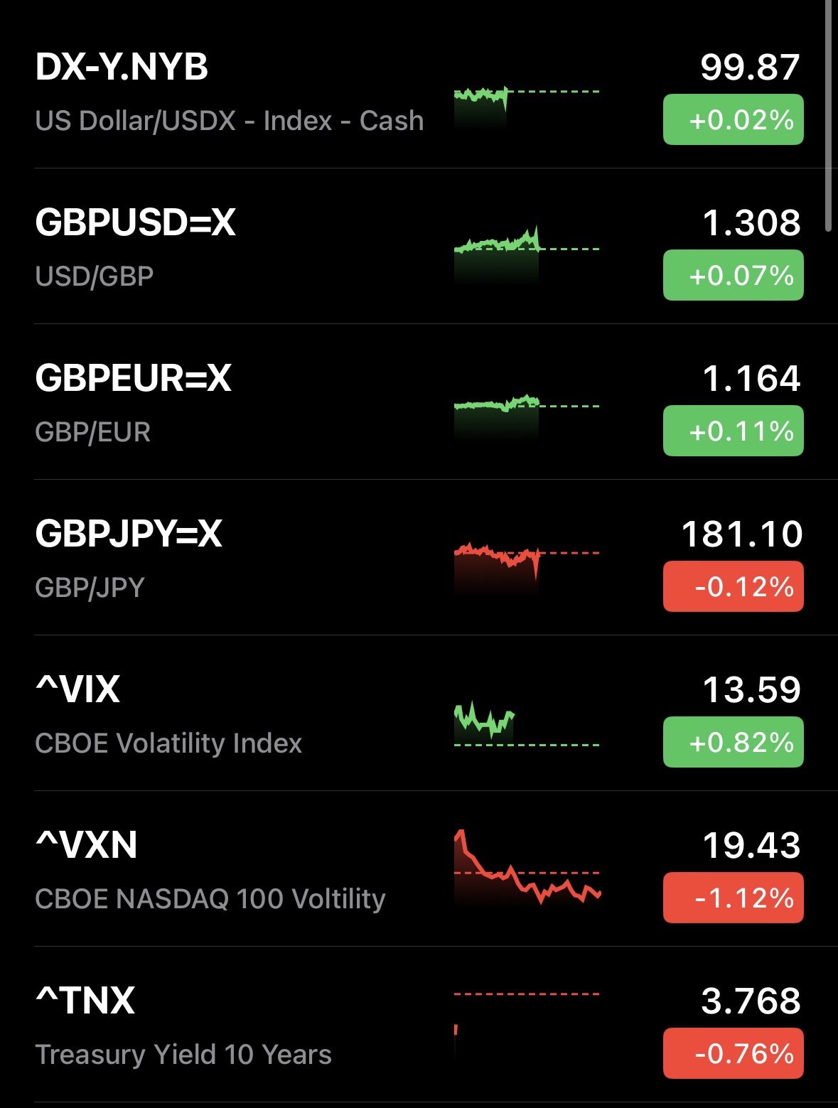
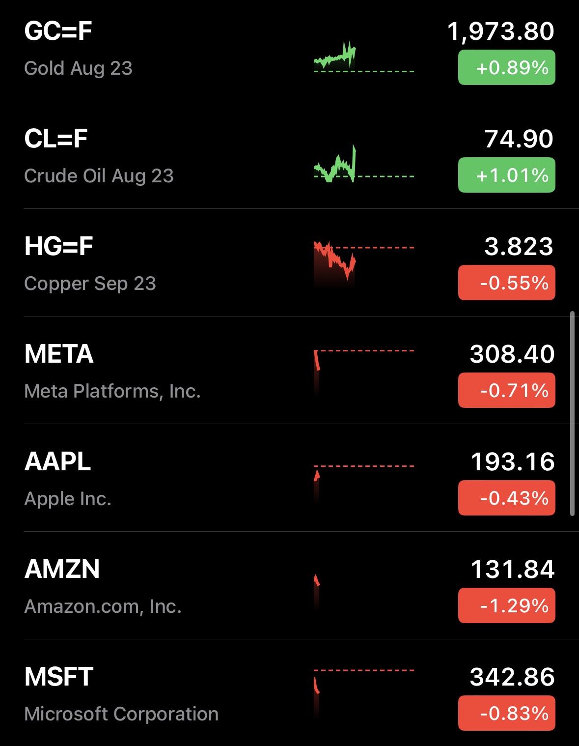
The first thing to note is that the US Dollar index is flat and currency moves were fairly muted. This suggested to me that there hadn't been any major news headlines surrounding central bank policy at any of the main central banks. The VIX was also fairly subdued although marginally up, showing a lack of fear (which also backed up the subdued dollar and yen). The VXN (the fear index for the Nasdaq 100) was down and the 10 year treasury yield was down too. This was nothing serious but suggested that long duration assets (tech stocks and long dated treasuries) were being bought.
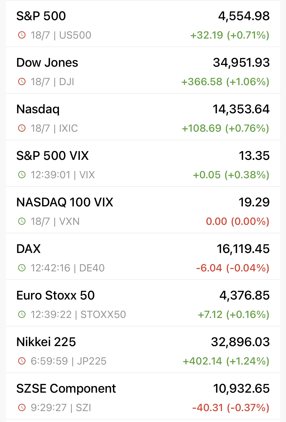
Bear in mind that the screenshots were taken half an hour after the US market opened and you can see that S&P 500, Dow Jones and Nasdaq 100 were not in agreement. The Dow Jones was up while tech stocks were down. It was quite a confusing picture.
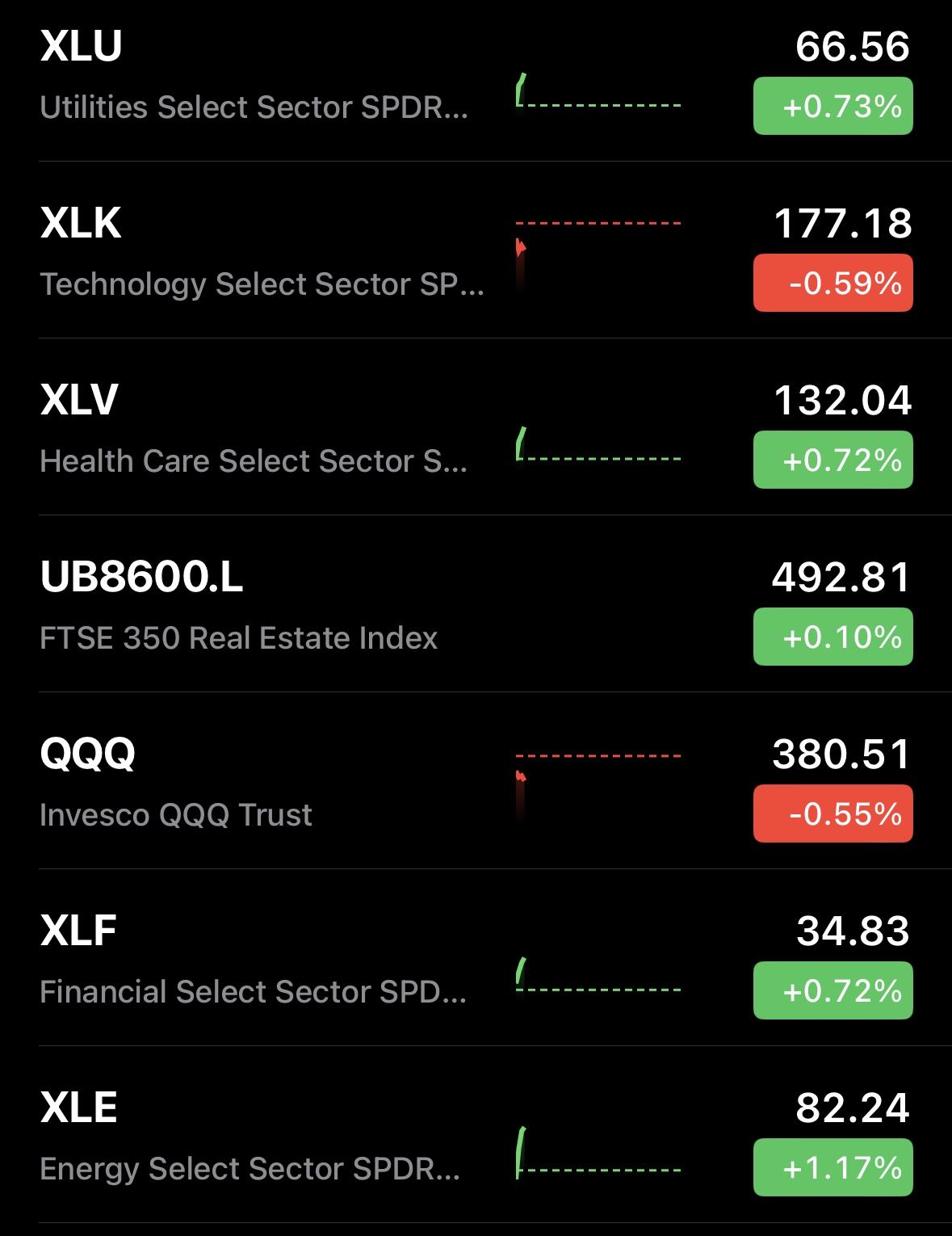
But if you look further on you can see that the biggest loser on those that I track was Amazon while the finance sector XLF was among the biggest winners. Often XLF will rally when there's news that raises the market's expectation of further rate rises, which would in turn be bad for tech stocks but also bad for treasuries (which would mean that treasury yields would rise). But treasury yields had fallen, not gone up, which was odd. Also there was very little movement in currency markets which suggested it was something a bit more nuanced than simply a reaction to a change in Fed policy expectations. Also the more defensive sectors of XLV and XLU had been bought, perhaps a hint at rising recession concerns.
I already knew that earnings season had started so I pondered whether XLF's rally was in response to strong bank earnings results. Also the fact that Amazon, which has a high exposure to consumer retail demand, was faltering more than any other tech stock, was worth looking at. So something in particular was upsetting Amazon investors yet its earnings results weren't due out for a couple of weeks.
A quick scan of the headlines with these thoughts in mind and I quickly saw that there had indeed been a host of bank earnings released which had largely been received positively, which explained the move in XLF. Elsewhere disappointing US retail consumer spending numbers had been announced, which obviously would impact one of the world's largest consumer retailers e.g. Amazon. But it also explained the move into defensive sectors.
Scenario 2
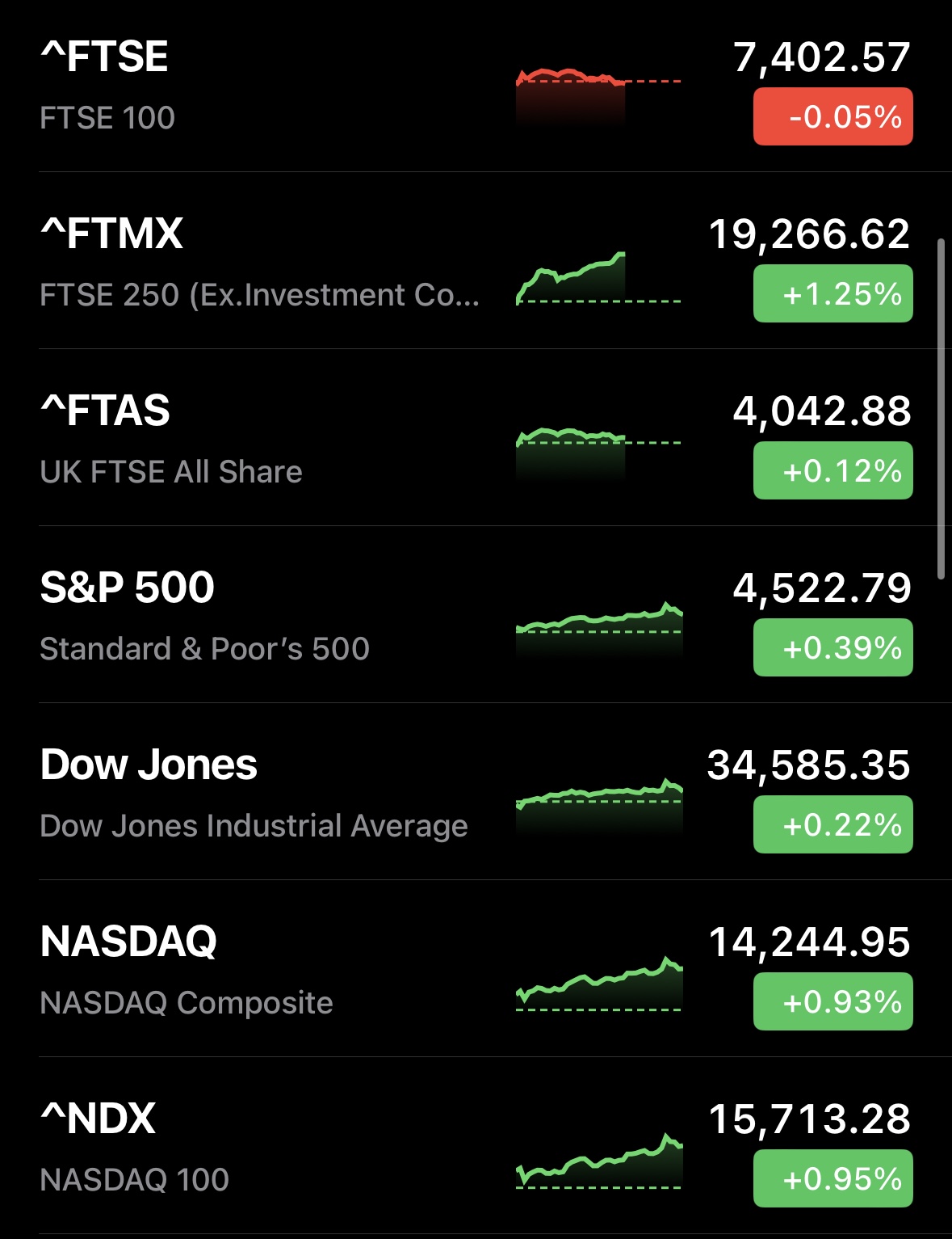
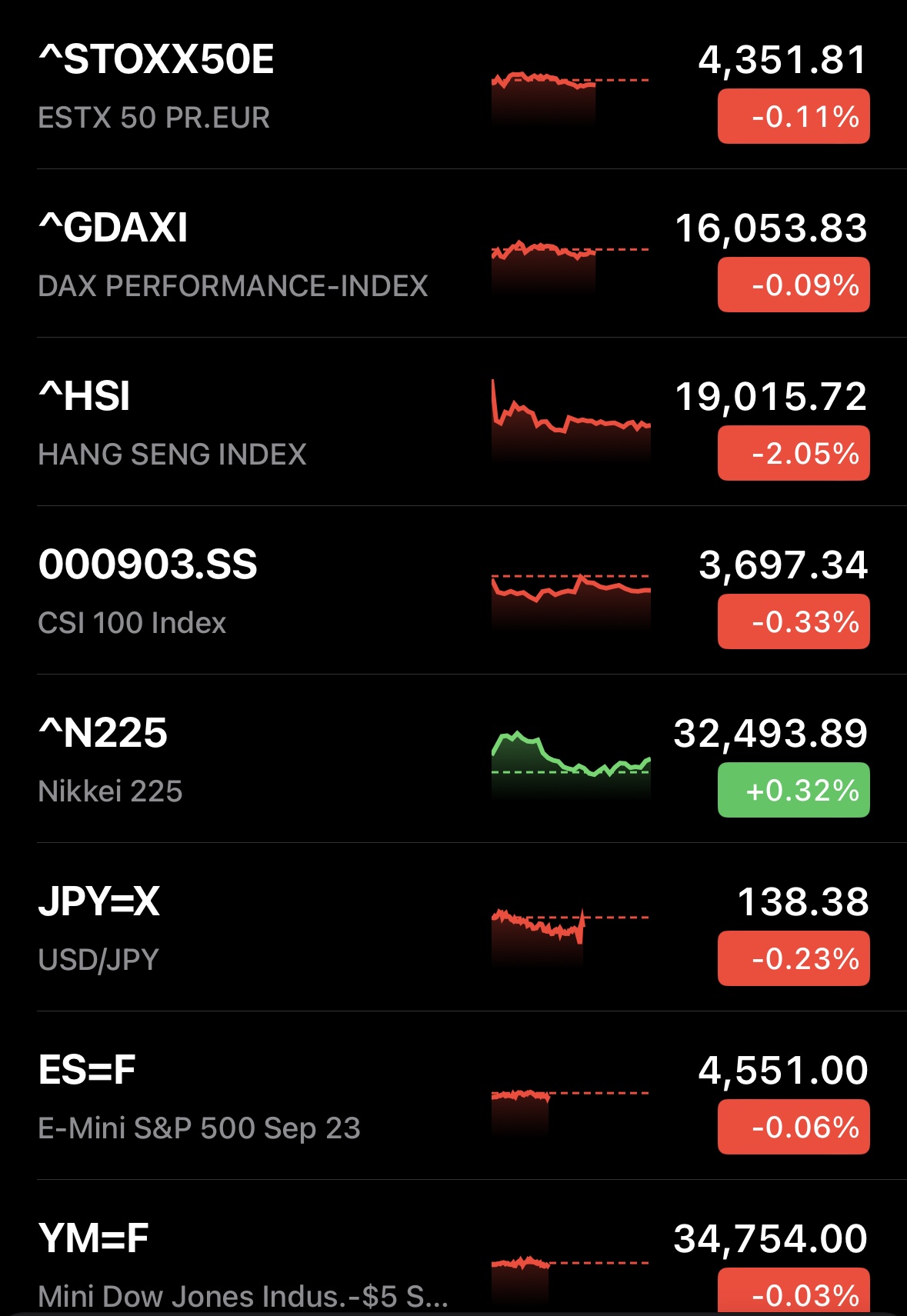
The market reaction to this scenario was much less subtle and it occurred on Thursday (20th July). Upon opening my investing.com app I was greeted with these screens.
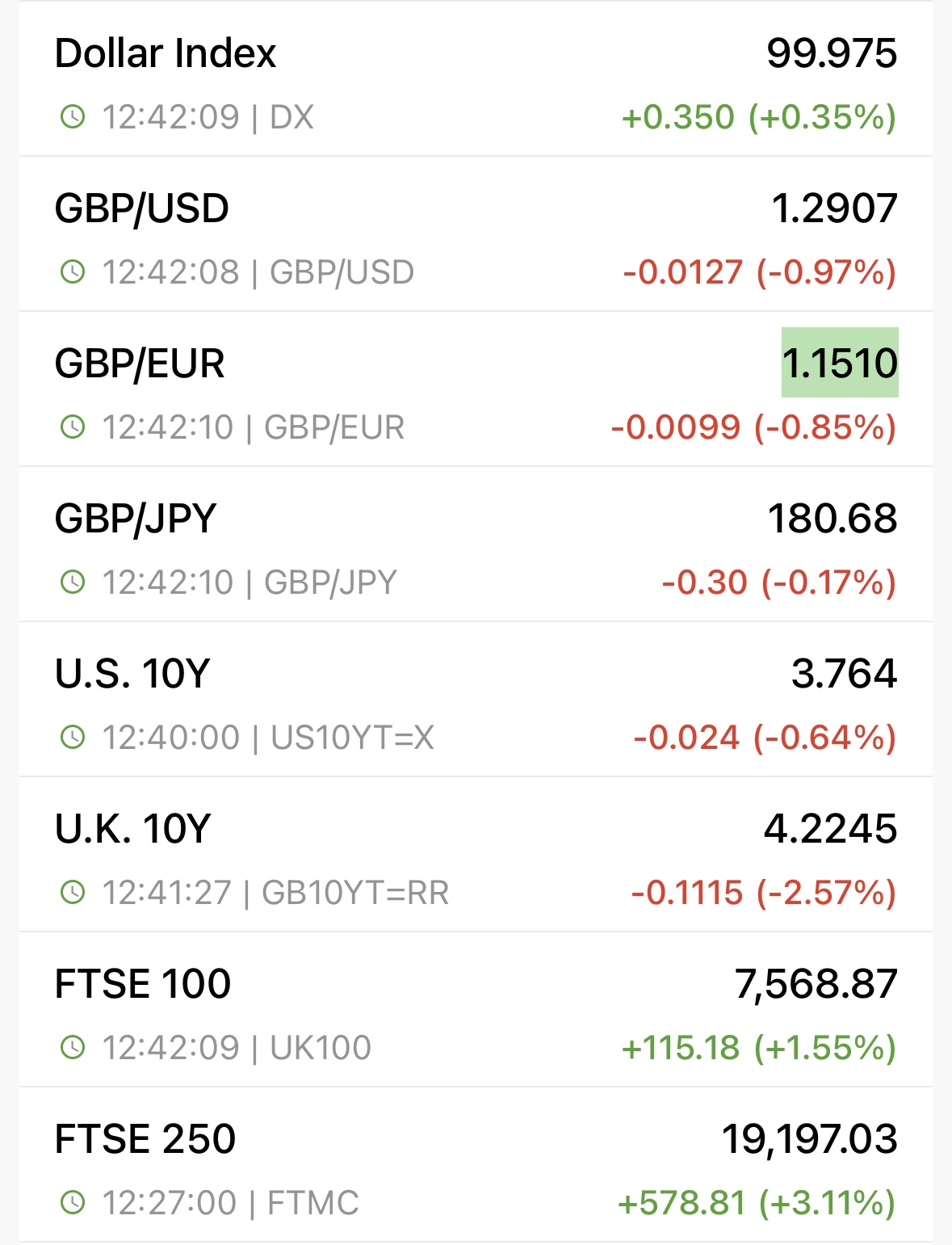
Straight away my eye was drawn to the significant fall in the value of the pound against all the currencies I track but especially the euro and the dollar. The US Dollar Index has risen but the currency moves suggested that this was very much a UK story that had broken.
That was confirmed further when looking at the sizeable slump in the 10 year UK gilt yield in comparison to a fall in the 10 year US treasury yield.
The FTSE 100 was up 1.55% which was unsurprising given the fall in the value of the pound, but the FTSE 250 (which is much more domestically focused) was up over 3% in the first few hours of trading. That is a huge move and suggested news had broken that was extremely positive for the UK economy. Given the moves in the pound and the 10 year UK gilt yield, it suggests that expectations of future base rate hikes had receded.
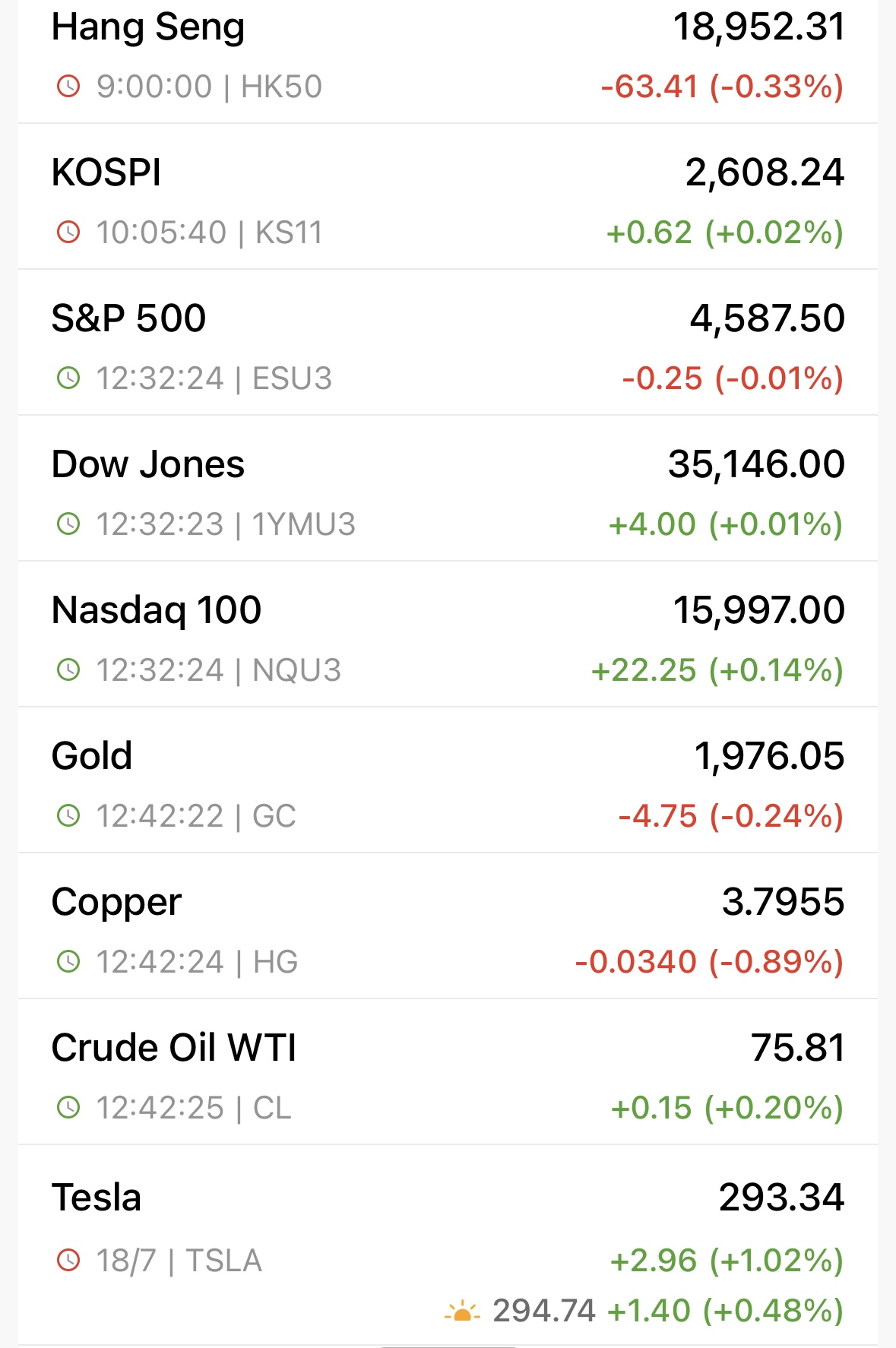
A quick look at the other global stock markets confirmed that this was likely to be a UK story. The S&P 500 was up 0.71% the day before (the market was closed at this point) and the futures were pointing to a flat open in the US. Also the fact that Asian equity markets were mixed suggested that this wasn't any kind of euphoria being carried over from the close of the US market, through the Asian trading day and into the European open.
The obvious conclusion was that the UK inflation data (which I also happened to know was being released that day) had come in much lower than expected. When I checked the news headlines, lo and behold, that's exactly what had happened.
Summary
By treating markets almost like a fun puzzle which you try to solve you can gain a greater understanding of how they work. More importantly, you gain a thirst for trying to understand them as they become less like hieroglyphics and more like jigsaw pieces. And in theory if you sincerely believe that, for example, inflation is going to fall quickly then you know how to position yourself to possibly take advantage in the future.
You should never obsess about daily market moves but it does bring investing to life. Sometimes it is quicker to learn by practical examples rather than through pure theory. I hope you found the article useful. Finally, I must stress that sometimes you can't explain why markets have moved the way they have or find a reason for it. That's perfectly fine. Often a reason presents itself eventually. However, when markets don't act as you might expect them to then that in itself is interesting and may lead to further insights. If nothing else this article should help you wade through the deluge of articles and headlines and pick out the most important stories.

£200 Pension Cashback Offer
Make a qualifying deposit or transfer a pension to our partner Interactive Investor.
- Deposit or transfer a pension of at least £20k and you could earn £200 cashback
- Terms and Fees apply, Capital at risk
- New & Existing customers opening a SIPP
- Offer ends 31st July 2026
Before starting your transfer, check you won't lose any valuable benefits (such as guaranteed annuity rates or a lower protected pension age) and find out what exit fees you might have to pay
