

The stock market sell-off during February rattled investors. Yet despite the subsequent rebound investors remain nervous. Every analyst seems to have an opinion which unhelpfully range from the bullish 'we are set for new all-time highs' to the bearish 'the worst is yet to come grab your tin hats'. So who should you listen to?
Of course, I do not have a crystal ball and I always advise investors not to try and time the market because they will never get it right. However, there's nothing wrong with trying to determine a range of possible future outcomes within investment markets. Think of it like a weather forecast. It’s not 100% accurate but it will give you a better idea of whether a storm is on the horizon. Technical analysis is the nearest thing we have to weather forecasting in the investment world.
It is always interesting to look back at my previous analysis (in this case in August 2017) with the benefit of hindsight and see how the market played out when it broke above or below the key levels highlighted.
What is technical analysis? - A recap
For those who don't already know or have forgotten here is an explanation of what technical analysis is:
Trying to predict the future of the stock market is akin to reading tea leaves. Personal predictions are almost always clouded by prejudices which reaffirm what we ‘want’ to happen rather than what is ‘most likely’ to happen.
That is why one objective method is to use technical analysis to try and judge likely outcomes. So what is technical analysis? One line of thinking is that stock markets are driven largely by human behaviour. At the simplest level you could argue that fear and greed drive a lot of investors’ actions. Let’s say that an opportunity presents itself and some investors jump on it and buy the shares in question. The demand then drives up the price. More investors jump on the bandwagon looking to profit. Then at some point the tide turns (fear sets in) as people think the price for the shares is looking expensive and so people start selling. More and more people start selling to take profits and the price falls. At some point the price falls until others think the shares look cheap and start buying, outnumbering the number of sellers. Again demand outstrips supply and the price goes back up.
This see-sawing explains the movement you see in stock market charts such as those below. The prices at which investors start bailing and selling the shares is called a point of resistance while the point at which they pile in is called a point of support.
As such there is a surprising level of predictability to human behaviour. In terms of the stock market that means when the price goes through historic points of resistance or support it can indicate a new unfolding market rally or collapse. Why does it do this? Part of it will be because traders trading in millions of pounds will use these points of resistance and support to trigger trades. Yet for a lot of investors they might not even be aware of these inflexion points. They simply are reacting to how other people in the market behave. Put it this way, when stock markets fall you feel tempted to sell, right? Also once it starts to rally, you are tempted to jump in? That’s why these patterns have a tendency to repeat.
Some investors and traders swear by it and trade solely using technical analysis. I don’t fall into that camp. I view technical analysis like a road map drawn by someone who has already completed a journey to somewhere near where you are planning to drive to. The road map won’t take you exactly to your intended destination, nor will it be entirely accurate. However, it will give you a better sense of what to expect. Then if you decide you like the look of a particular market you can use 80-20 Investor’s ‘Best funds by Sector‘ data to choose an actual fund to invest in.
Latest technical analysis
There are different types of technical analysis, however, I find the most useful guide is to simply highlight the points of resistance and support, as I've done previously. So below I provide technical analysis, looking at areas of support (the green lines in the charts below) and resistance (the red lines), on the key global equity markets and the pound/dollar exchange rate. Click on the charts to enlarge them.
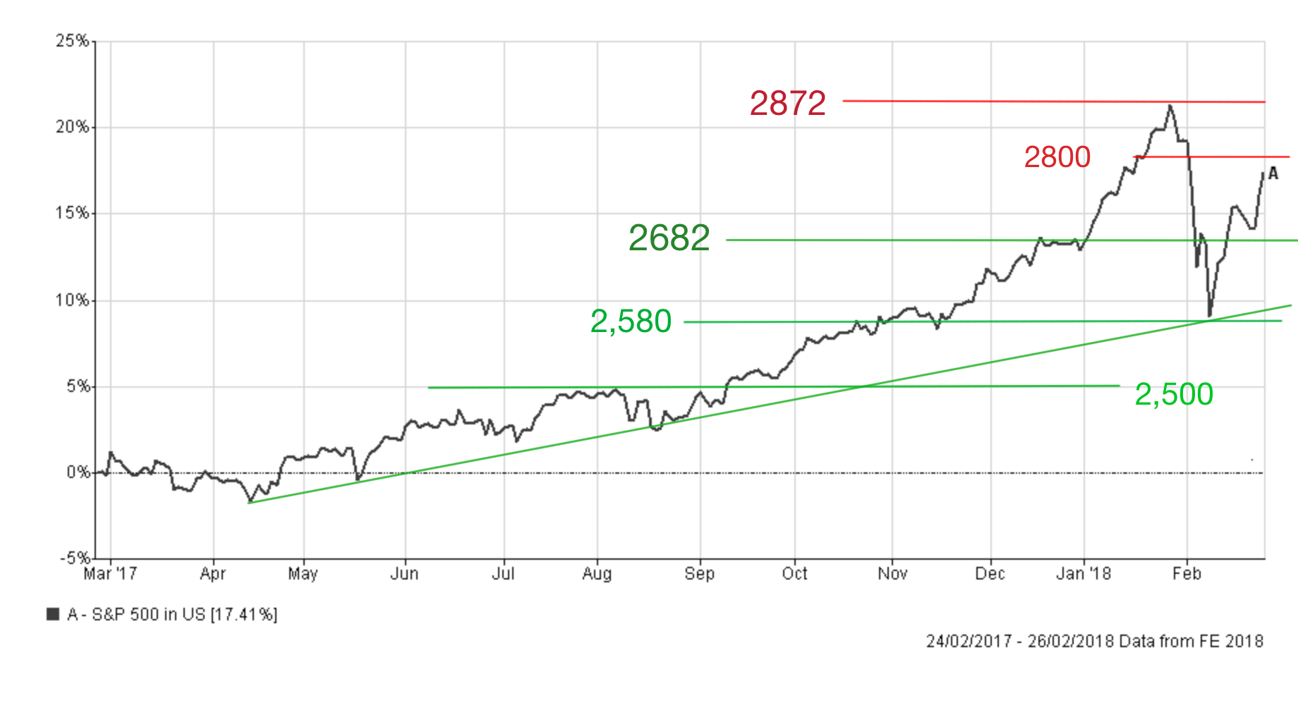
US stock market
The epicentre of the recent market sell-off was the US. Fears over rising inflation and more aggressive interest rate rises by the Federal Reserve was blamed as the catalyst for the downturn that started at the end of January. When the US 10 year Treasury yield hit 2.85% markets panicked and the rise in volatility was amplified by complex financial contracts that were betting that all would remain calm. The S&P 500 suffered a technical correction which means that at the end of a given trading day the closing value was more than 10% below its recent high point. As you can see from the chart below that occurred on 8th February when the S&P 500 hit 2,580. Since then it has rebounded and broken up through the key resistance level of 2,682 before it struggled to get above 2,725.
Investors keen on buying-the-dip eventually pushed the S&P 500 beyond 2,725 and up to the resistance level of 2,750. The important thing to remember is that all these resistance levels now turn into levels of support should the market break back downwards. Near-term 2,682 remains an important support line to keep an eye on. Overall the longer-term uptrend in the S&P 500 remains intact for now (shown by the upward sloping green line in the chart below) and it's only if we see a pullback below the region of 2,580 and ultimately 2,500 that this uptrend is under serious threat. That is 10% below where we are currently.
If the market continues to the upside we need to focus on 2,800 (it is a round number which has an odd psychological pull) and then 2,872, which is the recent market high. At the time of writing the S&P 500 is around 3.3% below the all-time high. We really need to see new all-time highs achieved repeatedly which are interspersed with dips and rebounds off the highlighted uptrend line before we have confirmation that the correction was just an interlude on the continued market bull run. Otherwise it could be a set up for a head and shoulders pattern and an eventual steeper sell-off.
UK stock market
The FTSE 100 had been something of a laggard in global equity markets until December 2017 when it rallied strongly thanks to a dip in the value of the pound and a rising oil price. The FTSE 100 finally hit a new all-time high of 7,778.64 on 12th January 2018.
Interestingly, just as the FTSE 100 didn't enjoy the full extent of the recent equity rally, neither did it suffer the full extent of February's equity market sell-off. As the chart below shows, the FTSE 100 fell just over 8% from its all-time high to hit 7,092 on 9th February. Technically the FTSE 100 didn't suffer a correction (a fall of 10% which would have required it to fall below 7,000). The index has since rebounded and, at the time of writing, sits at 7,282.45 which is 6.37% below its all-time high. The rebound has been limited (around 2.5%) from the sell-off low, hampered by a rising dollar/pound exchange rate.
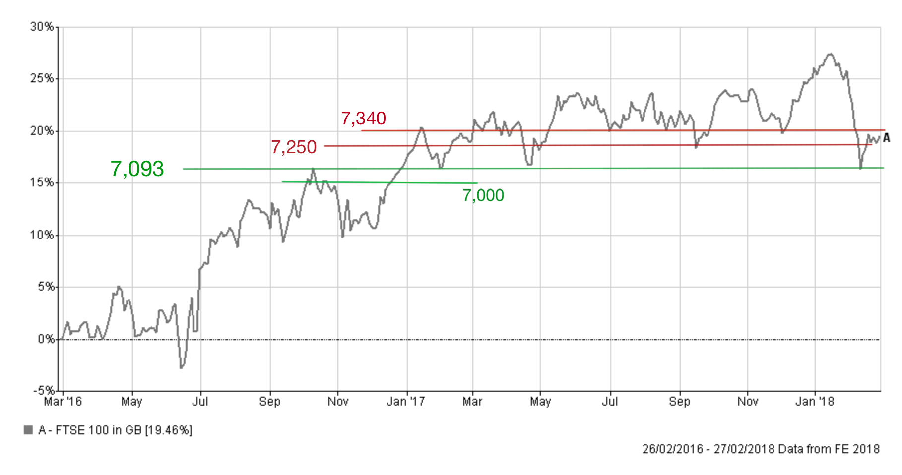
The first chart below (click to enlarge) shows the FTSE 100 over the last 12 months and you can see that it's given back all of its previous gains. It now sits just above a key line of support of 7,250. If the market is to break higher it needs to breach resistance levels 7,325 and 7,365. That would put 7,500 back on the table and then the possibility of pushing back towards the recent high. If we break above 7,500 then the support and resistance lines I spoke about in my last technical analysis briefing come back into play.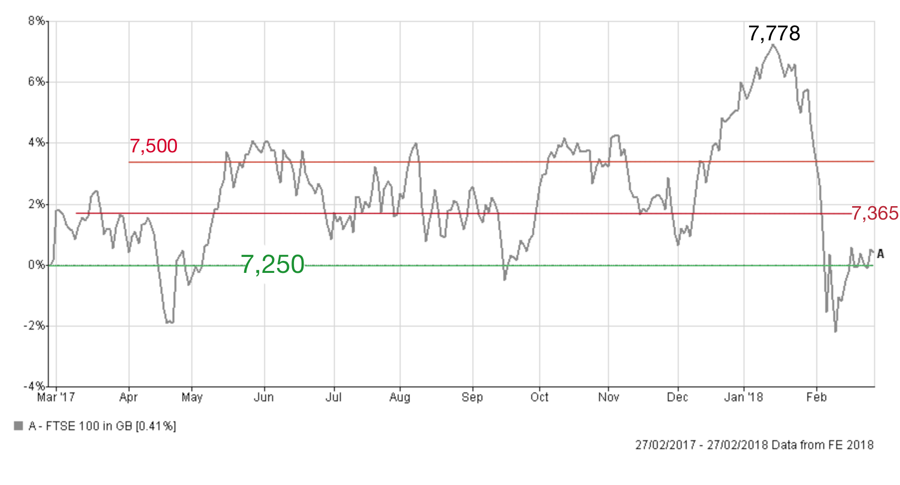
If we break below 7,250 that means that 7,200 and 7,093 become key support lines (the latter is highlighted in the two-year chart below). If we break below 7,000 it would mark a full 10% correction from the recent high but also a significant negative sign. Below this point, there is weak support and the market would likely head towards 6,700.
Japanese stock market
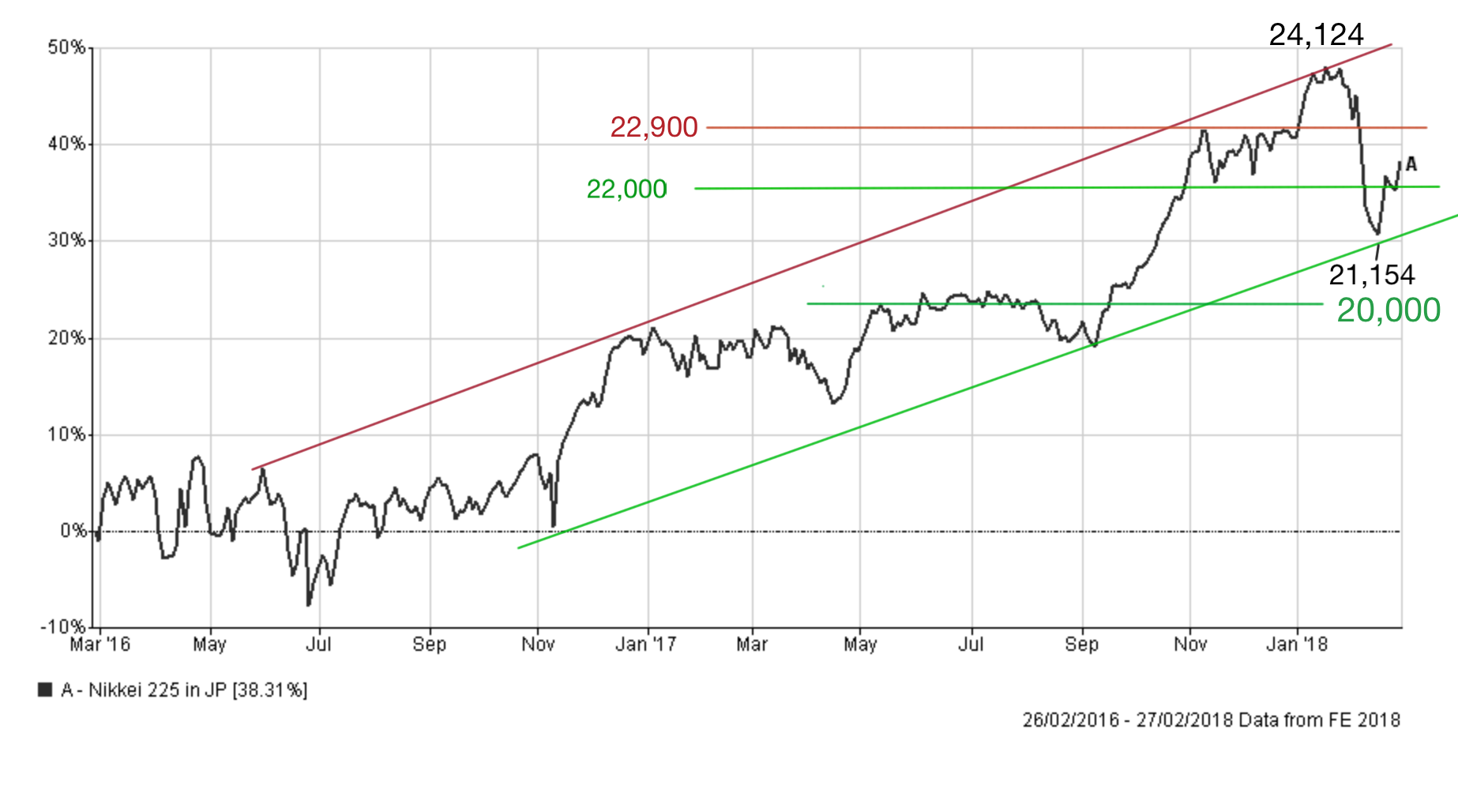
Japanese equities fared worse than most developed world equity markets during February's sell-off. From its recent high to February's low the Nikkei 225 tumbled 12.3%. Despite a sudden rally in the last few days it still sits more than 7% below the recent peak. The weak dollar versus a stronger yen has hampered the recovery of the exporter-heavy Japanese stock market. However, it may come as a surprise to many, that despite the sell-off the Nikkei 225 remains in an upward trend that started back in the summer of 2016 (as shown by the two parallel lines in the chart below). This uptrend has proved remarkably resilient and the recent low of 21,154 was not enough to break the trend. In the short-term there is an important level of support at 22,000 (the Nikkei is currently at 22,389). If we see another bout of market weakness we would need to see the uptrend and the recent 21,154 hold otherwise we could retrace back to 20,000. If we do and breach 20,000 then the lines of support discussed in my last brief (most notably 19,880 and 19,600) come into play and we'd be looking at bear market territory, On the upside if we can break above 22,900 (which is 2.2% above where we are now) then that threshold would turn into a level of support from which the market can try and regain its recent high.
Pound vs Dollar
For UK investors the strength of the pound was one the biggest influences on their returns in 2017. When the pound fell any funds or assets held overseas were immediately worth more (ignoring any change in their underlying value) because of the currency exchange rate. Obviously, the converse was also true.
Until recently much of the focus of the sterling/dollar exchange rate has centred around the impact of Brexit, but renewed dollar weakness has also been driving the pound higher. The dollar's continued slump has been something of an enigma, as I've discussed in recent newsletters. However, with the White House seemingly keen on talking down the dollar there has been little to arrest its decline against most major currencies. The falling dollar has helped push US stock markets higher while at the same time hampering the FTSE 100 and the Japanese stock market. A strong pound versus the dollar is usually bad for the FTSE 100 just as a strong yen versus the dollar is usually bad for the Nikkei 225.
The pound has soared to recent highs of over $1.4265, which is a long way from the lows after the Brexit vote. Currently, the pound is trading around the $1.40 mark. Despite the dollar's fall, the pound is finding it hard to breach the resistance level of $1.4065 before it can even try to push past $1.41. If the pound can push higher and above $1.43 then the near term ceiling is likely to be at $1.45.
On the downside, there is a lot of support around $1.40 and then $1.393. If we break below there then we are looking at $1.38 and then $1.375.

£200 Pension Cashback Offer
Make a qualifying deposit or transfer a pension to our partner Interactive Investor.
- Deposit or transfer a pension of at least £20k and you could earn £200 cashback
- Terms and Fees apply, Capital at risk
- New & Existing customers opening a SIPP
- Offer ends 31st July 2026
Before starting your transfer, check you won't lose any valuable benefits (such as guaranteed annuity rates or a lower protected pension age) and find out what exit fees you might have to pay
