

It's been a year since I last reviewed the performance of the alternative risk versions of my £50k portfolio. Furthermore, an 80-20 Investor member recently asked whether I could analyse how applying a market indicator, highlighted in the article "Navigating market tops and bottoms", would impact performance. So I thought it an opportune time to cover both in a single article.
Quick recap on the alternative portfolios
The higher and lower risk Damien's portfolios were launched back in April 2018. 80-20 Investor was designed to provide subscribers with research to empower them to make better investment decisions. The service is not prescriptive and a key aim when I originally conceived the idea for 80-20 Investor was that it would allow people to use it in a way that suited them. They could use it to help research funds in a particular sector or they could build a portfolio in accordance with their own views or risk appetite. For example, Subscriber A might want to take more risk than Subscriber B but they both could use 80-20 Investor to build portfolios that they felt would suit them
I deliberately created a product that was not a ‘one-size-fits-all’ solution. It’s a very tricky thing to do which is why the world of finance will opt for the easier ‘one-size-fits-all’ approach. Of course, in order for me to demonstrate the value of the 80-20 Investor fund shortlists I track the performance of the BOTB selection as a whole. This is a hypothetical exercise.
However, I also wanted to demonstrate how to use the research in reality which is why I have been running my own £50,000 portfolio (which is now worth £76,890) for the last six years. In doing so I document how I use the 80-20 Investor research and document all my portfolio changes as I make them. The results are not hypothetical but actual returns after charges. Of course the aim of my £50,000 portfolio is not to say this is the best or only way to use the 80-20 Investor research but one way. I get emails from readers who say how much they enjoy 80-20 Investor and even how they have outperformed (or indeed underperformed) my £50,000 portfolio by using the research to build their own portfolio.
However, my £50,000 portfolio is incredibly popular but it also brings its own issues. While I don't run the portfolio for subscribers to copy I have to be mindful that people will. Therefore I always try to keep my portfolio with an overall medium risk level. That does mean that I can't amplify the risk level of the portfolio which will hinder its performance in a market rally like we had in 2017, 2019 or indeed since 23rd March 2020.
So I introduced a higher-risk version of my portfolio back in April 2018. The problem was that if I started a higher-risk Damien's portfolio in April 2018 it would have had no history. That would make a comparison with my normal £50,000 portfolio impossible. I also didn't want to launch a purely hypothetical portfolio, back-dated to March 2015, whereby I picked a portfolio from previous high-risk funds. The danger was that I could be accused of cherry-picking with the benefit of hindsight, especially when it came to allocating how much I would put into each fund. The other key aim was that I wanted the exercise to demonstrate the range of returns you could have achieved over time using 80-20 Investor's research. I wanted to demonstrate that 80-20 Investor (or indeed my £50k portfolio) is not a one-size-fits-all solution. On top of that, some of you have said that while you may follow my £50,000 portfolio it isn't risky enough for you.
Damien's higher-risk portfolio methodology
As I have the details of every transaction I've ever made to my £50k portfolio and a copy of every dataset since 80-20 Investor launched I was able to meticulously go back and recreate a higher risk version of my portfolio as if I had actually bought it. To create a higher risk version of my portfolio I apportioned any money held in low-risk funds within my £50k portfolio into medium and high-risk funds, but with the same level of conviction as in my actual £50k portfolio. To explain this consider the dummy £50k portfolio below:
- £5k in a low-risk fund A
- £5k in low-risk fund B
- £5k in low-risk fund C
- £5k in a medium-risk fund D
- £2.5k in medium-risk fund E
- £10k in medium-risk fund F
- £2.5k in high-risk fund G
- £5k in high-risk fund H
- £10k in high-risk fund I
The portfolio above has £15k invested in low-risk funds, £17.5k in medium-risk funds and £17.5k in high-risk funds. To create a high-risk portfolio I would remove the low-risk funds and invest the £15k into medium and high-risk funds (where I currently have £35k) to reflect my conviction in the original £50k portfolio.
So to work out how much to invest in Fund D, I carried out the following sum £5k/£35k = 14.29%. Or in other words fund D makes up 14.29% of my medium and high exposure. Therefore I added 14.29% from the £15k (that would have been in low-risk funds) into Fund D. This makes fund D now worth £7.1k
I repeated this exercise for all the funds which left me with a higher risk version of Damien's portfolio. Remember, all I'm doing is ditching the low risk funds and spreading the money across the medium and high-risk funds in my portfolio.
- £7.1k in a medium-risk fund D
- £3.6k in medium-risk fund E
- £14.3k in medium-risk fund F
- £3.6k in high-risk fund G
- £7.1k in high-risk fund H
- £14.3k in high-risk fund I
I repeated the process for the entire five years I've been running my portfolio ensuring that all fund switches were reflected accurately in pounds and pence. I even reflected the occasions where a fund in my portfolio changed risk categories.
Damien's lower risk portfolio
I repeated the exercise to build a lower risk Damien's portfolio whereby I reallocated money (in the same manner) out of the high-risk funds into low and medium risk funds.
How have the alternative portfolios fared?
The chart below (click to enlarge) shows the performance of Damien's higher risk portfolio (in green) and the lower risk portfolio (in red) against my standard £50k portfolio (in blue).

The result is a fan chart showing a range of results from low risk to high risk (31.77% to 65.53%), with my £50k portfolio in between (53.62%).
The range of performance between the higher risk and lower risk portfolios has widened significantly (by 5.5%) since I last reviewed their performance back in June 2020. This is to be expected given the extraordinary rally we've experienced in equity markets. Once again, my £50K portfolio has actually pulled further away from the lower risk portfolio (by an extra 10%) which is pleasing.
Now, let's look at the performance of each portfolio more closely.
Damien's higher risk portfolio
The higher risk portfolio typically has somewhere between 75% and 95% in equities which makes it higher risk. At the moment it's equity content is approximately 80% equity. The chart below shows the performance of the portfolio against two key sectors, one of which has a maximum exposure to equities of 85% and one where there is no upper equity limit.
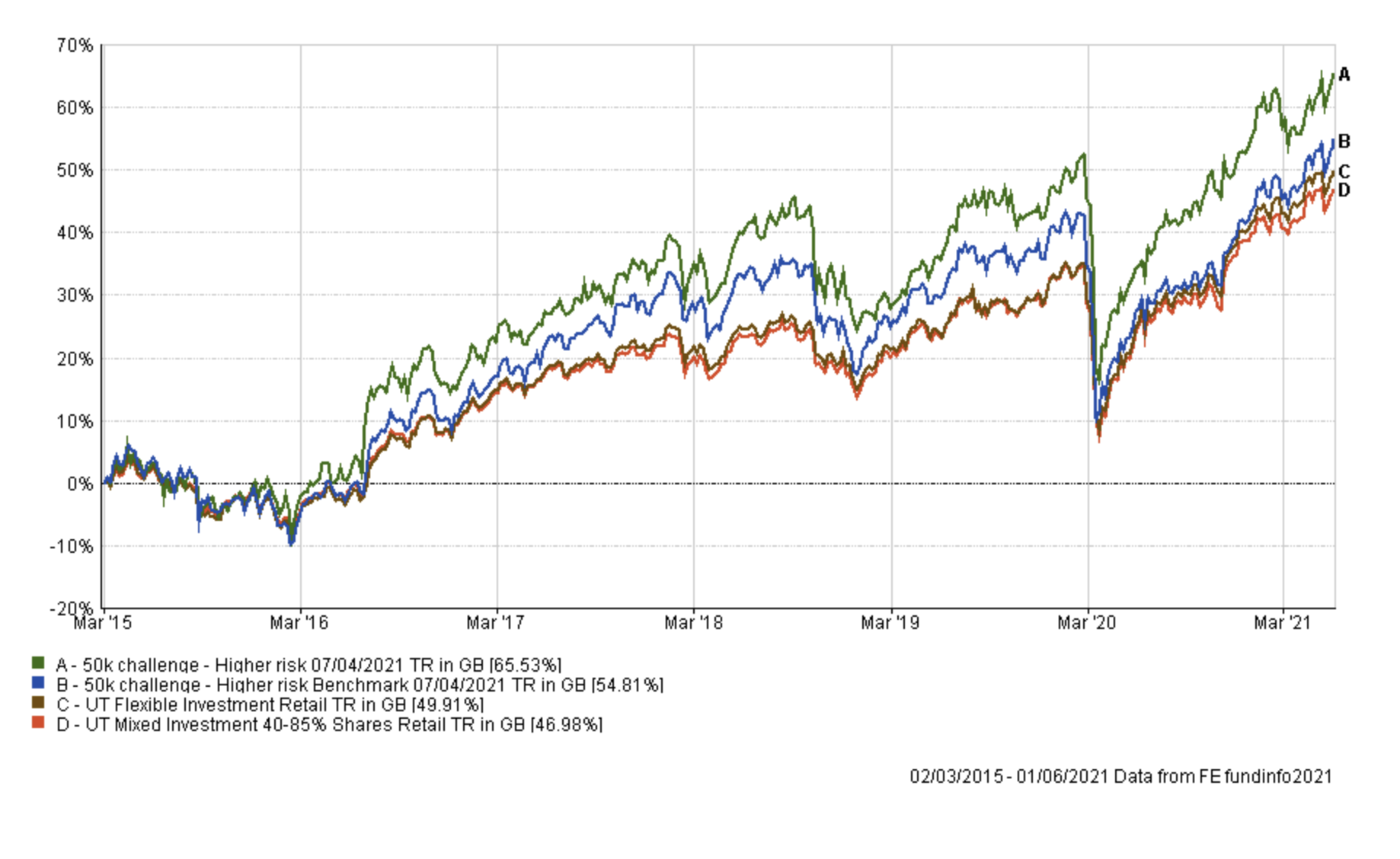
The green line is the performance of the higher risk portfolio while the red and brown lines show the average return achieved by professional fund managers from the aforementioned sectors. So, the blue line effectively shows the extra performance added by just the asset mix of my portfolio (where I was invested i.e European equities etc) over picking a typical multi-asset fund (the red and brown lines). While the green line (which is the higher risk profile's actual performance) shows the impact of being in the right funds at the right time, as identified by the 80-20 Investor algorithm. Again Damien's higher risk portfolio is outperforming all of its benchmarks and is in fact extending its lead from last time.
Damien's Lower risk portfolio methodology
The lower risk portfolio typically has between 20% and 40% in equities. Currently, it has approximately 43% invested in equities. So slightly higher than normal.
The chart below shows the performance of the portfolio against two key sectors, one of which has a maximum exposure to equities of 30% and the other where the maximum limit is 60%. The latter sector gives a steer of how well the lower risk portfolio is doing while taking much less risk.

The green line is the performance of the lower risk portfolio while the red and brown lines show the average return achieved by professional fund managers from the aforementioned sectors. So, the blue line effectively shows the extra performance added (or not added) by just the asset mix of my portfolio (where I was invested i.e European equities etc) over picking a typical multi-asset fund with a similar equity mix (the red line). While the green line (which is the lower risk portfolio's actual performance) shows the impact of being in the right funds at the right time, as identified by the 80-20 Investor algorithm.
The outperformance of the lower risk version of my portfolio has reduced since this time last year, due to its cautious approach.
Hopefully, this analysis once again helps to demonstrate the range of returns I would have achieved had I decided to vary the risk level of my portfolio. At the same time I hope it inspires subscribers who are thinking of ways to vary the risk levels in their own portfolios. 80-20 Investor is a tool to help you make your own informed investment decisions, it is not dictatorial.
Attempting to market time
To analyse the impact of using the market indicator, highlighted in the article "Navigating market tops and bottoms", on each portfolio's performance I had to decide upon an index to use as the trigger. As per the original article I settled for using the S&P 500 with the 10-month moving average indicator as the pairing has been shown to be useful in the past. Of course we could anlayse the impact of using the FTSE 100, or any other index, as the trigger index but for now we just want to see whether there is any benefit from trying to market time. Bear in mind that market tops and bottoms tend to be mirrored across most developed equity markets anyway.
Below I have produced three charts showing the performance of each of the risk versions of my £50k portfolio alongside what would have happened had you used the indicator at the start of each month to determine whether to sell out into cash (or not) and when to get back into the market.
Market timed higher risk Damien's portfolio
The green line is the standard higher risk version of my portfolio while the red version is using the 10-month moving average to decide when to get in and out of the market.

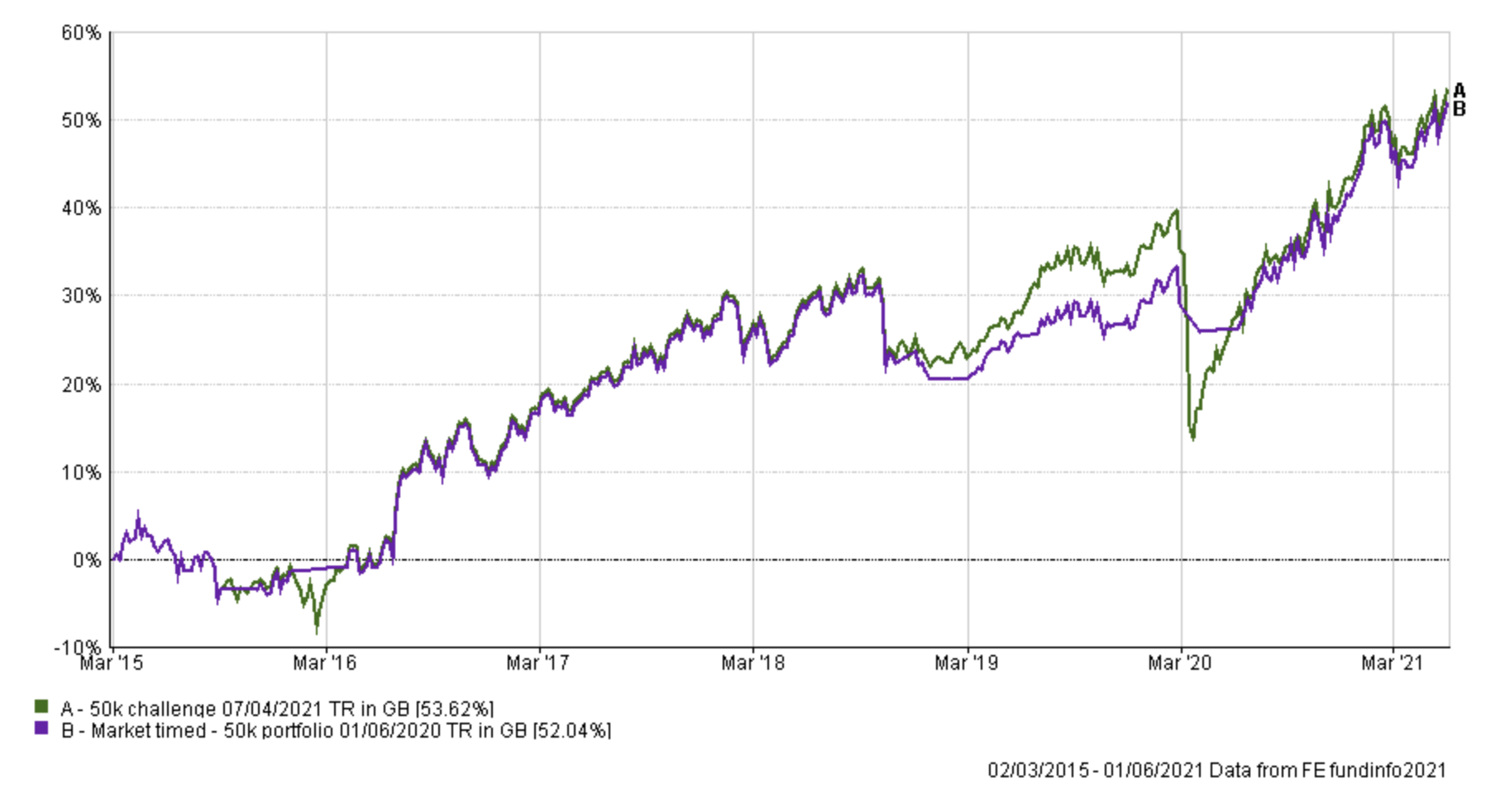
Market timed Damien's 50k portfolio
The green line is the standard version of my portfolio while the purple version is using the 10-month moving average to decide when to get in and out of the market.
Market timed lower risk Damien's portfolio
The green line is the lower risk version of my portfolio while the blue version is using the 10-month moving average to decide when to get in and out of the market.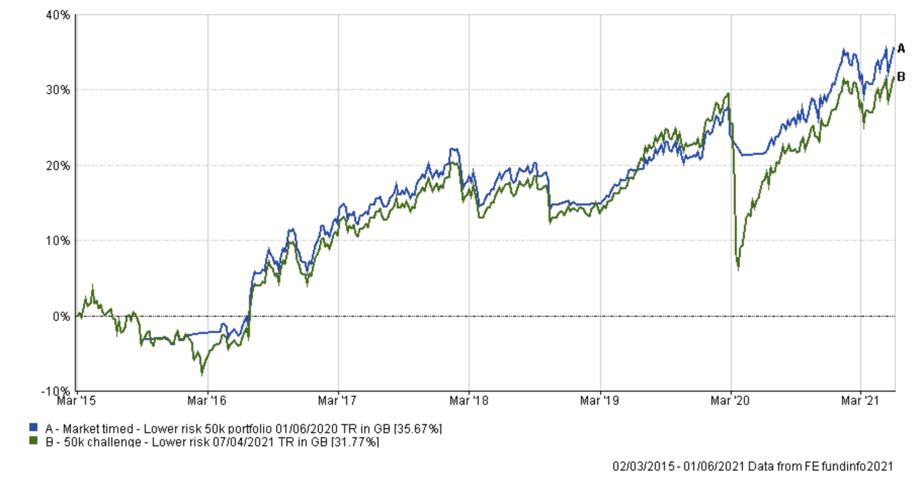
One surprising finding is that the indicator impairs performance the more risk you take. Having said that the indicator protects you from serious market implosions (bear markets) such as in 2020 whatever portfolio you choose. However the greater the risk profile the greater the negative impact on long term performance. Think of it like an insurance policy, the greater the risk of a claim the greater the cost.
Where the indicator does struggle is in periods like the end of 2018, when the market experienced very short sharp 10% corrections and rebounds at the end or the start of a month. The indicator caused you to bounce in and out of the market too quickly and as you can see it took the market timed version of my portfolio a while to recover. But for some people they may be happy with that, and on the 23rd March 2020 (the market low) anyone using the indicator would have been laughing. Ultimately you could argue that on my standard portfolio it worked as an insurance policy that didn't end up costing you anything over the long term but protected you from disaster. Of course, there is no guarantee that that will be the case in the future.
Alternative market timed portfolio
Inspired by my recent research article "Summer portfolio & Sell in May" I reconstructed the 'Market timed Damien's 50k portfolio' but instead of switching into cash I assumed you switched into a UK Gilt fund (I used the average return for a fund from the UK Gilt sector in my analysis). The table below speaks for itself. The green line is the standard version of my portfolio while the purple version is using the 10-month moving average to decide when to get in and out of the market and into cash. The red line assumes you use the 10-month moving average but instead of moving in and out of cash you move in and out of a UK gilt fund.


£200 Pension Cashback Offer
Make a qualifying deposit or transfer a pension to our partner Interactive Investor.
- Deposit or transfer a pension of at least £20k and you could earn £200 cashback
- Terms and Fees apply, Capital at risk
- New & Existing customers opening a SIPP
- Offer ends 31st July 2026
Before starting your transfer, check you won't lose any valuable benefits (such as guaranteed annuity rates or a lower protected pension age) and find out what exit fees you might have to pay
