

Precious metals, gold and silver, have been grabbing a lot of headlines of late. The price of gold, for example, has rallied more than 35% year to date as shown in the chart below (click to enlarge). I have also highlighted when I bought gold within my own £50k portfolio, which was just before the latest price explosion. Since then gold has rocketed 15% in a matter of weeks. 
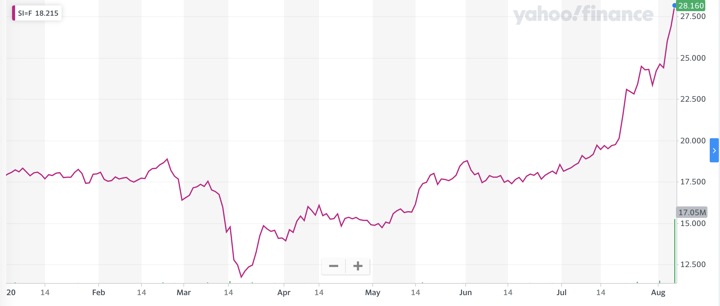
Silver too has rallied strongly and is up over 56% year to date as shown in the chart below. Again the price really exploded higher during July.
Perhaps it's no wonder then that investors who do not have any exposure are wondering whether it's too late to invest in the precious metals. In fact, I received the following question via Chatterbox:
Hi Damien,
Is it too late to invest in a gold ETF? I feel like I might have missed the boat...
Thank you
While I don't have the definitive answer to that question I can give you some insight via technical analysis. It's been a long time, three years in fact, since I wrote a technical analysis piece on the price of gold and silver so now is an opportune time to consider the outlook for the precious metals.
What is technical analysis? - A recap
First of all for those new to the idea of technical analysis here is a quick recap of what it is.
Trying to predict the future of the stock market or the price of any asset (including gold or silver) is akin to reading tea leaves. Personal predictions are almost always clouded by prejudices which reaffirm what we ‘want’ to happen rather than what is ‘most likely’ to happen. In addition, the narrative of why the price may go up or down is highly subjective but also prone to confirmation bias.
One objective method is to use technical analysis to try and judge the likely future outcomes. So what is technical analysis? One line of thinking is that asset prices (such as the price of stocks or the price of gold) are driven largely by human behaviour. At the simplest level you could argue that fear and greed drive a lot of investors’ actions. Let’s say that an opportunity presents itself and some investors jump on it and buy the shares in question. The demand then drives up the price. More investors jump on the bandwagon looking to profit. Then at some point the tide turns (fear sets in) as people think the price for the shares (or whatever asset you are looking at) is looking expensive and so people start selling. More and more people start selling to take profits and the price falls. At some point the price falls until others think the shares look cheap and start buying, outnumbering the number of sellers. Again demand outstrips supply and the price goes back up.
This see-sawing explains the movement you see in investment markets. The prices at which investors start bailing and selling the shares are called lines of resistance while the prices at which they pile in are called lines of support.
As such there is a surprising level of predictability to human behaviour. In terms of the stock market that means when the price goes through historic points of resistance or support it can indicate a new unfolding market rally or collapse. Why does it do this? Part of it will be because traders trading in millions of pounds will use these lines of resistance and support to trigger trades. Yet for a lot of investors they might not even be aware of these inflexion points. They simply are reacting to how other people in the market are behaving. Put it this way, when stock markets fall you feel tempted to sell, right? Also once it starts to rally, you are tempted to jump in? That’s why these patterns have a tendency to repeat.
Some investors and traders swear by it and trade solely using technical analysis. I don’t fall into that camp. I view technical analysis like a road map drawn by someone who has already completed a journey to somewhere near where you are planning to drive to. The road map won’t take you exactly to your intended destination, nor will it be entirely accurate. However, it will give you a better sense of what to expect.
One of the benefits of technical analysis is that it only considers the price of the asset. So the reasons why an asset, such as gold, may have risen/fallen in value or might do so in the future is irrelevant. It cuts through the noise to give you some insight into future possibilities. But like a weather forecast, it is not a guarantee of what will happen.
Gold
If we first look at the chart below showing the price moves over the last year, you can see that I have added red lines of resistance and green lines of support.
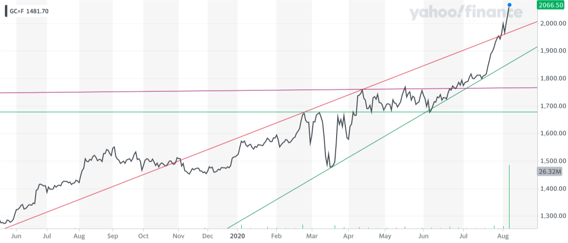
You can see that once the price of gold broke convincingly above $1,680 in April after the US Federal Reserve restarted its Quantitative Easing programme (i.e money printing), the precious metal traded in a sideways pattern until late June. At the same time it was respecting a rising support line from the March low (which it still is) and a rising resistance line (in red). When an asset is in a rising wedge pattern (as gold was) it will eventually break out higher or lower, often aggressively when it does so. In the end, gold broke higher after the price tested the rising support line at around $1,800 dollars in mid-July.
The price then broke out aggressively above $2,000 dollars at the start of August which leaves the price of the precious metal looking rather stretched in the short term. It seems likely that gold will pullback soon as such parabolic moves are not usually sustainable. Initially, $2,000 dollars should offer support, as will the rising trends line. If the gold price breaks below the rising trend line at around $1,970 it could open up a revisit of $1,800 and ultimately the support line down at $1,680. That would mean a drop of almost 20% from gold's current high.
However if we zoom out and look at the longer-term chart there is an interesting technical formation showing which is bullish for the price of gold, namely a cup and handle pattern. The chart below shows the performance of the price of gold over the last 20 years. You can see how gold has gone nowhere since 2012, forming a nice cup shape highlighted in blue.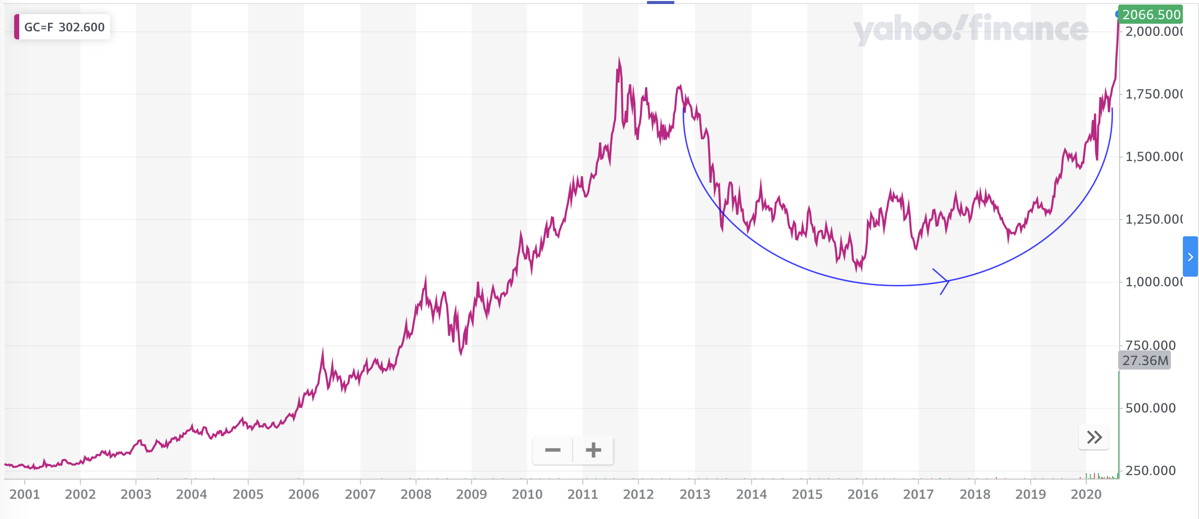
If we go back to 2008 we saw a similar formation but with the adjoining 'handle' completed on the right-hand side.
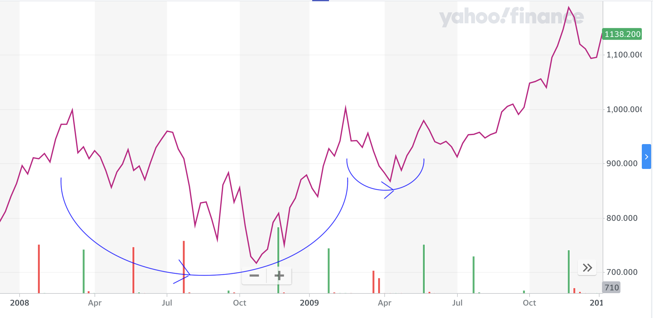
The handle was formed after a failed test of the previous high before it built enough momentum to break higher. A cup and handle formation is seen as a bullish pattern. Interestingly the depth of the cup usually matches the height of the eventual rally. So if a multi-year cup and handle formation is indeed forming in gold (the handle is missing at the moment) then the price target would be somewhere in excess of $2,500. Of course, history doesn't repeat and the recent rally spoils the cup and handle imagery somewhat. The point is that a shallow pullback in the price of gold now could still be bullish longer term. Alternatively, gold could trade sideways for a while, as it did between April and June until the rising trend line catches up.
While gold is certainly a momentum play right now, long term investors should also bear in mind its diversification benefits for a portfolio, if bought and held over the long term. So we shouldn't obsess over the short term moves. Also, given that the best way to gain exposure to precious metals is via physically-backed ETCs, repeatedly moving in and out of them will rack up switching charges. For more on investing in gold over the long term read the articles below:
- The best all-weather portfolios analysed
- Damien’s July 2020 portfolio review – Something a little different
- Should you ever invest in gold? If so how much?
Silver
The chart below shows the price of silver over the last year with key resistance lines (in red) and support lines (in green) highlighted. The price of silver had been going nowhere, perhaps on the back of growing economic concerns (silver has more economic uses than gold). Then at the same time that gold broke higher in July. silver eventually broke through resistance around $18.76 and never looked back. The difference is that the chart below looks like the chart for gold, but on steroids, as the price of silver has risen over 50% in a matter of weeks. It highlights how if you invest in silver you can expect 2-3 times the volatility than when investing in gold, which is why it's not suitable for most investors and certainly shouldn't form a significant portion of your portfolio. When silver rallies it can be extremely profitable but when it falters it can be extremely costly,
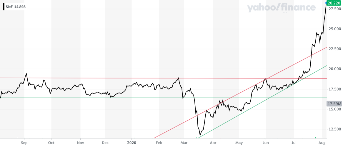
Clearly a lot of the recent price moves will be down to speculation, off the back of the rise in gold, or as a result of gold investors trying to diversify their precious metal profits. But from a technical perspective silver looks very susceptible to a pullback. A pullback to $23 would see someone entering the market now experience a 20% loss. There is a case for a support level around $25 but if this is broken it would be bad news and a revisit to the resistance line around $18.76 is possible and would be costly if you invested at the current highs.
If we look at the price of silver over the long term it puts the latest price moves into historical context. You can see that back in 2011 the price of silver rose 175%, in a year where the supportive backdrop echoes that of 2020. Back in 2011 the US Federal Reserve had just announced the third round of QE (more money printing), interest rates were low, investors were seeking haven assets and the value of the dollar was tumbling, with the US dollar index hitting a low of 73.
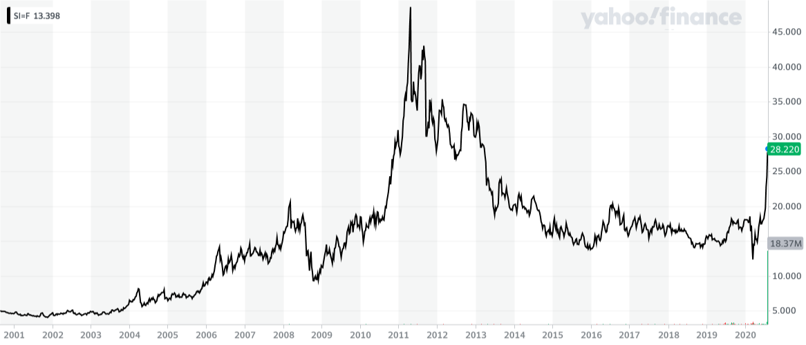
Fast forward to today and the backdrop is similar. The value of the dollar has tumbled in recent months, although the dollar index is still around 93, as the Fed continues to print money. That doesn't mean we are about to see a repeat of 2011 but it highlights that while the price of silver looks due a correction stranger things have happened. But get caught on the wrong side of a move in silver and you will get burnt. The outlook for both precious metals will rely a lot on the US Federal Reserve continuing to devalue the dollar as well as investor's appetite for haven assets. Only then will we know whether the recent moves in precious metals will reverse or are have much further to run
Gold/silver Index
As a closing thought, the gold/silver index is worth highlighting. It is calculated by dividing the current gold price by the price of silver. So currently the gold/silver index is 157, while the historical average is somewhere between 50 and 70. Therefore a number of 157 suggests that gold is overvalued versus silver and that silver is likely to perform better (on a relative basis) than gold in the near term.
How to invest in gold and silver?
One of the best ways to gain exposure to gold and silver is via Exchange Traded Commodities, such as I have in my own £50k portfolio. Hargreaves Lansdown has two pages which explain how investors can gain exposure to gold and commodities (via a number of named ETCs). While you might not invest with Hargreaves Lansdown the suggestions will be the same for most other platforms.

£200 Pension Cashback Offer
Make a qualifying deposit or transfer a pension to our partner Interactive Investor.
- Deposit or transfer a pension of at least £20k and you could earn £200 cashback
- Terms and Fees apply, Capital at risk
- New & Existing customers opening a SIPP
- Offer ends 31st July 2026
Before starting your transfer, check you won't lose any valuable benefits (such as guaranteed annuity rates or a lower protected pension age) and find out what exit fees you might have to pay
