

A 5% to 6% holding in gold has been a long-term part of my own £50k portfolio because of the diversification benefits it provides. It has also been a significant contributor to my portfolio's performance over the last couple of years. The inclusion of the iShares Physical Gold ETC was inspired by my original research article "Should you ever invest in gold? If so how much?" which I published in 2015.
My recent newsletter titled "It's high time to buy gold" highlighted how the precious metal has risen to new all-time highs. It also raised the question of where the price of gold could go from here? Will there be further new all-time highs or are we due a pullback? I was even asked the following question in Chatterbox.
"What are your views on Gold and Silver based ETFs? They seem to be rallying up as much as have the stocks rallied in the last 18 months. Silver is said to rally up more as it has industrial usage as well, what are your thoughts?"
So I thought it was an opportune moment to consider the outlook for gold and silver from a technical analysis perspective.
What is technical analysis? - A recap
First of all for those new to the idea of technical analysis here is a quick recap of what it is.
Trying to predict the future of the stock market or the price of any asset (including gold or silver) is akin to reading tea leaves. Personal predictions are almost always clouded by prejudices which reaffirm what we ‘want’ to happen rather than what is ‘most likely’ to happen. In addition, the narrative of why the price may go up or down is highly subjective but also prone to confirmation bias.
One objective method is to use technical analysis to try and judge the likely future outcomes. So what is technical analysis? One line of thinking is that asset prices (such as the price of stocks or the price of gold) are driven largely by human behaviour. At the simplest level you could argue that fear and greed drive a lot of investors’ actions. Let’s say that an opportunity presents itself and some investors jump on it and buy the shares in question. The demand then drives up the price. More investors jump on the bandwagon looking to profit. Then at some point the tide turns (fear sets in) as people think the price for the shares (or whatever asset you are looking at) is looking expensive and so people start selling. More and more people start selling to take profits and the price falls. At some point the price falls until others think the shares look cheap and start buying, outnumbering the number of sellers. Again demand outstrips supply and the price goes back up.
This see-sawing explains the movement you see in investment markets. The prices at which investors start bailing and selling the shares are called lines of resistance while the prices at which they pile in are called lines of support.
As such there is a surprising level of predictability to human behaviour. In terms of the stock market that means when the price goes through historic points of resistance or support it can indicate a new unfolding market rally or collapse. Why does it do this? Part of it will be because traders trading in millions of pounds will use these lines of resistance and support to trigger trades. Yet for a lot of investors they might not even be aware of these inflexion points. They simply are reacting to how other people in the market are behaving. Put it this way, when stock markets fall you feel tempted to sell, right? Also once it starts to rally, you are tempted to jump in? That’s why these patterns have a tendency to repeat.
Some investors and traders swear by it and trade solely using technical analysis. I don’t fall into that camp. I view technical analysis like a road map drawn by someone who has already completed a journey to somewhere near where you are planning to drive to. The road map won’t take you exactly to your intended destination, nor will it be entirely accurate. However, it will give you a better sense of what to expect.
One of the benefits of technical analysis is that it only considers the price of the asset. So the reasons why an asset, such as gold, may have risen/fallen in value or might do so in the future is irrelevant. It cuts through the noise to give you some insight into future possibilities. But like a weather forecast, it is not a guarantee of what will happen.
Gold
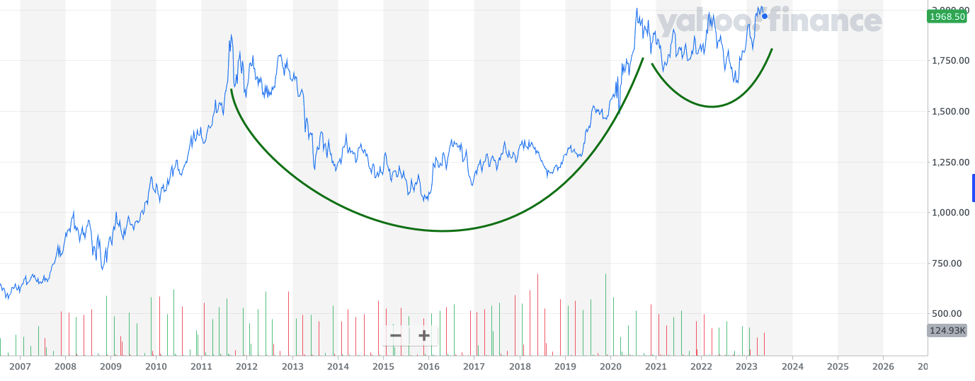
I recommend reading the last gold technical analysis piece which I wrote in May 2023, because it is another great example of when technical analysis can accurately predict short and long term trends.
In that piece I highlighted how the price of gold had completed a very bullish decade-long technical set-up, namely a cup and handle pattern that began in 2012. Below is the chart that I published back then, when the price of gold was still below $2000 an ounce. At the time I predicted that if the cup and handle pattern was confirmed that it suggested a potential upside target of $2500 per ounce for the price of gold. A bold claim given that that would represent a 25% rally.
Now we are in October 2024 and here is an updated version of the above chart.
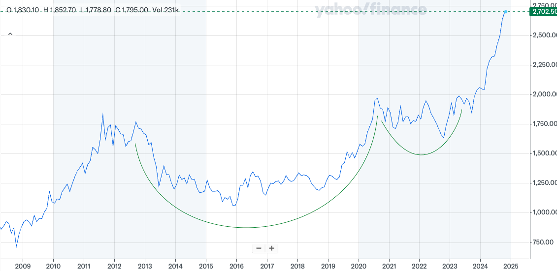
Gold now sits at $2700 an ounce and an all-time high, buoyed by the geopolitical uncertainty and major central banks embarking on monetary policy easing (i.e cutting interest rates).
If we zoom in and look at the short-term technical outlook, the picture remains very bullish.
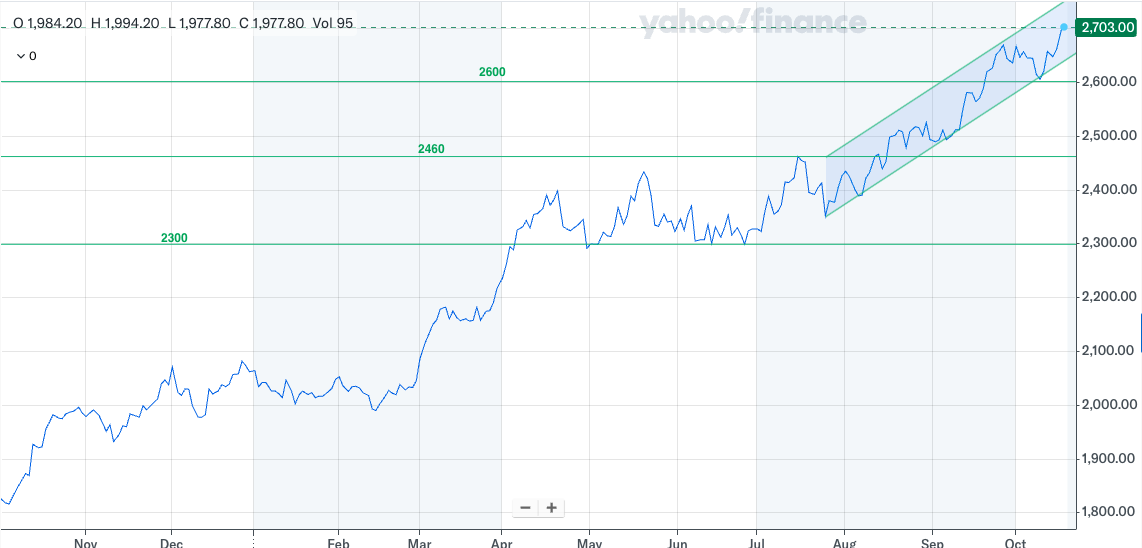
Gold continues to push relentlessly higher, with the occasional pullback sparking a wave of new investors to enter the market. This has formed a clear uptrend channel. The strength of the uptrend suggests that $2800 dollars is a distinct possibly and were that to be achieved then a move to $3000 would become another possible target.
Of course, while the price of gold looks bullish from a technical perspective, all good things come to an end. If gold were to break down then the psychologically important round numbers of 2600, 2500, 2400 and 2300 will all come into play. But there is the possibility of a period of consolidation, just as we saw between April and July this year following a similarly powerful move, like the one we've experienced this autumn.
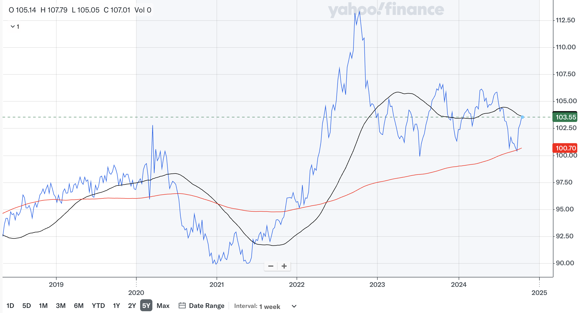
Gold also typically moves inversely to the strength of the US dollar, although the relationship does change. The slump in the strength of the US dollar over the summer no doubt helped the price of gold. Yet, the recent dollar strength (shown in the chart of the US dollar index below) hasn't hurt the rally in gold. Nonetheless it's certainly something to keep an eye on.
Silver
Silver has always been the more volatile cousin of gold. Back in 2022 I highlighted how silver was attempting to break out of a downtrend which dated back to 2021.
This is the chart that I published back then.
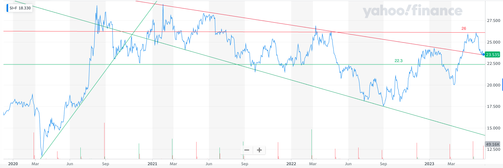
Here is a new updated chart. Note how once the price of silver broke above the key 26 level it then exploded higher and eventually moved above the psychologically important 30 level. It then struggled and eventually broke back below the 50 day moving average (the black line) before finding support around the 27.50 level.
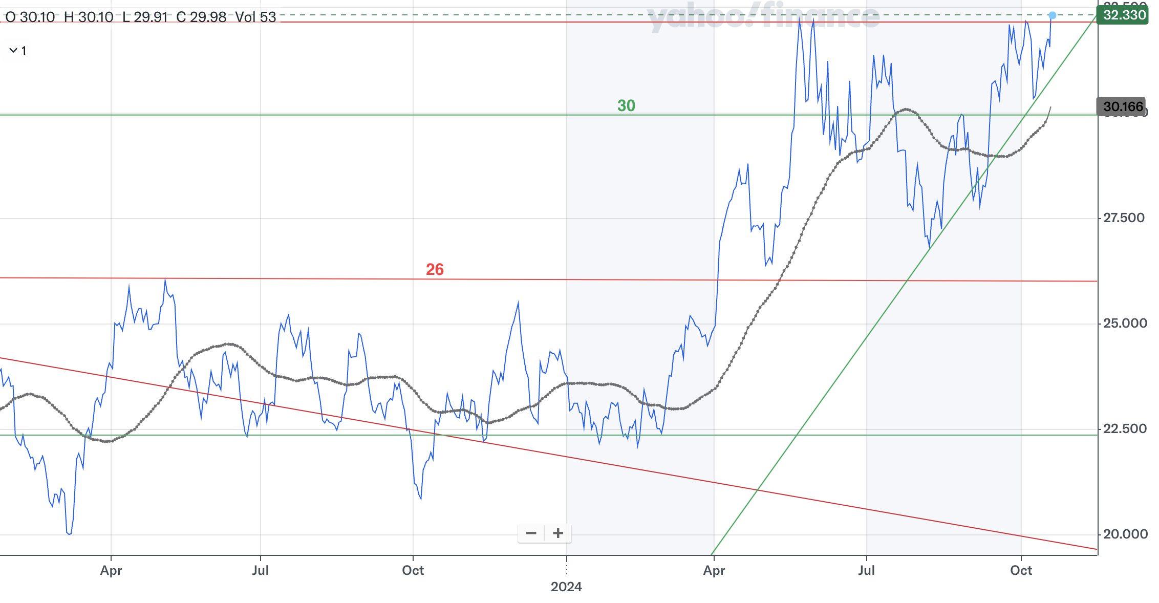
It has led to silver forming a bullish uptrend line (in green) but more concerning is that the $32.30 level has proved a difficult resistance line to overcome on a number of occasions. There is a suggestion of a double-top forming should silver pull back from its current level. If it does then a double-top would be a bearish pattern and would suggest the price of gold could head back below the $30 level which would be significant and would see investors looking for $28 and $27.50 to provide support.
While silver's technical outlook is still positive for now it is far less bullish than gold. Part of this will be a result of concerns over the economic outlook, especially in China. Silver has industrial uses, unlike gold, so economic fundamentals impact its price movements.
Looking higher, if we can break above $32.50 then that would be bullish for silver.
Gold/silver Index
As a closing thought, the gold/silver index is again worth highlighting. It is calculated by dividing the current gold price by the price of silver. So currently the gold/silver index is at 159, while the historical average is somewhere between 50 and 70. Therefore 159 suggests that gold is overvalued versus silver and that silver is likely to perform better (on a relative basis) than gold in the near term.
But this doesn't always pan out. Back in May 2023, when I last published a technical analysis update on gold and silver, the gold/silver index was at 121. However, since then the price of silver has risen by 34.74% while the price of gold has risen by 37.95%. The performance differential is not significant but silver has not outperformed gold, despite the gold/silver index at the time suggesting it would.

£200 Pension Cashback Offer
Make a qualifying deposit or transfer a pension to our partner Interactive Investor.
- Deposit or transfer a pension of at least £20k and you could earn £200 cashback
- Terms and Fees apply, Capital at risk
- New & Existing customers opening a SIPP
- Offer ends 31st July 2026
Before starting your transfer, check you won't lose any valuable benefits (such as guaranteed annuity rates or a lower protected pension age) and find out what exit fees you might have to pay
