

2022 has been an incredibly difficult year for investors. At the start of the year I wrote a research piece about the diversification dilemma, which looked at what we could do in a world where bonds and equities fall in tandem. At the time I wrote that article, we were only coming to the end of the first 4 months of the year, too short a time period from which to draw conclusions based on statistical analysis of correlations between different assets.
So I tackled the dilemma and analysed the performance of various all-weather portfolios to glean which was performing best. With the benefit of hindsight we now know that the 60/40 bond equity portfolio, which at the time was down around 5.6%, has continued to lose value and at the time of the analysis carried out for this article was down over 12%, year to date. This "blip" in the correlation between bonds and equities continues and has not reverted back to the recent historical norm of being negative.
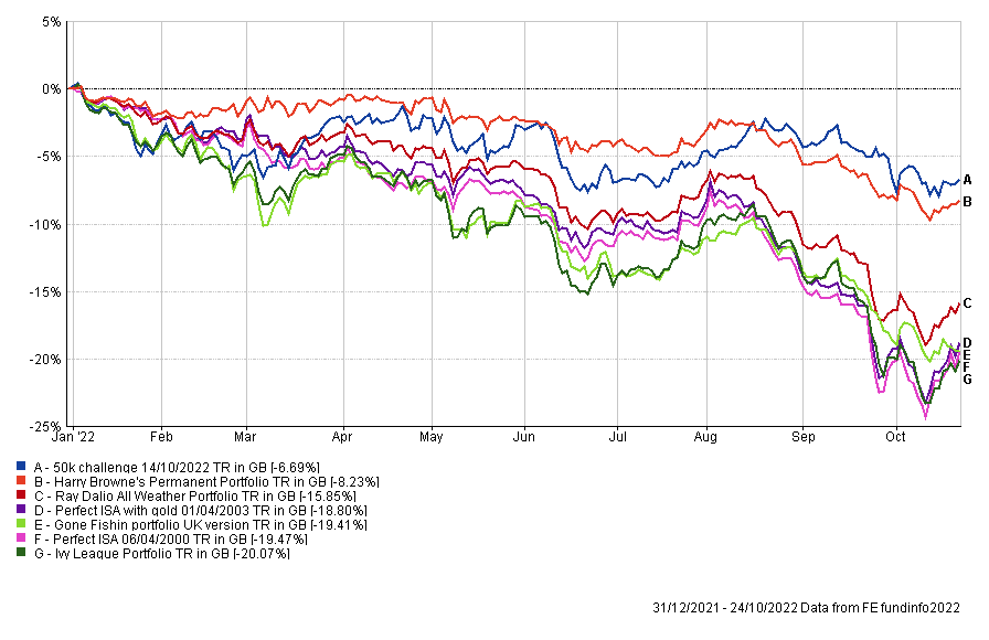
Not so perfect portfolios
The chart below shows the updated year-to-date performance of the all-weather portfolios I previously analysed. You can find details of the asset mix for each portfolio in the original diversification dilemma research article.
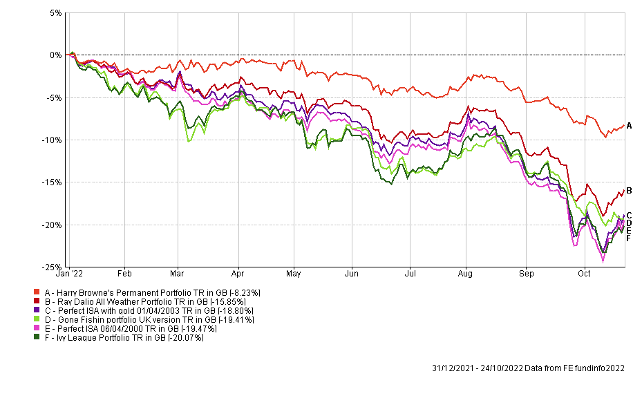
The first thing to highlight in the chart is that the top three performers remain the same as earlier in the year, namely the Harry Browne Permanent Portfolio, Ray Dalio All Weather Portfolio and 80-20 Investor Perfect Gold Portfolio. But it's only the latter that has significantly outperformed the other portfolios across the entire year. So what is going on? Are traditional assumptions about asset correlations no longer valid? How can you build a more diversified portfolio to cope with what is fast becoming the worst year for the traditional bond/equity portfolio in 100 years?
Changing correlations
Correlations between assets can and do change over time. In fact, they can and do change for extended periods of time, meaning that conventional wisdoms about diversification, based on recent history, become invalid.
Given that we are fast approaching the end of 2022, we now have enough data to look at how/if correlations between various assets have changed over the year. To do this I calculated something called the correlation coefficient between different assets. It is complicated to work out but it is very easy to use. This correlation figure can range between -1 and 1. A figure of 1 would suggest that the two objects follow each other while a score of -1 suggests that as one rises the other falls and vice versa. A score of 0 means that the two assets are not correlated.
Correlation heatmaps
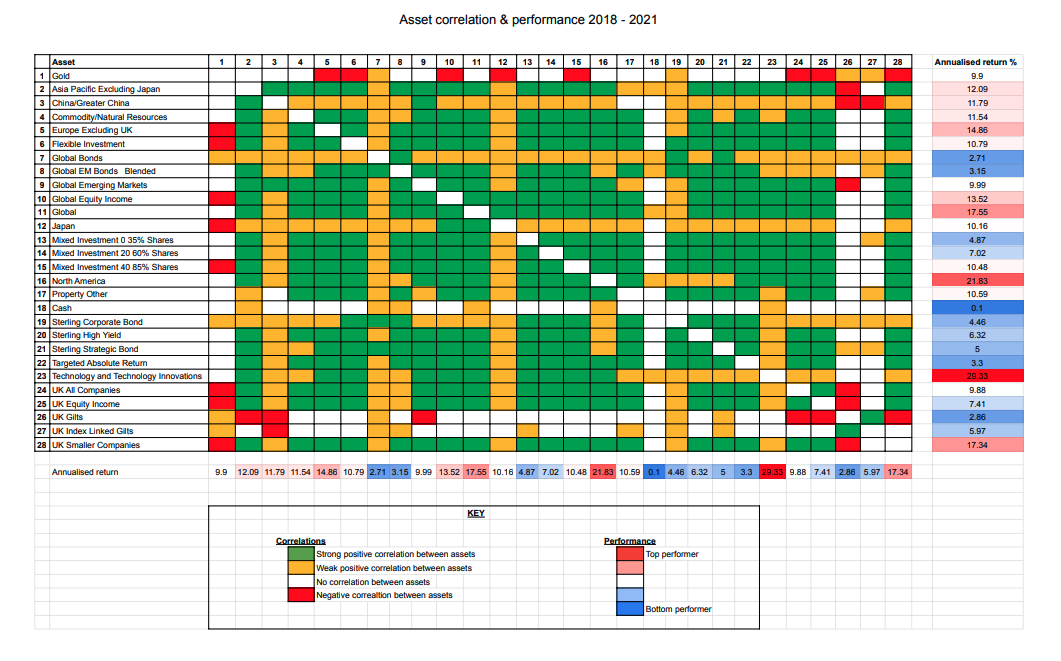
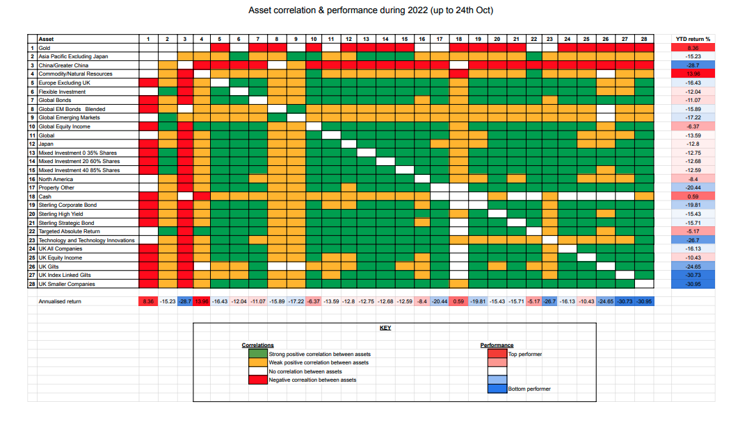
To enable you to see how asset/sector correlations have behaved before and during 2022, I have produced three heatmaps. The first heatmap shows 25 domestic and international Investment Association sectors (covering assets including bonds, equities and cash) plus gold, along with their respective correlations and annualised performance in the three years prior to 2022. The second shows the correlations between the same sectors/assets during 2022, along with the year to date performance of each asset class.
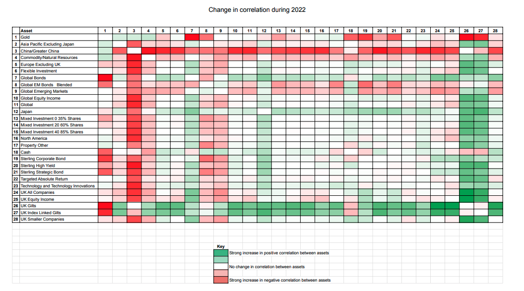
The third chart shows the change in correlation in 2022 as well as the strength of that change. So you can see the areas where conventional wisdoms have altered the most.
Each chart is colour coded (click on each image to enlarge them). A green square shows that there is/was a high positive correlation (over 0.7) between the two sectors in question. A yellow square shows that there is/was a weak positive correlation between the two sectors (i.e a correlation coefficient between 0.2 and 0.7). A white square indicates that there is/was no discernible correlation between the asset classes (i.e they are uncorrelated and have a correlation coefficient of between -0.2 and 0.2). A red square indicates a negative correlation between two sectors (i.e a correlation coefficient of -0.2 or lower). You will notice that the first column contains numbers which help you identify the assets type which each subsequent column refers to.
Now, let's say that you have a significant UK gilt holding in your portfolio. The first chart shows that prior to 2022 it would have been largely uncorrelated to most other assets that were within your portfolio. (Note: the geographical sectors are all equity sectors unless stated otherwise). This has since changed in 2022 as shown in the second chart where UK gilts are now positively correlated to equities. The only assets to show a negative correlation or little correlation (or at least not a significant one) to most other assets in 2022 are gold, cash and Chinese equities. Holding these assets will help diversify your portfolio, however as shown by the year to date performance figures for 2022, Chinese equities have been one of the worst performing assets in 2022, emphasising that diversification isn't the only consideration.
2018-2021 Asset correlation heatmap

2022 Asset correlation heatmap

Change in correlations during 2022

Summary
2022 has been a difficult year to invest because of the change in correlations between asset classes making traditional methods of diversification ineffective. This was visually demonstrated in the earlier chart of the performance of the various all-weather portfolios. It means now that new patterns have emerged:
- Technology stocks have become increasingly correlated to gilts…. which are both being affected by interest rate risks.
- Global bonds and equities have become increasingly correlated.
- Cash remains the most uncorrelated asset, while gold has also proved a good portfolio diversifier.
- One of the sectors where correlations to other assets have remained relatively unchanged is the Targeted Absolute Return, although the longer term returns are poor.
- Commodities have also been consistently a good diversifier throughout the period (2018 onwards) and have become less correlated to other asset classes during 2022.
- Global bonds have gone nowhere, in terms of performance, in the three years to the end of 2021 and have lost money heavily in 2022.
This explains why my portfolio (the blue line) has outperformed all of the all-weather portfolios (as shown below) and the traditional 60/40 bond equity model during 2022. Correlations will no doubt change in the future but until they do it still pays to think beyond traditional asset allocations and focus on those with momentum (that have performed well) and that have shown the ability to still diversify a portfolio.

£200 Pension Cashback Offer
Make a qualifying deposit or transfer a pension to our partner Interactive Investor.
- Deposit or transfer a pension of at least £20k and you could earn £200 cashback
- Terms and Fees apply, Capital at risk
- New & Existing customers opening a SIPP
- Offer ends 31st July 2026
Before starting your transfer, check you won't lose any valuable benefits (such as guaranteed annuity rates or a lower protected pension age) and find out what exit fees you might have to pay
